Traders can use a great variety of types of charts in their trading. Some of them are common, like candlestick charts. Yet some are more exotic and are used only rarely. But that does not mean that such charts are not useful to traders. One of such less popular types of charts, usually used only by professional traders, is the Kagi chart.
What is the Kagi chart?
The Kagi chart is a type of chart that shows the price movement of an asset. It consists of vertical and horizontal lines connected under a 90-degree angle. They can be either thick or thin. Sometimes, a trader can choose to color the thick lines green and the thin lines red. The Y-axis shows the price value. The Kagi chart does not show a consistent time scale. Instead, the X-axis shows key moments when price reversal happened.
The Kagi chart was created in the 1870s in Japan. Initially, it was used by rice traders to gauge supply and demand. The word "kagi" in Japanese is used for an L-shaped key. Indeed, sometimes the Kagi chart is called the Key chart. The name reflects the L-shaped lines of the chart.
Building the Kagi chart
Components of the Kagi chart
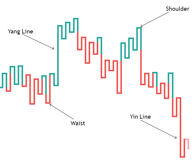
The Kagi chart consists of the following components:
- Yang line — a thick/green up line that shows an uptrend or increase in demand.
- Yin line — a thin/red down line that shows a downtrend or increase in supply.
- Shoulder — a horizontal line that connects an up line and a down line and indicates a price reversal down.
- Waist — a horizontal line that connects a down line and an up line and indicates a reversal up.
Construction of the Kagi chart
To construct the Kagi chart, first, a horizontal line is plotted at the price's close level. Next, a vertical line between the horizontal line and the next period's close is plotted. What happens next depends on what the price does:
- If the price moves in the same direction, then the vertical line is extended to the closing price level.
- If the price reverses its movement but the reversal amount is smaller than the predetermined value, then nothing happens.
- If the price reverses its movement and the reversal amount is larger than the predetermined value, then a horizontal line and a new vertical line ending at the closing price level are plotted.
If the price is above the previous peak (shoulder), then the line turns thick/green. If the price moves below the previous low (waist), then the line turns thin/red.
How the reversal amount is determined?
There are three methods to determine the reversal amount:
- The arguably most usual method is percentage-based. The usual amount professionals recommend is 4% of the current price's value, though it is an amount useful for the stock market and less so for the Forex market. Forex pairs rarely change by more than 1% during a daily trading session.
- Another method is to set a fixed value, for example, 5 pips.
- And the last one is to use the Average True Range (ATR). The usual ATR value is 14 periods (days, weeks, etc. depending on your chosen time scale). The advantage of this method is that it accounts for volatility. The disadvantage is that it can change the look of the chart during the previous periods, making it hard to identify trends and to find a good trade opportunity.
How to trade the Kagi chart?
The most common strategy for the Kagi chart is to buy when the line turns thick/green and to sell when the line turns thin/red. The downside of the strategy is that it can create too many false positives during choppy trading.
There are many ways to filter out the noise from the markets. One of them is to plot a trendline and buy when a waist is created above it or sell when a shoulder is created under it. Another one is to wait until the price falls below the three previous waists or rises above the three previous shoulders to confirm a new trend.
Advantages and disadvantages
Advantages
The main advantage of the Kagi chart is considered to be the fact that it is independent of time. This allows it to filter out the market noise and make it easier to spot trends.
Disadvantages
The disadvantage of the Kagi chart is the necessity to find a proper reversal value. If a trader sets it too low the chart becomes too choppy, creating too much noise, making it harder to spot trends, and basically erasing the advantages of the Kagi chart. If a trader sets the value too high the chart will create too few trading signals, resulting in missing potentially profitable trade opportunities. The latter means that the Kagi chart is not as useful for less actively traded assets.
How is the Kagi charts different from candlestick charts?
The main difference between the Kagi chart and the candlestick chart and other common charts is the fact that the Kagi chart is time-independent. While the candlestick chart creates a bar for every time period (hour, day, week, etc.), the Kagi chart creates a U-turn only when the price reverses its movement. That makes the Kagi chart less prone to market noise, easier to use in spotting trends and allows it to show more data on the same time frame.
How is the Kagi chart different from other time-independent charts?
Being a time-independent chart, the Kagi chart somewhat resembles the point-and-figure (P&F) as well as the Renko charts. However, the Kagi chart is considered to be a better tool in spotting trends due to the way those charts are built. To better understand why, we should look at how the charts look and how they are constructed.
Kagi vs. point-and-figure charts
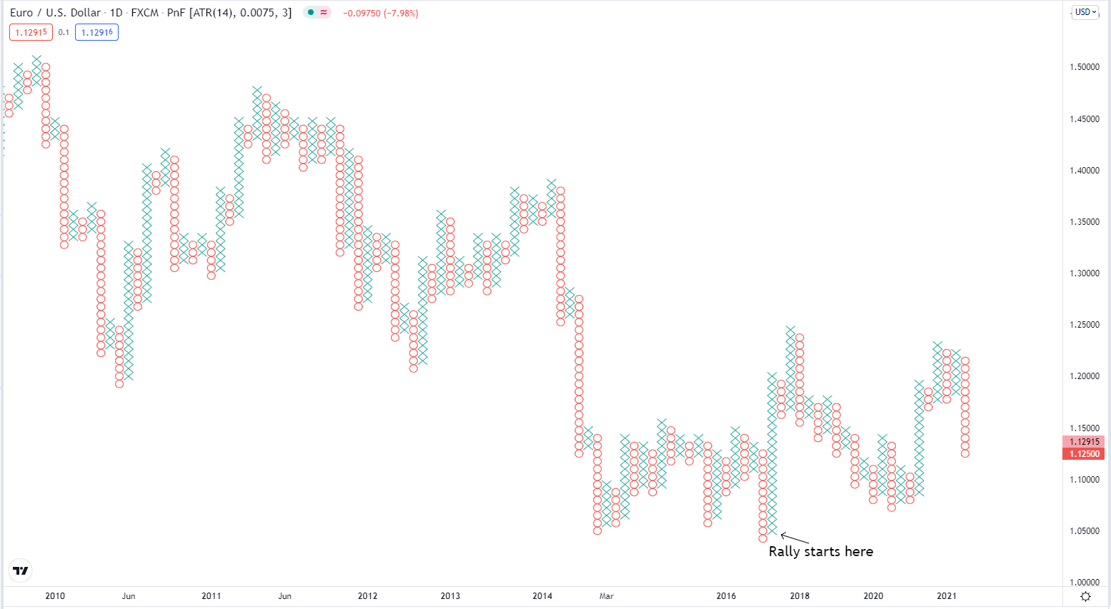
The P&F chart consists of Xs and Os. An X is created when the price rise more than the specific amount above the previous high, while a Y is plotted when the price falls more than the predetermined amount below the previous low. While it makes it easy to understand and plot the chart, such an approach means that it usually takes a relatively long time for a new X or Y to appear. This makes it not that useful for fast-trading intraday markets, like the Forex.
Let's look, for example, at the chart of EUR/USD. A rally had started at the end of May 2020, and those traders who entered long positions early could have profited greatly from it. Yet, if we look at the daily P&F chart of the currency pair, it would take too long to identify the trend, and traders might have lost a significant chunk of profit waiting for confirmation.
Using a smaller timescale alleviates the problem a bit. Here is the same chart on the 4-hour timescale.
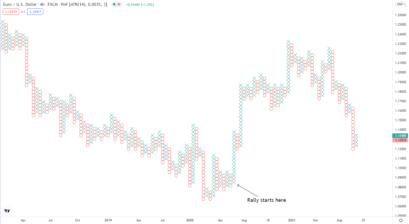
With all Xs and Os, the chart still looks just too crowded visually, making it harder to see less prominent trends.
Kagi vs. Renko charts
But what about Renko charts? The Renko chart consists of boxes (called bricks). A new brick appears only when the price moves at least by the set minimum amount. Additionally, a new brick can appear only if the closing price rises above the top of the previous brick or falls below the bottom by at least the specified amount. With new bricks appearing more often than Xs and Ys on the P&F chart and with each new brick being placed to the side from the previous one, it makes it far easier to catch a trend on the Renko chart than on the P&F chart. Let's look at the Renko chart of EUR/USD.
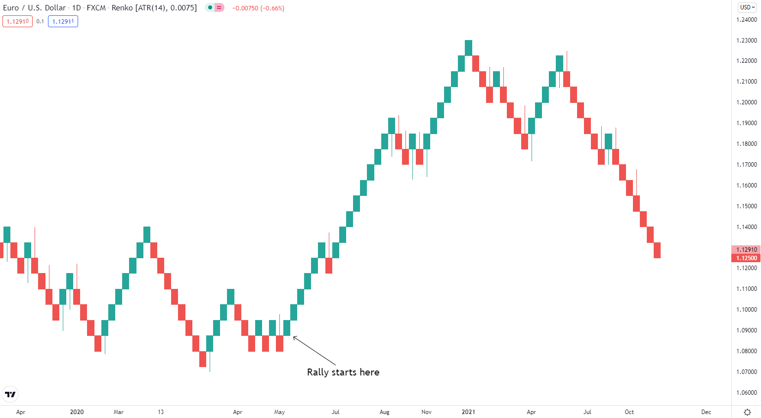
However, as a new brick is created every time the relevant price action happens, it reduces the advantage of filtering out market noise and makes the Renko chart look closer to the candlestick chart than other time-independent charts. Additionally, due to the nature of how the Renko chart is built, it cannot quickly react to trend reversals. As no two bricks can be placed beside each other, the price has to move at least by two bricks before it is allowed to change the direction.
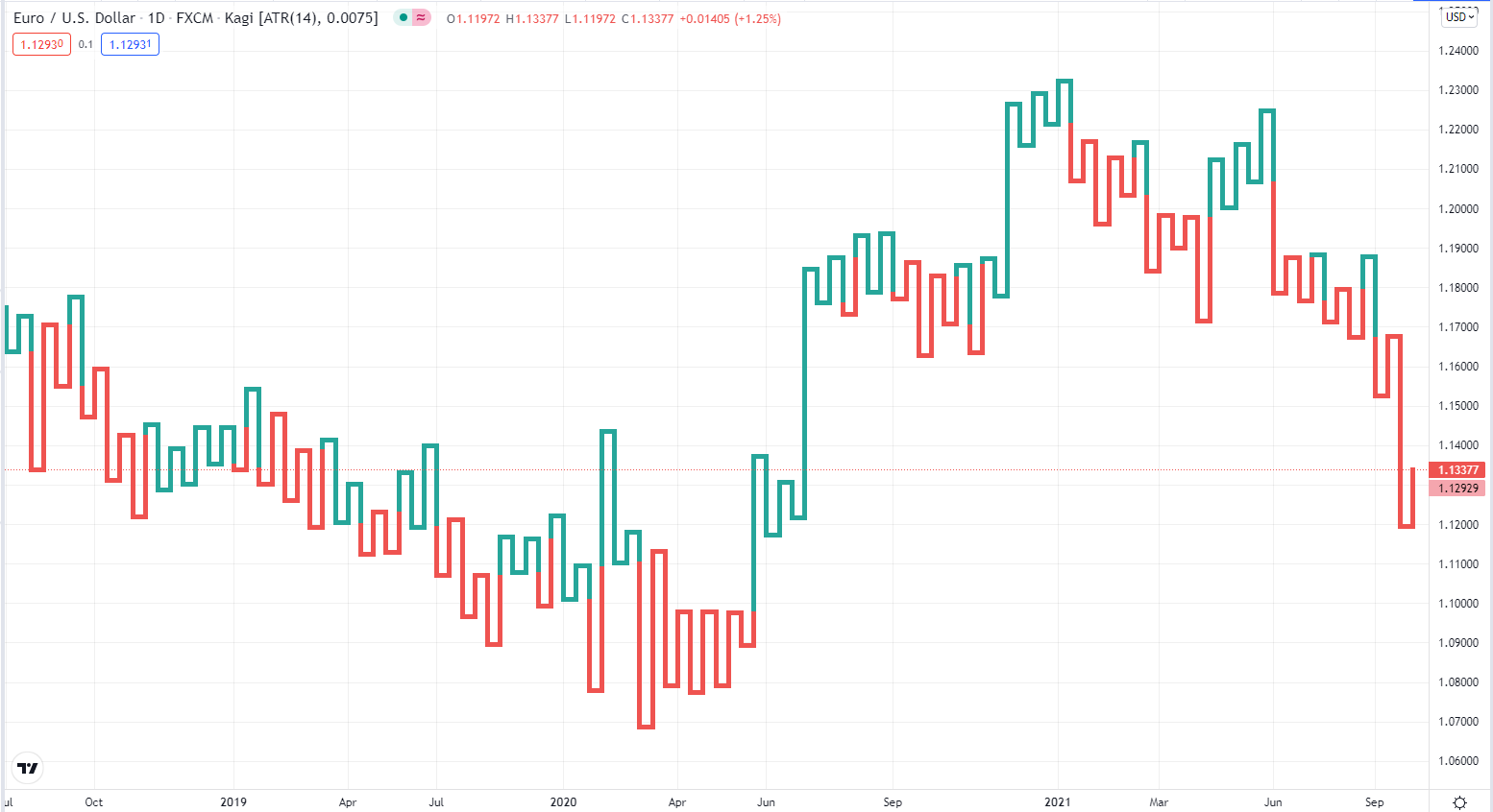
And to conclude the comparison, let's look at the Kagi chart of EUR/USD.
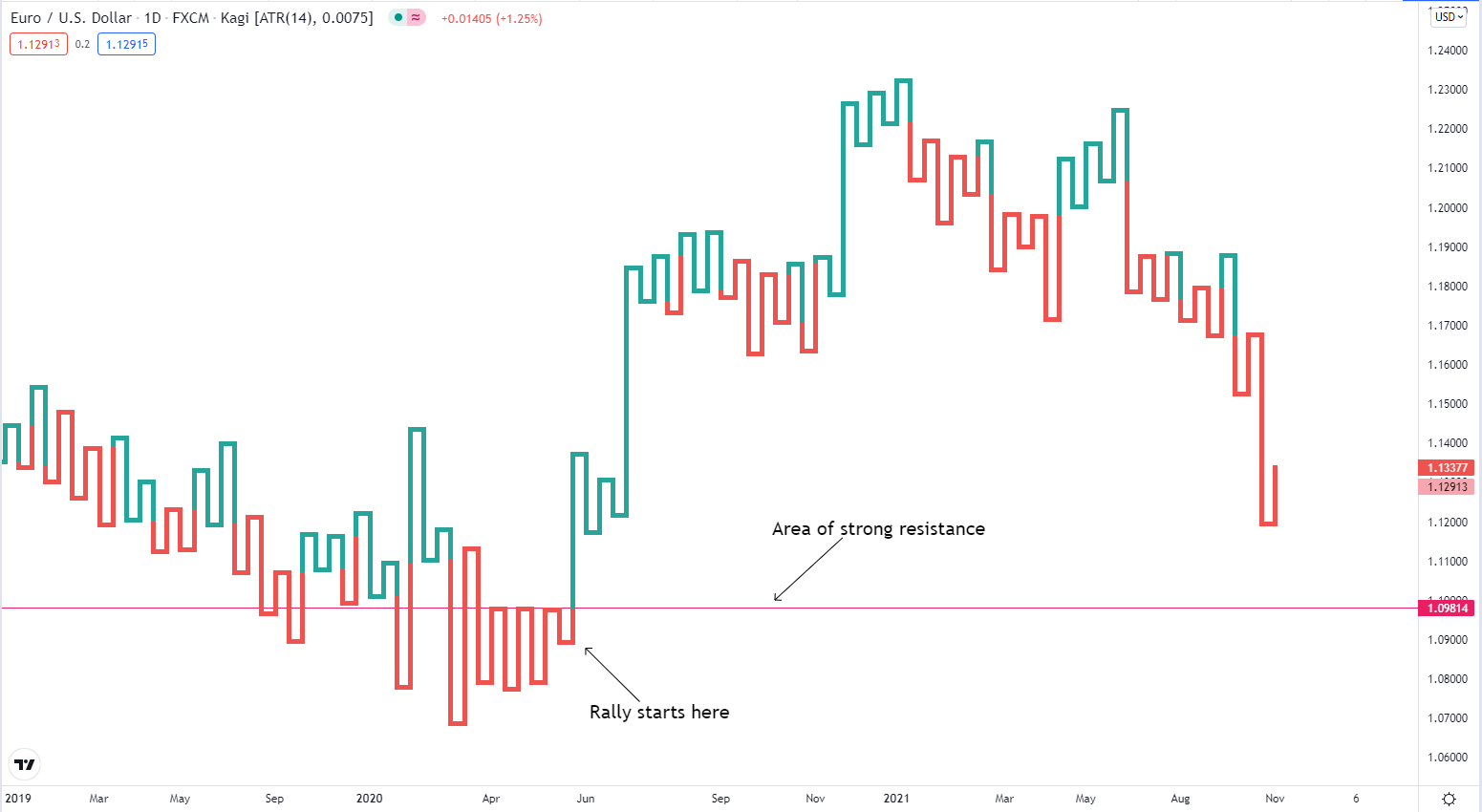
Not only it is quite easy to see the uptrend, but traders could also have jumped in as soon as the price broke above the strong resistance level, tested three times before, and the chart sent a bullish signal by turning the Yin line into a Yang line.
Can the Kagi chart be used in Forex?
The method for building the Kagi chart does not discern between different assets. That means nothing prevents traders from using Kagi charts for trading the Forex pairs.
It is important to remember, though, that some currency pairs are more actively traded than others. That means it can be useful to use different reversal values for different currency pairs. Some professional traders advise using an ATR-based reversal value to account for variations in volatility. Others advise against this as such an approach removes precise control of the reversal value from the hands of the trader on top of changing the look of the chart in the past.
Which trading platforms support the Kagi chart?
Unfortunately, the Kagi being a less popular chart means not every platform supports it. Here is the list of popular platforms that allow using the Kagi chart.
MetaTrader 4 & 5
The MetaTrader platform does not support the Kagi chart out of the box. But it can be downloaded for free from the official code base as a separate indicator.
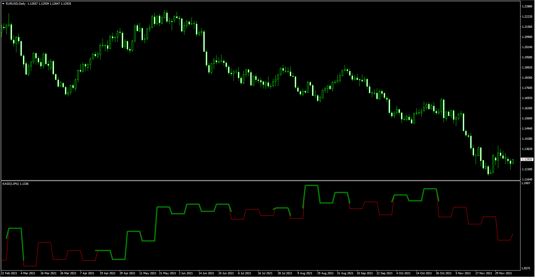
Here is one example of such an indicator for the MetaTrader 4 platform called KAGI_1:
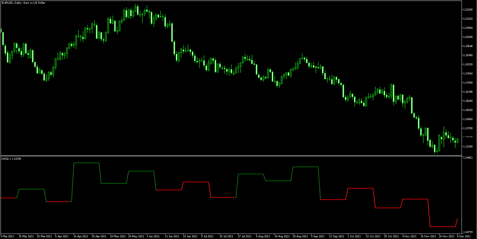
And here is an example of a Kagi chart indicator for the MetaTrader 5 platform called kagi-1:
While the indicators allow you to see Kagi charts on the popular MetaTrader platforms, the charts do not look great, and MetaTrader is clearly not the best way to use Kagi charts. It is better to use platforms that have the Kagi chart by default, like the ones listed below.
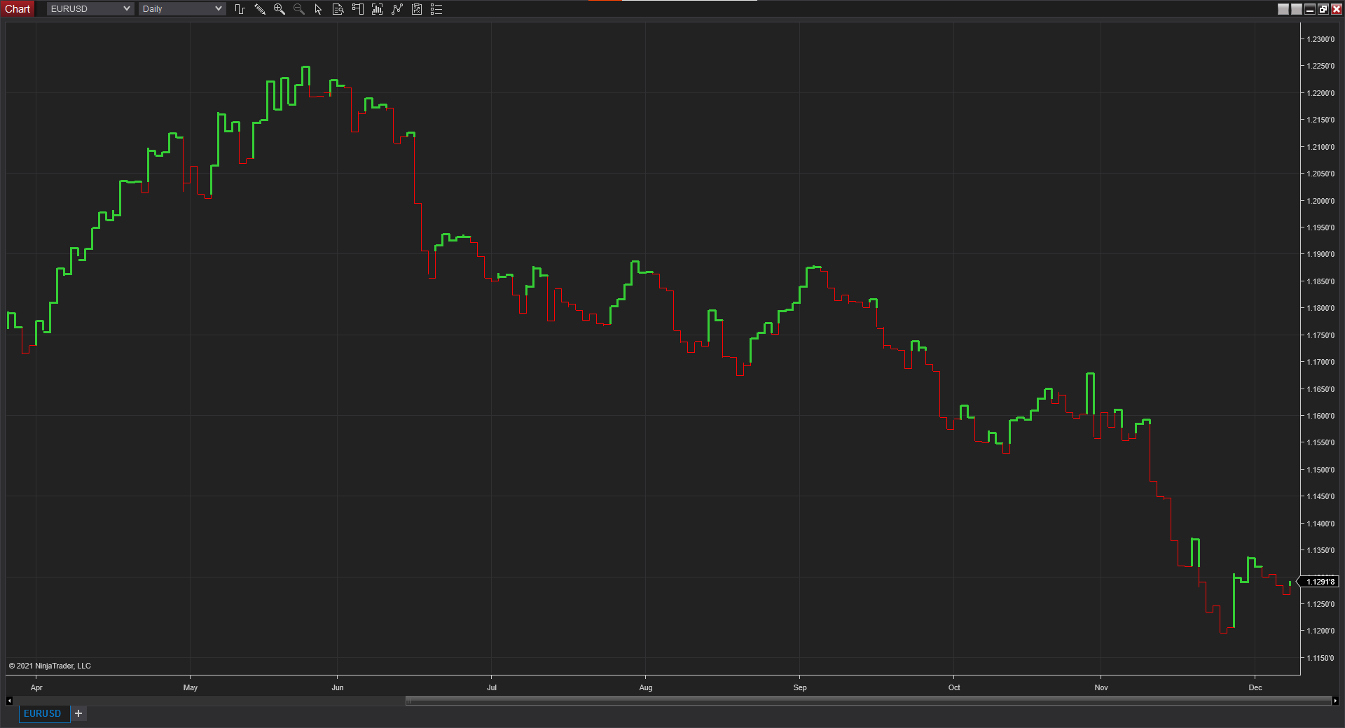
NinjaTrader
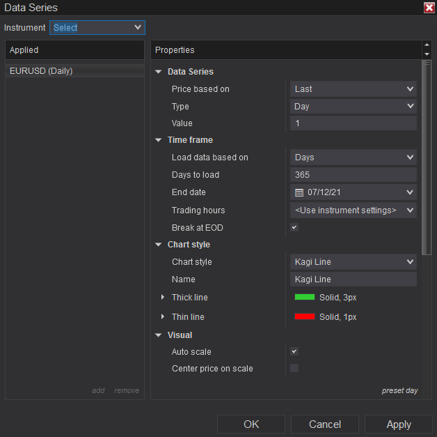
NinjaTrader comes with the Kagi chart out of the box. To use it a trader should choose the Kagi Line option in the Chart Style of the Data Series menu item (Data Series->Chart Style->Kagi Line).
Here is an example of how the Kagi chart looks in the NinjaTrader platform:
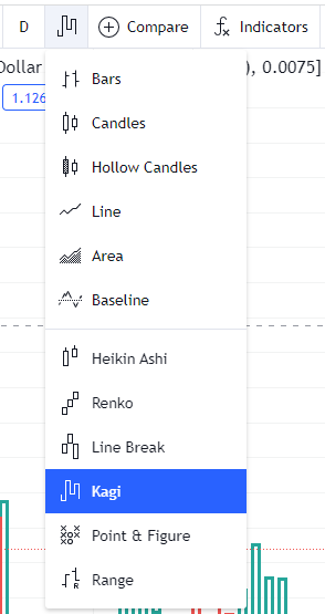
TradingView
TradingView is perhaps the easiest way to try Kagi charts as it has this type of chart built in and does not require a download. You can simply choose Kagi when choosing the chart type. Unfortunately, the Kagi chart is available for free only on daily or longer timeframes. Intraday timeframes are available only to paying customers.
Here is an example of how the Kagi chart looks on the TradingView platform:
If you want to share your opinion, observations, conclusions, or simply to ask questions regarding the use of the Kagi chart in Forex, feel free to join a discussion in our forum.