Exotic Types of Charts
Indicators have a perpetual problem — they struggle to filter out noise and deliver a pure trend. Indicators are prone to false breakouts and whipsaws — as are our eyes, which suffer from the additional problem of wishful thinking. Exotic types of charts are an effort to overcome these drawbacks. Considering how different they can be from regular charts, some traders think that using them can be considered a trading system on its own, separate from regular trading.
Point-and-Figure (P&F)
Point-and-figure charts capture only significant prices, “significant” meaning prices that exceed previous highs or lows by a specific amount. P&F charts filter out noise. You do not care about time, and in fact, you do not even see time on the horizontal axis, as in all other charts. The only thing that counts in a P&F chart is the price move. Whole periods can go by — days — with no entry on the chart because no move occurred that was higher or lower than the last one. When you do get a higher high by x number of points (that you specify in advance), you put an X on the chart. When it’s a lower low, you put an O. A point-and-figure chart, therefore, shows alternating columns of X’s and O’s, each column representing an up move or a down move. Remember, you can have a column of (say) 10 X’s but that does not mean it took 10 periods — it could be 3 periods or 30.
The minimum move to generate an X or an O is named box size. Software will offer you a default setting, but in practice, that is usually what fits on the screen and bears no relationship to how the currency actually moves. Most Forex chartists would select an average true range for the box size. The minimum move to name a reversal is named the reversal amount and is usually two to four boxes. Obviously, if you get a series of reversal columns containing only one X or O, your box size or your reversal amount is too small.
P&F charting is handy for drawing support and resistance, both the horizontal “historic” last high or low type and the standard connect-the-lows or highs type. The S&R lines tend to be exceptionally reliable because you have filtered out noise and compressed time. Other patterns are reliable, too, like double tops and bottoms and triangles.
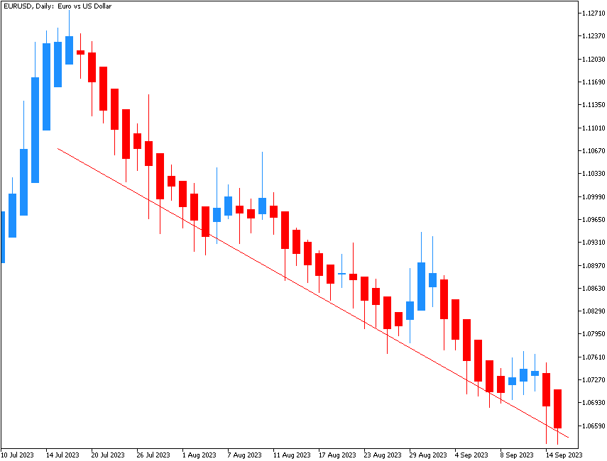
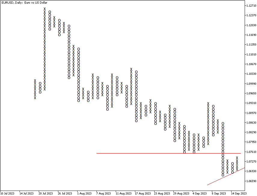
P&F charting is considered more suitable for longer-term investing than for the quicker intraday trading engaged in by most Forex traders today, but you can use this chart form on any timeframe, including 5 minutes. The figure below shows the P&F chart format using a box size of 100 points. This currency pair was trying to halt its decline and rebound but has broken hand-drawn support, a clear sell signal. But recently, it started to log higher highs and higher lows, suggesting an upside correction, though probably a short-lived one. You can combine a point-and-figure chart with other indicators, too, such as the MACD and stochastic.
Renko
Renko charts are very similar to point-and-figure charts – they filter noise, place a box named a brick on the chart only when a minimum move has been achieved, and disregard time. Renko is named after the word for “brick” in Japanese, renga. Renko was introduced to the West by candlestick expert Steve Nison.
As in point-and-figure, with Renko charts, you specify the number of points that must be reached and surpassed to form a new brick. Practitioners often set the brick size to a small number on a short-term chart, say 5 or 10 pips, and then specify that it takes three bricks to confirm a new move.
A new Renko brick is drawn on the chart only when the current close is above the top (or below the bottom) of the existing last brick by a specified amount. If the price move qualified for one brick and part of a second brick, only one brick is drawn. In most, if not all, software, indicators created from Renko bars also exclude the non-qualifying or surplus points, which makes for very clean indicators (such as MACD) that are a big help in decision-making.
In Renko charts, new bricks are drawn each on their own column of the chart. The X-axis doesn't represent a time scale in Renko charts — each block just shifts the chart to the right. As a result, all Renko bricks form different forms of stairs-like patterns.
The figure below shows the same currency pair and periodicity in Renko form as in the previous point-and-figure chart, also using 100 points for the brick size. Again, the horizontal axis does not show calendar dates because they are irrelevant. We never know how long it takes for a minimum brick to be formed. The interesting thing about the Renko chart compared to the point-and-figure chart is that the Renko chart has not yet delivered a rebound.
Heikin-Ashi
Heikin-Ashi candlesticks use an averaging process to form a composite candlestick (heiken means “average” in Japanese, and ashi means “leg” but can be translated as “pace”). In the arithmetic that follows, O = open, H = High, L= Low, and C = Close.
- The close of a Heikin-Ashi candlestick is the (O + H + L + C) / 4.
- The open of the current period candlestick is the previous period’s (O + C) / 2.
- The high is the highest of 3 possible candidates — the current period high, the current Heikin-Ashi open, or the current Heikin-Ashi close.
- The low is the lowest of 3 possible candidates — the current low, the current Heikin-Ashi open, or the current Heikin-Ashi close.
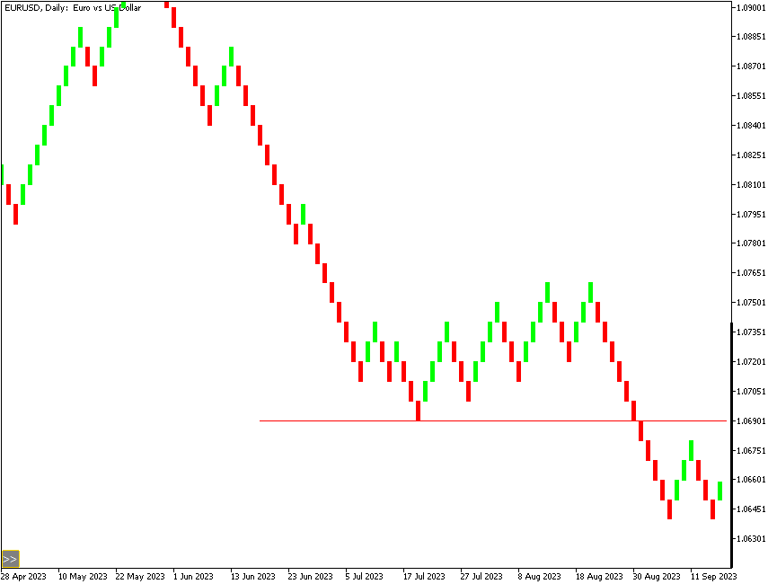
When the HA close is over the HA open, the candlestick is white or blank. When the HA close is below the HA open, it is colored black or otherwise filled in. HA candlesticks tend to deliver longer strings of one-colored bars than conventional candlesticks — again, the averaging process removes noise. Some traders consider that the clean identification of trendiness makes Heikin-Ashi a trading system in its own right. Most standard candlestick patterns do not, in general, apply to HA candlesticks, although dojis and spinning tops remain valid, and you can still draw support and resistance, channels, and other techniques. Note that an HA chart will show time along the horizontal axis, unlike point-and-figure and Renko charts. Unlike the previous two charts, the currency pair did not show any significant pause in its downside movement on the Heikin-Ashi chart, thus not creating a strong support level at any point during its downfall.