If you have some basic knowledge of trading, currencies, orders, indicators, and charts, this guide will be too basic for you. However, if you are new to chart types, you will quickly see here different types of charts that are available in MetaTrader and how to read them. Every chart has its own way of showing the price data and it is important to understand their differences. In this guide, you will see the three most popular kinds of charts.
MetaTrader offers three types of charts:
- Bar chart
- Candlestick chart
- Line chart
Using one type of chart or another is a personal choice — some traders like candlesticks while other traders like bars, or maybe for some strategies, you only want to see a clean line chart. There is no best or worst, there is the chart that it is more suitable for your strategies and techniques.
Remember that to change the type of chart you are using, you simply need to select the chart and then click the chart type in the Chart bar or via the Charts menu.

You can also quickly switch between chart types using keyboard shortcuts:
- Alt + 1 — a hotkey for bars.
- Alt + 2 — a hotkey for candles.
- Alt + 3 — a hotkey for line.
Line Chart
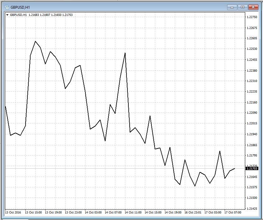
We can start from the last type as it is the simplest one and shows the least amount of information. A line chart consists of just a line connecting all the close prices, like the one below.
Bar Chart
A bar chart includes more information than a line chart. On a bar chart, you can find the Open, High, Low, and Close (OHLC) prices for every period. This is very helpful to understand what was the dynamic of the price during the period. For example, whether there were spikes or the price has increased or decreased in the period, or there was high volatility or uncertainty, and so on.
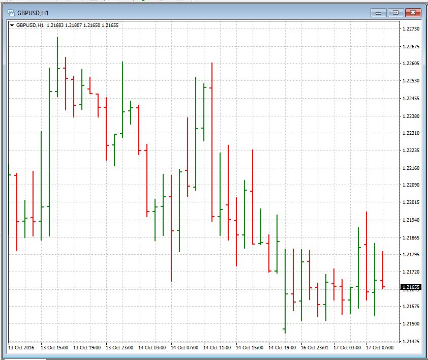
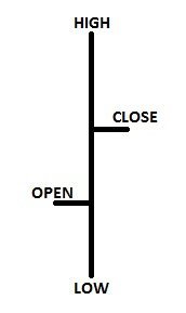
Reading a bar chart may be confusing if you are not used to it, but don't worry — it won't take long to get used to it. To read a bar chart, consider a single bar, it is read as follows.
The bars can also be colored if you prefer (see the guide on How to Configure Your Color Scheme).
Candlestick Chart
A candlestick chart contains the same information as a bar chart, but presented in a slightly different way. You can take a look here:
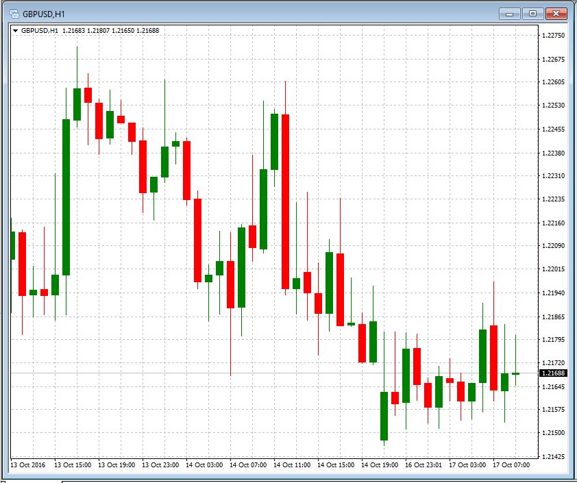
Unlike a skinny bar, a candlestick has a body and shadows. The body shows the difference between the Open and the Close prices, while the shadows show how far the price has gone up and down during the period.
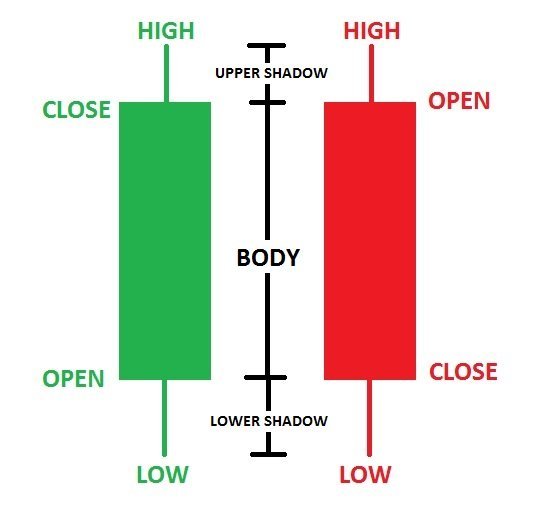
Similar to a bar chart, a candlestick chart may also take some time to be read easily and quickly, but it won't take too long.
Candlestick and bar charts are the most suitable ones for price action trading.
Conclusion
There is not a global best chart for everyone, each one of us may prefere a different chart. It is really a personal choice to use a chart rather than another so the suggestion is to use all of them for a while and see which one suits best your personality and strategies.