Line Chart
Some analysts use only tables of numbers to which they apply formulas — including algo traders — but the vast majority of technical analysts use the chart as the workspace. The most basic of charts uses a line to connect prices that are collected at the same interval, whether hourly, daily, or some other timeframe. As a general rule, line charts use the closing price of the interval as the most representative of total trader sentiment during the preceding period.
This is obviously more useful when the close used on the chart coincides with a significant time point, like the actual close of trading in a specific market. In Forex futures, for example, the Chicago Mercantile Exchange has a “settlement” closing price that is used to clear trades done at the close and to mark-to-market open trades being carried over to the next session. Because every trader knows this, they may try to engineer a specific price at the settlement to favor their position. In contrast, traders do not care much whether the close at 10:00 is much different from the close at 10:05 (5-minute interval) or between 10 and 11 (hourly interval). In other words, the daily close is more important as a signifier of market sentiment than the hourly close.
Because spot Forex trades around the clock, defining open/high/low/close is arbitrary. As a general rule, data vendors like eSignal, Bloomberg, and Refinitiv consider that the Forex market opens in New Zealand at 18:00 Eastern US time and closes in New York at 17:59 Eastern time. Therefore, the close that is used in a daily line chart is the New York close.
Features of a Line Chart
The Forex line chart is the same as the line chart you learned in science class in grade school. It consists of two axes perpendicular to one another. The horizontal or x-axis denotes time, and the vertical or y-axis denotes prices. Prices from specific times are placed on the vertical axis at the same interval between any two prices and connected with a line.
Prices that are placed on the chart are named ticks. The word tick means several different things in trading, and so the wise course is to use the word as little as possible and only when you are 100% certain you are using it correctly. For example, the wider application of the term tick is that it defines the smallest price change by which a security can move. In both spot and futures Forex, that is normally 0.0001 or 0.00001 for fractional quotes, although the dollar value of a tick is different in the two markets.
To avoid confusion, when talking about the ticks on a line chart, most analysts will call them price points or data points rather than ticks.
Benefits and Drawbacks of a Line Chart
The chief benefit of a line chart is its simplicity. A line chart offers a visually easy way to grasp changes in numerical value over time. Below is a line chart of the EUR/USD using the daily close for each data point. Without adding any other indicator, your eye immediately sees a broad uptrend.
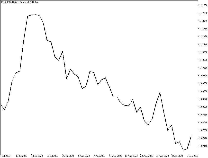
The chief virtue is also the chief drawback. A line chart lacks detail and nuance. You get an impression of a trend at a glance, but you do not get a “feel” for how the trend was constructed. The line chart shown here could have been assembled out of a series of days on which the high-low range was the same or nearly the same or out of a series of days on which the high-low range was very wide on only a fraction of the days and very small on the majority of them.
So what? We interpret trader sentiment from the high-low range. The absence of that information on a line chart is a drawback. Further, you have to stop and look again to see a rebound in the line. That rebound can be critically important to your success as a trader.
We could also complain that the even spacing of data points on a conventional line chart is a drawback. In point-and-figure charting, for example, you put a data point on the chart only when the price change from the previous price is significant, without regard for the y-axis (time). The point-and-figure chart below shows exactly the same data as the line chart, but the format emphasizes that each column of lower lows (the O’s) is usually accompanied by lower highs and that each rebound (the X’s), with one exception, does not go higher than the highest O column.
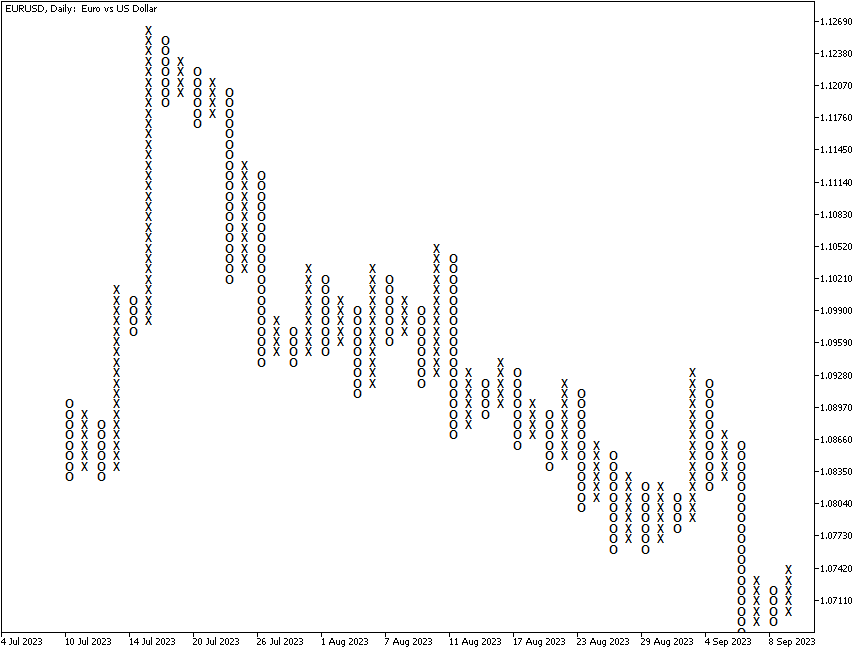
As a rule, in point-and-figure charting, we do not expect a rally to exceed the last highest high of a falling O column. This could be useful when setting stops. Point-and-figure charting has mostly fallen out of favor today, and probably only a tiny number of traders use it, but it serves as a contrast to the line chart and shows that other chart formats have a lot more to offer.