One pattern that can help you trade successfully when you are using price action is the broadening top, also known as the megaphone top, or sometimes the "reverse triangle" pattern.
This guide is going to go over the basics of the broadening top chart pattern. It will explain what this pattern looks like, what it tells you about price, and how you can use it in your trading.
What is the broadening top chart pattern?
The broadening top chart pattern shows up when price is ranging with increasingly higher highs and lower lows.
That means that you are seeing the opposite of consolidation. Price is ranging across an ever-widening zone.
Traders often use the broadening top chart pattern to look for breakout entries.
One thing that may be useful for traders to note is that if you zoom out to a higher timeframe, the broadening top chart pattern is the same thing as a bullish outside bar or bearish outside bar from price action trading strategies. You will see an example of this later.
Key point:
The broadening top chart pattern occurs when price ranges with increasingly higher peaks and lower valleys, forming a megaphone shape.
What does the broadening top chart pattern show you?
The broadening top chart pattern shows you that volatility in the market is increasing, causing larger swings in price. That means that the market is currently indecisive, but may be ready to make a move. Often, this takes place when a previous trend is getting ready to reverse.
So, for example, you might notice a broadening top chart pattern after the market has been climbing for a while, just before price reverses and drops. The opposite could occur as well.
But you can sometimes also encounter the broadening top in situations that have been ranging for a while without a strong trend. It's also not uncommon to occasionally run into it in continuation scenarios as well. But reversals are the classic context for the broadening top pattern.
Key point:
The broadening top chart pattern shows indecision and growing volatility in the market. It can occur in a variety of contexts, but is often a reversal pattern.
How to identify the broadening top chart pattern on your charts
To find a broadening top chart pattern, you need to look for a series of bars or candlesticks where the highs are getting higher, and the lows are getting lower, forming a triangular shape that is getting broader (not narrower).
In terms of market context, if you find such a pattern after a trend, that is a good sign that a reversal may be imminent. But again, you may find it profitable in other contexts too sometimes.
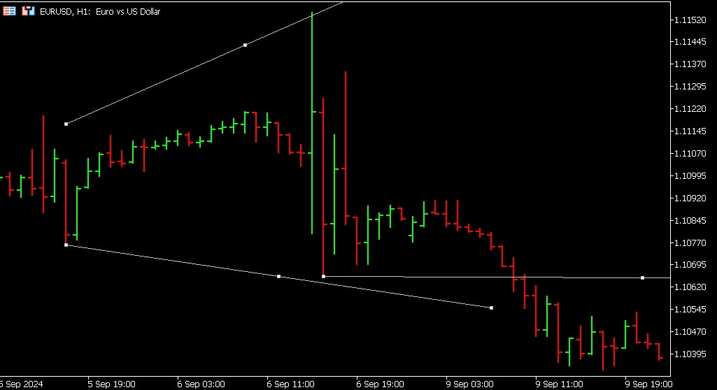
Here is an example of what this looks like:

The trend lines have been drawn to show you the megaphone shape. A horizontal line has been added showing you where you could place a sell order (there are some other entries here that also make sense based on previous support levels).
Above, you are looking at the hourly EUR/USD chart. What you may also find interesting is what you see on the daily timeframe:

This is just another way of visualizing and understanding the same setup. As you are now looking at the daily timeframe, you can see that there is a larger bearish bar that fully encompasses the previous bar. This is sometimes referred to as a bearish outside bar (BEOB), and can indicate that price is about to break downwards.
If you looked at the hourly timeframe for the broadening top pattern, you could have gotten in on this trade earlier than if you spotted it on the daily timeframe as a BEOB (as you would need the BEOB to finish forming to spot the pattern).
On the other hand, sometimes waiting longer can help you avoid whipsaws. So, that might be an advantage to using the daily charts and delaying entry.
The lines in the image above weren't redrawn. They are just zoomed out. But interestingly enough, you can see that you could redraw the upper and lower lines to encompass three bars, which would also be a larger broadening top pattern. Check the image below:
This is the same chart. It's just have been scrolled back a little in time and with the trend lines redrawn to show you the daily broadening top pattern. The horizontal line aligned with a previous support/resistance level has also been redrawn to show you a good potential entry for this trade.
If you go back to look again at the first hourly chart, you should also be able to see where you could have drawn these lines to identify this larger broadening top pattern.
This example illustrates some of what makes trading complicated. Even a single trade setup can sometimes be visualized and understood in multiple ways.
Key point:
To identify a broadening top chart pattern, look for a pattern of higher highs and lower lows, then draw trend lines to mark them.
How to use the broadening top chart pattern to trade
This has been pretty much explained above. But just to recap, here is how you can trade using the broadening top chart pattern.

- Watch your charts until you see a pattern of higher highs and lower lows.
- Draw trend lines to mark to help you visualize the shape of the pattern.
- Put an entry where it makes sense to you. Checking previous nearby levels of support and resistance can help you choose where to put the entry. Remember, these are usually, but not always, reversal patterns.
Do not forget to set your stop loss and take profit target as well.
That is all. Just wait for the trade to fire, and exit when appropriate. You may need to test a few variations on entry and exit rules to figure out what is profitable.
Key point:
All you need to do to use the broadening top chart pattern when trading Forex is to search for the pattern, draw trend lines to visualize it, and place a suitable entry.
Broadening top pattern vs. triangle pattern
As mentioned earlier, a broadening top pattern is the opposite of consolidation and it is also sometimes called the "reverse triangle" pattern.
The triangle pattern is another popular price action pattern. But instead of progressive higher highs and lower lows, it is characterized by lower highs and higher lows. Sometimes, the bars or candles will even be enclosed entirely by those preceding them.
This is another type of pattern that shows uncertainty in the markets, and can lead to a breakout. The difference is that volatility is decreasing with a triangle, whereas it is increasing with the reverse triangle.
However, whereas the normal triangle pattern is usually a trend continuation formation, the broadening top pattern serves mostly as a reversal signal after trend exhaustion.
General tips for using the broadening top chart pattern
Here are a few recommendations for trading successfully using the broadening top chart pattern:
- Pay attention to context: Along with noting whether the asset has been trending or ranging, you may want to add an indicator to your chart to help you check whether it is overbought or oversold. Examples include Bollinger bands, the relative strength index (RSI), and the stochastic oscillator, among others.
- Watch out for fakeouts: While this pattern can help you get in on breakouts, sometimes price whipsaws back in the opposite direction. This may sometimes stop you out. Some traders may prefer to wait for the retracement before getting in on a trade.
- Test your strategy: Whatever approach you decide to take with entries, exits, and any indicators you want to use, make sure that you thoroughly backtest and demo test. Only go live once your results prove that your method is viable.
Key point:
These best practices will help you use the broadening top chart pattern with success.
Conclusion: the broadening top chart pattern can help you spot breakouts
The broadening top chart pattern alerts you to situations where volatility is increasing and the market is uncertain. When you see it, you can set an entry to try and catch a potential breakout. It is one of many price patterns that you can use to read the markets and understand what price is doing and how you can potentially profit.