Elliott Wave Analysis by EWF

Walmart (NYSE: WMT) ended its rally from the April 2025 low triggering a larger degree correction. We mentioned this idea earlier this year in our previous article. Today, we explain the Elliott Wave structure unfolding now. Our analysis leads to the next potential investment opportunity.

Elliott Wave Analysis

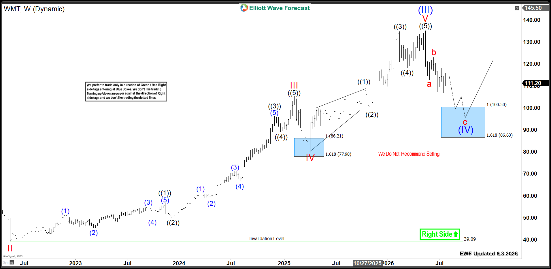
WMT's last rally from the April 2025 Blue Box unfolded as a five-wave advance. This move ended at $135, marking wave (III). From that peak, the stock began a three-wave zigzag correction within wave (IV). Price already established the first two legs, "a" and "b". Consequently, as long as WMT stays below the recent June peak of $116.80, further downside continuation should occur within wave C.

Based on the a-b connector, WMT should reach the $100.50 - $86.63 Blue Box equal legs area. Therefore, buyers and investors should wait for this extreme zone. They will enter the market there and look for the stock to turn higher. It will either resume the rally in wave (V) toward new highs or bounce in three waves at minimum.

Walmart WMT Weekly Chart 08.03.2026
Walmart WMT Weekly 8.3.2026

Conclusion​

Walmart (WMT) weekly bullish cycle remains firmly intact. Therefore, this correction will create the next strategic buying opportunity before the uptrend resumes.

Source: https://elliottwave-forecast.com/stock-market/walmart-wmt-new-investment-opportunity-below-100/
 
In this Elliott Wave update, we examine the long-term structure in the SPDR S&P Oil & Gas Exploration & Production ETF ($XOP). The ETF continues to show a bullish double-nest structure from the 2020 low, which supports additional upside over the longer term. However, $XOP currently trades at an important inflection point. The correction against the April 2025 low may have already ended, or the ETF may need a deeper 7-swing pullback before the larger bullish trend resumes.

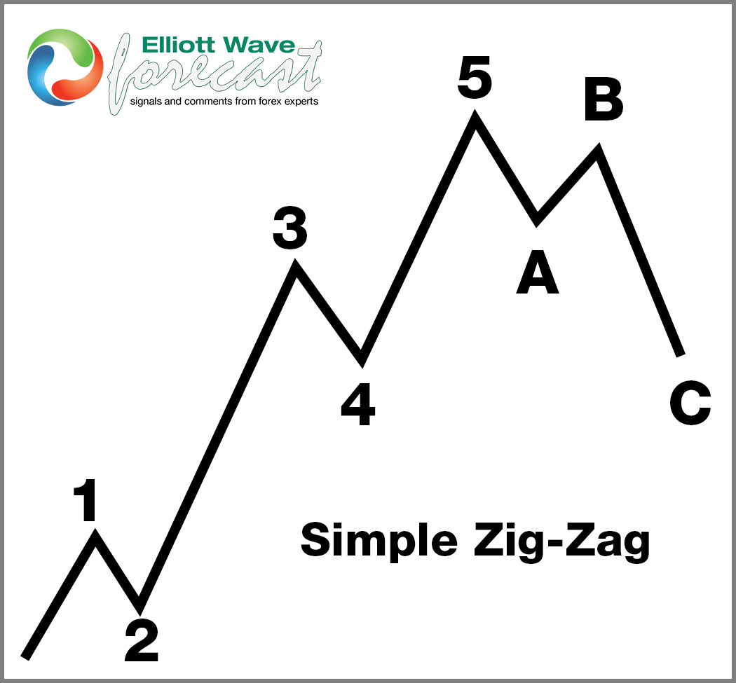
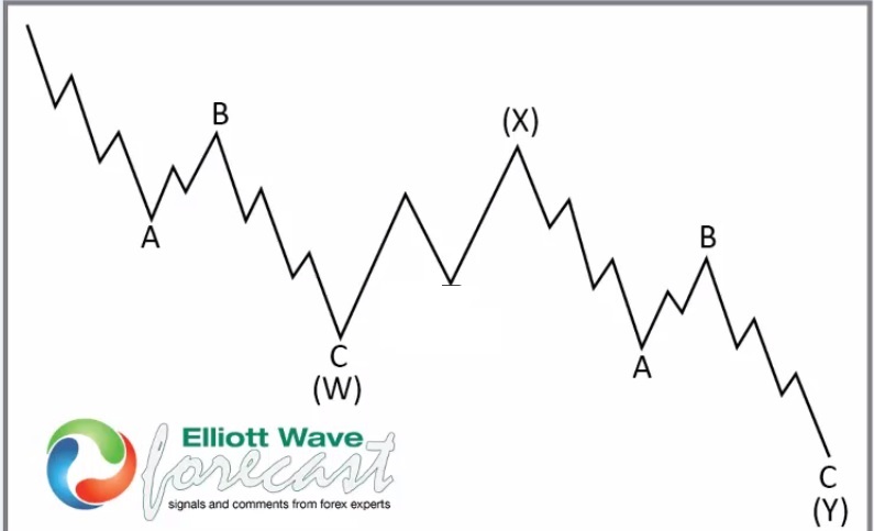
5 Wave Impulse + ABC correction + WXY correction​

$AMD

$NVDA

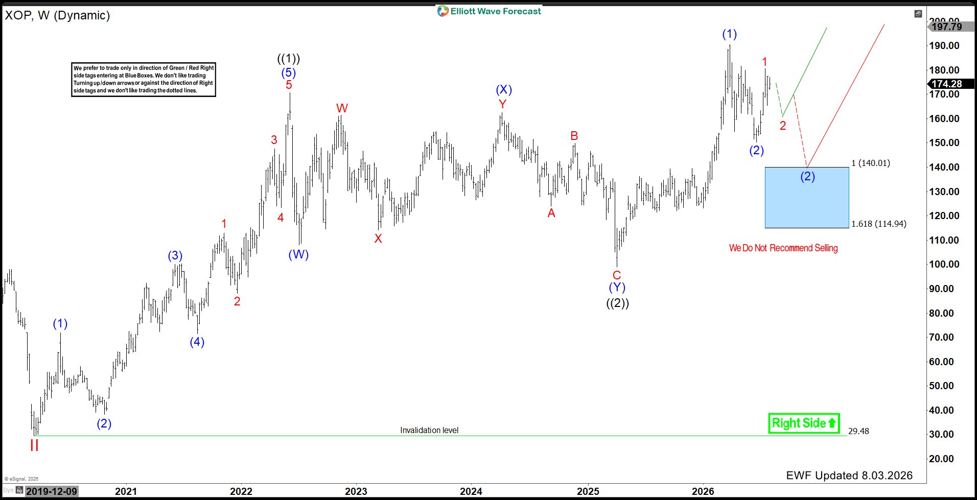
$XOP Shows a Double Nest From the 2020 Low​

Looking at the weekly chart, XOP established an important low in 2020 and then advanced in five waves to complete wave ((1)). Afterward, the ETF corrected that rally in a 7 swing (WXY) structure and formed wave ((2)) at the April 2025 low.

The strong rally from that low appears to have completed another five-wave advance in wave (1). Consequently, the larger structure now displays a bullish double nest. This pattern often occurs before a powerful third-wave acceleration, which keeps the long-term outlook constructive.

$XOP

April 2025 Low Started a New Bullish Cycle​

From the April 2025 low, $XOP rallied sharply and reached the 2026 peak near the $190 area. That advance can be counted as a completed five-wave impulse in wave (1).

The ETF then pulled back in wave (2) and found support near the $150 area. Since that low, price has started to recover and may already be building the next impulsive sequence. Nevertheless, the current structure has not yet confirmed whether the correction fully ended at that low.

$XOP Is Trading at an Important Inflection Point​

At this stage, two possible scenarios remain in play.

In the first scenario, wave (2) already ended near the recent low. Under this view, the current rally represents wave 1 of a new impulsive advance. A short-term pullback in wave 2 should remain supported, followed by another strong move higher.

However, $XOP could still fail to sustain the current recovery. In that case, the correction against the April 2025 low may remain incomplete and develop as a larger 7-swing structure.

Therefore, the next pullback and subsequent price reaction should help clarify which path the ETF will follow.

Blue Box Area Offers the Alternative Buying Opportunity​

If $XOP extends the correction in 7 swings, the next major support comes within the Blue Box Area between 140.01 and 114.94. This region represents the 100%–161.8% Fibonacci extension of the corrective sequence.

Typically, buyers are expected to enter within a Blue Box Area and produce at least a three-wave reaction higher. Accordingly, we do not recommend selling into this zone. Instead, the area should provide another buying opportunity in the direction of the larger bullish trend.

A decline into the Blue Box would not necessarily damage the long-term outlook. Rather, it could complete wave (2) at a lower level before the next major advance begins.

What Comes Next for $XOP?​

The preferred bullish scenario calls for the recent low to hold. In that case, XOP should complete a short-term pullback and then continue higher toward and eventually above the 2026 peak.

Alternatively, a failure to hold the recent support would open a deeper corrective path toward 140.01–114.94. Buyers would then be expected to enter the Blue Box and support the next bullish cycle.

In both scenarios, the larger direction remains higher. The primary uncertainty concerns whether wave (2) has already ended or requires another 7-swing decline first.

Technical Summary​

To summarize, $XOP shows a bullish double nest from the 2020 low, and the April 2025 low appears to have started another long-term advance. The ETF now trades at an important inflection point.

The recent low may have completed wave (2), allowing a new impulsive rally to develop. However, if the recovery fails, $XOP can pull back in 7 swings toward the 140.01–114.94 Blue Box Area, where another buying opportunity should develop.

The broader bullish sequence remains valid above the long-term 29.48 invalidation level. Therefore, whether the next low has already formed or develops inside the Blue Box, the larger outlook continues to favor additional upside.

Source: https://elliottwave-forecast.com/st...point-as-double-nest-supports-further-upside/
 
GameStop Corporation (NYSE: GME) continues to develop a complex Elliott Wave structure on the weekly chart. After completing a major cycle-degree red wave III at $120.75, the stock entered a prolonged consolidation phase in red wave IV. The correction has taken the form of a sideways range and appears to be developing as a five-legged contracting triangle. The chart shows the triangle progressing through waves ((A))-((B))-((C))-((D))-((E)), with the final swings of wave ((E)) potentially still unfolding. This structure suggests that the wave IV correction may be approaching completion.

GME 08.04.2026 Weekly Elliott Wave Chart​

GME_2026-08-04_06-13-37-scaled.png

GME Wave IV May Complete Near $11.89 And​

Following the 2024 low, GameStop started another corrective sequence. The chart shows wave (A) followed by a contracting triangle structure. Within this triangle, the subdivisions appear as A-B-C-D-E, with the pattern now approaching its final stages. The current decline is expected to unfold as wave (C), which should complete the larger triangle and the corresponding wave ((E)). The chart projects the potential completion of red wave IV near the $11.89 level.

This area is important because $11.89 represents the 0.618 Fibonacci retracement level of wave (A) in wave (C) marked on the chart. If price reaches this support zone and the Elliott Wave structure completes as expected, it could provide a significant potential reversal area.

Once red wave IV completes, we expect GameStop to begin another five-wave advance in red wave V. The initial objective is for wave V to break above the $120.75 peak, confirming the continuation of the larger bullish cycle. Beyond that level, the rally could extend further toward the $148.75 area before the next major pullback develops.

Conclusion​

GameStop's Elliott Wave structure suggests that red wave IV may be nearing completion within a contracting triangle. A potential completion near $11.89 could set the stage for wave V, with expectations for a move above $120.75 and a potential extension toward $148.75.

Source: https://elliottwave-forecast.com/st...iott-wave-promising-triangle-setup-new-highs/
 
Analysts remain cautious on QS because the company is still pre‑revenue and continues to burn cash. Even so, they highlight recent manufacturing progress and note that partnerships like Honda and Volkswagen keep long‑term potential alive. We see this mixed sentiment creating wide price targets and uneven expectations for the next quarters.

At the same time, analysts warn that commercialization delays remain the biggest risk. However, they also point to strong liquidity and improving pilot‑line performance as positive signs. We expect these themes to dominate analyst commentary over the next three months as QS works to prove it can scale its solid‑state technology.

Elliott Wave Outlook: QuantumScape (QS) Weekly Chart May 2026

Elliott Wave Outlook: QuantumScape (QS) Weekly Chart May 2026


Back in May, wave A fell harder than we expected and hit the 6‑dollar zone. We saw QS bounce to 9.66 and complete Wave B. After that bounce, we still expected more downside to finish three waves and complete the Wave (2) correction. Only then were we ready to look for buying setups to trade Wave (3) of the impulse.

We viewed the ideal area to finish the correction between 5.03 and 3.60. In that region, the market had to show a strong bullish reaction to confirm the pullback had ended and the next upward cycle could continue.

(If you want to learn more about Elliott Wave Principle, please follow these links: Elliott Wave Education and Elliott Wave Theory.)

Elliott Wave Principle Behind the Market Structure​

Impulse

An impulse is a clean 5‑wave pattern that drives the trend forward.

  • Waves 1‑3‑5 are strong and directional.
  • No overlap between waves 1 and 4.
  • Wave 3 is usually the strongest.
  • Structure is clear, with increasing momentum.
Elliott Wave Principle Behind the Market Structure


Elliott Wave Outlook: QuantumScape (QS) Weekly Chart August 2026

Elliott Wave Outlook: QuantumScape (QS) Weekly Chart August 2026


As we see on the chart, Wave B resisted the buyers’ pressure and the market continued lower. Price has already reached the 5.03–3.60 zone, and it could start moving higher from here. Even so, the short‑term bearish structure still looks incomplete, and we expect more downside before the trend can turn.

At this stage, we ideally want to see two additional lows to complete the Wave C impulse and form a clean bottom. In the worst case, the market may produce one final low below 4.77 before confirming a bullish reversal. Once that structure finishes, we will look for signs that the next upward cycle is ready to begin.

Source: https://elliottwave-forecast.com/stock-market/qs-approaches-key-bottom-structure-potential-reversal/
 
In today's blog post, we take a trip down memory lane and look back at a previous CADJPY analysis. This serves as a great example of how we use technical analysis to identify potential market moves.

Specifically, we'll be examining the CADJPY chart from 07.29.2026. At that time, we were tracking a potential bullish move. Our Elliott Wave analysis suggested that a primary wave (B) corrective pattern was nearing completion.

CADJPY-Before.jpg


According to our forecast, we anticipated that CADJPY would form a significant high somewhere in the 117.52 region. This level represented a major Fibonacci resistance zone, and we believed it would be a logical place for the bulls to take profits and for the bears to re-enter the market.

The Reaction: Sharp Reversal from the Highs

1CADJPY-24020260803185117.jpg


As anticipated, CADJPY capped its upward momentum right at the projected peak area and reversed aggressively to the downside. The pair completed wave ((v)) of C of (B) just below the 116.49 invalidation level, confirming the top before launching into a sharp impulsive decline.

This sell‑off drove prices more than 500 pips lower, reaching the 110.50 zone to complete wave 1, now trading around 112.02. The initial drop unfolded in five clear sub‑waves, underscoring the strength of the move.

Looking ahead, with wave 1 complete, the forecast calls for a corrective three‑wave bounce in wave 2—((a)), ((b)), and ((c))—toward the 113.50–114.00 region. Once this corrective rally is complete, the higher‑degree downtrend is expected to resume, extending the bearish sequence. Importantly, selling directly into current lows is not advised, as a corrective bounce is anticipated before the next major decline unfolds.

Conclusion

The CADJPY sequence is a textbook example of how Elliott Wave analysis maps out corrective structures and anticipates reversals. By combining wave counts, invalidation levels, and right‑side tags, traders can position themselves with the trend rather than against it.

Source: https://elliottwave-forecast.com/elliottwave/how-elliott-wave-mapped-the-cadjpy-drop/
 
Valero Energy Corporation., (VLO) manufactures, markets & sells petroleum based & low-carbon liquid transportation fuels & petrochemical products in the US, Canada & internationally. It comes under Energy sector & trades as “VLO” ticker at NYSE.

In weekly, VLO is trading in bullish sequence at all time high. It favors further upside, while short term pullback remains above 6.18.2026 low to extend April-2025 rally. It should find support between $288.36 - $272.10 area for next rally towards $330 or at least 3 swings bounce.

VLO - Elliott Wave Latest Daily View:​

VLO-D1.jpg

In weekly, it ended (I) of ((III)) at $184.79 high (4.05.2024) & (II) at $99.00 low (4.07.2025). Above there, it favors rally in I of (III). Within I of (III), it ended ((1)) at $155.12 high, ((2)) at $130.78 low, ((3)) at $320.24 high & favors pullback in ((4)) in 7 or 11 swings. Within ((3)), it placed (1) at $178.43 high, (2) at $155.29 low, (3) at $265.61 high, (4) at $232.72 low & (5) at $320.24 high. It is showing 11 swings & favors pullbacks in 12th as ((4)) started from 7.22.2026 high before 13th swing rally.

Below 7.22.2026 high, it placed (W) at $294.21 low & proposed ended (X) at $315 high. As long as the bounce fail below $315 high, it expects (Y) to extend lower between $288.36 - $272.10 area to finish ((4)). It should find support there for next rally in ((5)) or a 3-swing connector before larger correction unfolds. So far, the pullback is too shallow, but above 6.18.2026 low, it favors more upside as the part of I wave. We like to buy the pullback in 3, 7 or 11 swings at extreme area for next rally. Better opportunity can be larger double in ((4)) or later II pullback against April-2025 low.

Source: https://elliottwave-forecast.com/stock-market/valero-vlo-analysis-buying-pullback-for-rally-330/
 
Hello fellow traders. In this technical block we’re going to take a quick look at the Elliott Wave charts of AMD stock published in members area of the website.

Recently, AMD completed a three-wave structure from the peak, which could be the first leg of a deeper correction unfolding as a seven-swing pattern. In the following analysis, we will examine the Elliott Wave structure in detail and discuss the potential market outlook from this support zone.


AMD Elliott Wave 1 Hour Chart 07.29.2026​

AMD stock is correcting the cycle from the 185.53 low. The price has reached an important technical zone between 437.76 and 360.77, marked as the Blue Box. As our members know, this buying zone is derived by measuring the Equal Legs area using the Fibonacci Extension tool. From this area, we expect buyers to step in and regain control, potentially driving the price higher in a three-wave bounce. Once the bounce reaches the 50% Fibonacci retracement against the (X) connector high, we will take partial profits and move the stop loss to break-even.

You can learn more about Elliott Wave Patterns at our​

90% of traders fail because they don’t understand market patterns. Are you in the top 10%? Test yourself with this advanced Elliott Wave Test


AMD Elliott Wave 1 Hour Chart 08.03.2026​

The stock found buyers at the Equal Legs zone, producing a solid reaction from that area. As a result, long positions taken from the Equal Legs zone are now risk-free. The rally from the buying zone looks impulsive, so we assume we should see at least another leg higher in five waves.

Important note: Our analysis is not based on Elliott Wave in isolation. We perform detailed higher-time-frame cycle analysis, which shows an incomplete market structure. This is one of the key drivers of price action, along with correlation analysis and broader market context.

We also teach our members in live analysis sessions how to identify incomplete bullish and bearish sequences. Even a 14-day trial, is enough to noticeably improve your trading analysis and forecasting approach.


Source: https://elliottwave-forecast.com/stock-market/amd-finds-support-in-the-blue-box-buyers-zone/
 
Hello fellow traders. In this technical article we’re going to take a look at the Elliott Wave charts charts of RUSSELL Futures $RTY_F published in members area of the website. RUSSELL made a clear 3-wave move down from the 3068 peak and completed the correction right at the Equal Legs zone. In the following text, we will explain the Elliott Wave pattern and the trading setup.

RUSSELL Elliott Wave 4 Hour Chart 07.29.2026​

RUSSELL is showing a clear 3-wave correction from the peak. The price is reaching the extreme zone at 2901.69–2822.28. We don’t recommend selling RTY_F and prefer the long side from the marked Blue Box (buying zone).

We expect Russell to ideally make either a rally toward new highs or, alternatively, a 3-wave bounce. Once the bounce reaches 50% Fibonacci retracement against the ((x)) black high, we will make the long position risk-free by moving the stop loss to breakeven and taking partial profits.

The current view suggests that we may only be ending the first leg of the proposed pullback. Regardless, the right side remains the bullish side, and the Blue Box presents a valid trading setup.

Our strategy allows us to enter trades from the current area and make them risk-free as soon as the corresponding bounce develops.

Official trading strategy on How to trade 3, 7, or 11 swing and equal leg is explained in details in Educational Video, available for members viewing inside the membership area.

Quick reminder on how to trade our charts :

Red bearish stamp+ blue box = Selling Setup
Green bullish stamp+ blue box = Buying Setup
Charts with Black stamps are not tradable.


RUSSELL Elliott Wave 4 Hour Chart 07.29.2026​

RUSSELL found buyers right at the Equal Legs zone at 2901.69 and produced a very good reaction from the Blue Box Area. Consequently, any long positions taken from the zone should be risk-free by now.

The 3068 level is important at this stage. We would need to see a break above that high to confirm that the next leg is in progress.

You can check the latest charts and target levels in the membership area of the site. The best instruments to trade are those with incomplete bullish or bearish swings. These are listed in the Sequence Report, and the best ones are shown in the Live Trading Room.

Keep in mind that the market is dynamic, and the proposed view may have changed in the meantime. Our member chat rooms are open 24/7 and provide ongoing expert guidance on market trends and Elliott Wave analysis. Members are encouraged to ask questions about market structure and technical setups at any time.


Source: https://elliottwave-forecast.com/in...xplained-buyers-react-from-the-blue-box-area/
 
Tracking high-beta assets like the QQQ using Elliott Wave theory and extreme-area forecasting gives traders a clear edge. By identifying high-probability reversal regions—known as Blue Boxes—investors can position ahead of the broader market shift.

From July through early August 2026, QQQ navigated its corrective structure as expected, finding aggressive buyers inside the designated Blue Box before turning higher.

The Forecast into the Blue Box

On 07.20.2026 QQQ completed a primary 5-wave Elliott Wave cycle, topping out near 771.03 before entering a complex corrective phase. The pullback developed as a 7-swing WXY (double three) structure, defining a Blue Box reversal zone between 683.44 - 644.56 at the 100–161.8 Fibonacci extension levels. Instead of selling into weakness, the analysis targeted this zone for buyers to defend the broader uptrend, maintaining invalidation at 555.55.

QQQ-4-hr-20-july-weekend-before.png


The Reversal from Blue Box

By 08.06.2026 update, price action followed the forecast precisely. QQQ dipped into the Blue Box area of the 683.44 - 644.56, completing wave (c) of ((y)). Immediately upon reaching this high-probability zone, aggressive buyers triggered a strong V-shaped bounce. The resulting surge pushed QQQ back above 715.22, neutralizing local bearish pressure and allowing traders who bought inside the Blue Box to de-risk their positions while booking partial of the position.

QQQ-4-hr-9-august-weekend-after.png


Key Takeaways

Patience at extreme areas allowed traders to avoid chasing short positions and wait for price to reach calculated area (Blue box). The confluence of Fibonacci extensions and Elliott Wave structures—specifically the 100–161.8 zone—provided a reliable, high-probability reversal region. Anchoring risk management to the 1.618 Fib extension level established clear risk-to-reward parameters, giving traders a structured foundation before the move unfolded.

Source: https://elliottwave-forecast.com/bluebox-wins/qqq-finds-buyers-in-the-blue-box/
 
Hello fellow traders,

In this technical article, we will take a look at the Elliott Wave charts of the IWM ETF , recently shared with our members. The market completed a clear 3-wave corrective move from the recent peak and found support precisely within the Equal Legs area. In the following analysis, we break down the structure and outline the trading opportunity.

IWM Elliott Wave 4-Hour Chart 07.29.2026​

IWM is showing a textbook 3-wave correction from the peak. The price is reaching the extreme area (Blue Box / buyers’ zone) at 287.08–279.54. At this stage, we do not recommend selling and continue to favor the long side from the marked area. From this zone, we expect the ETF to produce at least a 3-wave bounce or resume the bullish trend toward new highs. Once the bounce reaches the 50% Fibonacci retracement against the X red high, we adjust the position by moving the stop loss to breakeven and securing partial profits.

The current structure suggests the first leg of the pullback is close to completion. However, the broader outlook remains bullish, and the Blue Box continues to provide a high-probability trading setup.

Our strategy allows us to enter positions in the extreme area and quickly reduce risk as the market reacts, turning trades risk-free as soon as the expected bounce develops.

Official trading strategy on How to trade 3, 7, or 11 swing and equal leg is explained in details in Educational Video, available for members viewing inside the membership area.


How to Read Our Charts​

  • Red bearish stamp + Blue Box = Selling setup
  • Green bullish stamp + Blue Box = Buying setup
  • Black stamp = No trade zone

IWM Elliott Wave 4-Hour Chart 08.09.2026​

IWM found buyers right at the Equal Legs zone(287.08) and produced a strong reaction from the Blue Box area. As a result, any long positions taken from this zone should now be risk-free.

The ETF has since broken to new highs, confirming that the next leg higher is in progress. We continue to view IWM as a buy on dips and do not recommend selling it during any proposed pullback.

You can check the latest charts and target levels in the membership area of the site. The best instruments to trade are those with incomplete bullish or bearish swings. These are listed in the Sequence Report, and the best ones are shown in the Live Trading Room.

Keep in mind that the market is dynamic, and the proposed view may have changed in the meantime. Our member chat rooms are open 24/7 and provide ongoing expert guidance on market trends and Elliott Wave analysis. Members are encouraged to ask questions about market structure and technical setups at any time


Source: https://elliottwave-forecast.com/et...00-etf-overview-and-elliott-wave-trade-setup/
 
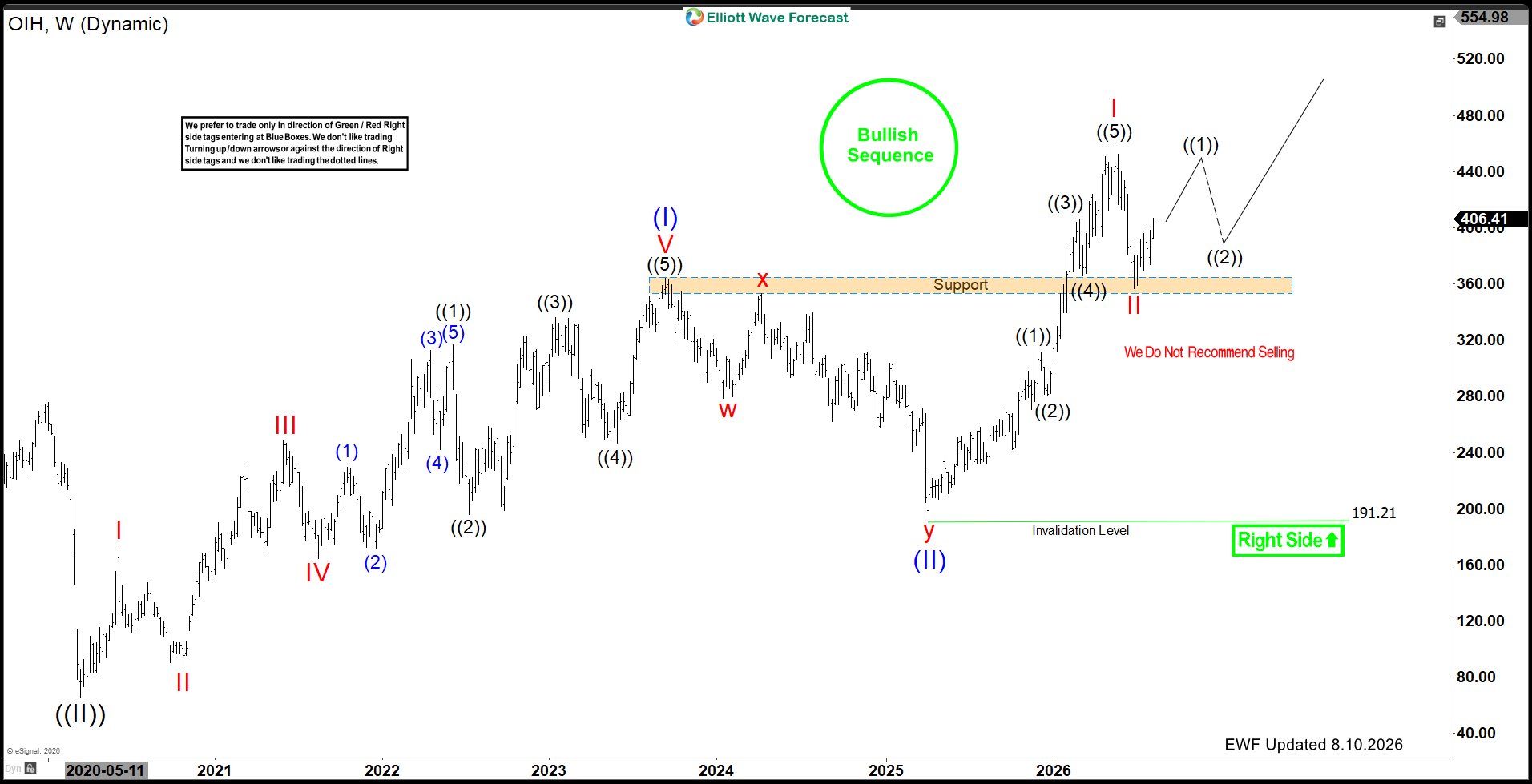
In this Elliott Wave update, we examine the long-term structure in VanEck Oil Services ETF ($OIH). The ETF continues to display a bullish double nest from the 2020 lows, which supports the idea of additional upside over the longer term. More importantly, $OIH recently tested the highlighted support area and produced a strong reaction higher. As long as that support continues to hold, the bullish sequence can eventually extend toward the $624 area over the next few quarters.

$OIH Shows a Double Nest From the 2020 Lows​

$OIHLooking at the weekly chart, $OIH established a major low in 2020 and has since developed a series of bullish impulsive sequences. The structure from that low can be interpreted as a double nest, which represents one of the stronger bullish Elliott Wave formations.

A double nest develops when the market forms multiple wave 1 and wave 2 structures before acceleration begins. Consequently, once those corrective waves finish, the market can enter an extended third-wave phase and produce a much stronger advance.

That larger structure remains visible in $OIH and continues to support the long-term bullish outlook.

Major Correction Ended at the 2025 Low​

After completing the previous bullish cycle, $OIH entered a large corrective phase that unfolded into the 2025 low. From there, buyers returned aggressively and started another impulsive advance.

The rally from that low produced a clear five-wave sequence in wave I, pushing $OIH sharply higher. Afterward, the ETF entered another correction in wave II and returned toward an important former resistance area.

Instead of breaking down, however, that previous resistance started acting as support.

Highlighted Support Area Produced the Expected Reaction​

The most important development on the chart comes from the highlighted support area around the mid-$350 region. $OIH recently pulled back toward this former breakout zone and attracted buyers.

Since testing that support, the ETF has reacted sharply higher and moved back above the $400 area. This reaction strengthens the view that wave II may already have ended and that a new impulsive sequence could now be underway.

Furthermore, the ability of former resistance to turn into support adds another layer of confirmation to the bullish Elliott Wave structure.

Bullish Sequence Remains Incomplete​

The larger sequence from the 2020 lows remains bullish and incomplete. Therefore, the recent reaction from support should not necessarily be viewed as only a short-term bounce.

Instead, the structure allows $OIH to begin another five-wave advance. The first leg higher can complete wave ((1)), followed by a corrective wave ((2)) pullback. Once that correction finishes, another stronger move higher should follow.

As a result, temporary pullbacks should continue to be viewed within the context of the larger bullish sequence rather than as evidence that the long-term advance has ended.

OIH Can Reach $624 Over the Next Few Quarters​

As the bullish sequence continues to develop, the larger Elliott Wave structure supports an eventual move toward the $624 area.

This does not mean the ETF will move directly toward that target. Several smaller-degree advances and corrections should take place along the way. However, as long as key support remains intact, those pullbacks should provide opportunities for the bullish trend to reset before extending higher again.

Therefore, the $624 area remains a reasonable upside objective over the next few quarters as the double-nest structure continues to unfold.

Key Support Keeps the Bullish Outlook Intact​

For now, the highlighted support zone remains an important reference point. The recent reaction from that area shows that buyers continue to defend the larger bullish sequence.

Meanwhile, the broader Elliott Wave view remains valid above the 191.21 invalidation level. As long as that level remains protected, the long-term right side continues to favor higher prices.

Technical Summary​

To summarize, $OIH continues to show a bullish double nest from the 2020 lows, suggesting that the larger upside sequence remains incomplete. More recently, the ETF corrected back toward an important former resistance area and reacted strongly higher from support.

That reaction supports the idea that another impulsive advance is developing. While short-term pullbacks should still occur along the way, the larger bullish sequence can ultimately carry $OIH toward the $624 area over the next few quarters.

As long as key support remains intact, the broader Elliott Wave structure continues to favor buying corrective pullbacks rather than chasing the downside.

Video Analysis​

[video width="1920" height="1080" mp4="[URL]https://elliottwave-forecast.com/wp-content/uploads/2026/08/Debut-2026-08-10-11_51_08.mp4[/URL]" poster="[URL]https://elliottwave-forecast.com/wp-content/uploads/2026/08/oih.jpg[/URL]"][/video]

Source: https://elliottwave-forecast.com/vi...om-2020-lows-targets-624-after-support-holds/
 
Astera Lab, ALAB, is retreating after over 410% gain between April and June 2026. The retracement has found support in the blue box. is this the start of a new bullish phase?

Astera Labs is a semiconductor company that builds high-speed connectivity chips and software for AI and cloud data centers. Its products help CPUs, GPUs, memory, and networks communicate faster and more efficiently, making large AI systems and data centers perform better. Founded in 2017 and headquartered in San Jose, California, Astera Labs is a key beneficiary of the growing demand for AI infrastructure.

The stock launched its IPO on March 19, 2024, at $36 per share and was listed on the NASDAQ the following day under the ticker ALAB. It immediately traded at $50.60 before surging to $95.20 about a month later. From that peak, however, the stock gradually declined over the next five months, eventually reaching a low of $36.20. From that low, the stock never looked back and began a strong upward move. Therefore, the Elliott Wave forecast discussed in this post begins from the August 2024 low.

ALAB Elliott Wave Analysis - Daily Chart

ALAB


ALAB began its first bullish cycle from the all-time low and rallied to $147 on January 6, 2025, where it completed wave ((1)). Wave ((1)) formed a clear impulse structure.

From the top of wave ((1)), wave ((2)) began and developed into a double zigzag, eventually ending at $47 on April 4, 2025. From this low, the third swing began and completed another impulse wave structure on September 18, 2025, reaching $244 before the fourth swing followed with a double zigzag that ended on March 30, 2026.

However, the fourth swing entered the price territory of the first swing. Therefore, it cannot be considered wave 4 of a larger-degree impulse structure. As a result, we can instead consider a nested structure of ((1))-((2))-(1)-(2), which could lead to a strong impulse sequence at the primary degree.

Wave (2) of ((3)) ended at $97.89. From this low, the stock surged massively to hit $456 which is now its record high. Normally, this was suppose to be wave (3) as we have identified in the previous update. However, the pullback went very deep and reach the territory of wave (1). Thus, it will violate one of the key rules of an impulse wave structure. The rule states that wave 4 does not correct into the territory of wave 1. Thus, we can identify the surge to $456 as wave 1 of 93) and the decline that followed to be wave 2 of (3). Thus, the long term structure is in a multiple nest.

Very interestingly, the wave 2 pullback completed a 7-swing structure at the blue box and bounced. Thus, for as long as it trades above the 29-July low, the upside will be supported in the short ter. From the July low, we'd expect another 5-wave up for ((i)) of 3. The price target for around $740-$893. If wave ((i)) rallies as expected and completed a 5-wave structure, traders can continue to buy the dips from the extreme in subsequent trades.

Source: https://elliottwave-forecast.com/st...ue-box-support-has-the-bullish-phase-started/
 
The long-term advances in the Dow Jones and Copper cannot be correctly labeled as regular Elliott Wave impulses. The reason is based on one of the most important rules within Elliott Wave Theory: Wave 4 of a regular impulse cannot overlap the price territory of Wave 1 at the same degree. This overlap is visible in both markets.

In the Dow Jones, the advance from the 2009 Wave ((II)) low contains overlapping price action that prevents the entire rally from being counted as a regular five-wave impulse. Copper presents the same structural condition in its advance from the 2011 cycle. Rather than suggesting that these bullish cycles are approaching completion, the overlap points toward a much more powerful interpretation: both markets are developing Elliott Wave nests.

That distinction is extremely important because a nest represents a sequence of first and second waves at different degrees. Once those structures are completed, the market normally enters the most powerful portion of the Elliott Wave sequence—an acceleration through multiple third waves.

Why the Overlap Matters​

A regular bullish impulse follows a five-wave sequence below:

Wave 1 advances.
>Wave 2 corrects Wave 1.
>Wave 3 produces another advance.
>Wave 4 corrects Wave 3.
>Wave 5 completes the impulse.

One of the essential rules governing this structure is that Wave 4 cannot overlap the price territory of Wave 1. When that overlap occurs, the proposed regular impulse becomes invalid at that degree, unless the market is forming a diagonal. This is precisely why the long-term advances in the Dow Jones and Copper should not be treated as simple or nearly completed impulses. The overlapping swings indicate that these markets are developing through a sequence of nested impulses and corrections.

What might initially appear to be Waves 1, 2, 3, 4 and 5 of a single impulse is better understood as a series of first and second waves at progressively smaller degrees. Thus, instead of: 1–2–3–4–5, the structure is developing more like: ((1))–((2))–(1)–(2)–1–2 This is the anatomy of a bullish Elliott Wave nest.

The Dow Jones Nest from the 2009 Low​

The Dow Jones established a major long-term low in 2009, ending Wave ((II)). The advance from that low has remained bullish, but the internal overlapping prevents us from labeling the entire move as a regular impulse approaching its conclusion. The correct interpretation is that the Dow Jones has been building a succession of first and second waves.

Each correction has maintained the larger bullish structure and created another base from which the next advance could begin. The 2020 decline ended another important Wave II within the larger sequence, while the subsequent corrections have continued developing the nested structure.

The weekly chart shows the market advancing through several degrees of first and second waves. The correction into the 2026 low completed another Wave (2), and the Dow Jones has already resumed the bullish sequence. This means the market is not simply advancing within a late Wave 5. Instead, it is moving through the early stages of a much stronger phase of the long-term bullish cycle.

The next important pullback should remain corrective and be followed by another extension higher. As long as the important pivot at 36,860 remains intact, the bullish sequence remains valid, and we do not recommend selling the Dow Jones.

Dow Jones Weekly Chart​

INDU-WEEKLY20260810193537-1024x508.jpg

The overlapping structure from the 2009 Wave ((II)) low invalidates the interpretation of a regular impulse at that degree. The sequence is better counted as a bullish nest, supporting additional acceleration.

Copper Is Displaying the Same Bullish Structure​

Copper has been developing a similar long-term sequence since its 2011 cycle.

The decline into the 2020 low completed Wave ((II)), and the advance that followed has unfolded through a series of nested first and second waves. The internal overlap means the move cannot be counted as one regular impulse at the larger degree. Following the 2020 low, Copper completed Wave ((1)) and corrected in Wave ((2)). From there, the metal continued higher through another sequence of Waves (1) and (2), followed by smaller-degree Waves 1 and 2.

This creates a powerful bullish nesting formation. Copper is now advancing within the developing third-wave sequence. The weekly structure suggests that the current cycle still has additional upside before completing Wave ((1)). After that cycle ends, a corrective Wave ((2)) should create another major buying opportunity before the next acceleration higher.

As long as the 3.1230 pivot remains intact, the long-term bullish sequence remains valid. Consequently, we do not recommend selling Copper.

Copper Weekly Chart​

2HG-WEEKLY20260810194743-1024x508.jpg


Copper’s overlapping advance supports a nested Elliott Wave structure rather than a regular impulse. The sequence favors additional upside and another acceleration after the next corrective pullback.

Two Major Markets Are Confirming the Same Message​

The importance of this setup becomes even greater because the same structural pattern is visible in two markets with a strong connection to global economic activity. The Dow Jones reflects the long-term behavior of major U.S. companies and the broader appetite for equities. Copper is one of the most important industrial metals and is closely connected to construction, manufacturing, infrastructure, electrification and global growth.

When the Dow Jones and Copper both display bullish nested structures, the message extends beyond two individual instruments. Together, they indicate that the larger Risk-On cycle remains incomplete.

Both markets are showing:

Long-term bullish sequences.
Overlapping advances that invalidate regular impulse counts at the larger degree.
Multiple first- and second-wave structures.
Important bullish pivots holding below the market.
The potential for acceleration through a series of third waves.

This synchronization supports the view that the next stage of the market should not be a normal or gradual advance. It should become increasingly powerful as the nested structures begin releasing their third-wave energy.

Why the Nest Points Toward Acceleration​

A nest often develops before the strongest part of an Elliott Wave cycle. It can remain overlapping and frustrating for an extended period because the market continues producing first waves followed by corrective second waves. However, every completed Wave 2 creates the foundation for another Wave 3.

Once the corrections end, several third waves can unfold simultaneously at different degrees. This is when momentum expands, participation broadens and price begins advancing much faster.

The sequence can transition from: ((1))–((2))–(1)–(2)–1–2 into: ((3))–(3)–3

That is the source of the expected acceleration.

The overlapping price action is therefore not a sign of structural weakness. It represents the process of building energy before the market enters the strongest phase of the bullish sequence.

What This Means for Risk-On Markets​

The bullish nests in the Dow Jones and Copper support a powerful conclusion: the broader Risk-On cycle is preparing to accelerate.

The Dow Jones is pointing toward higher equity prices, while Copper is confirming strength in the industrial and commodity side of the global market. When these two major instruments accelerate together, the movement should support a broad expansion across Risk-On assets.

This environment should favor:

Global equity indices.
Industrial sectors.
Commodities and metals.
Cyclical assets.
Risk-sensitive currencies.
Other instruments correlated with global growth.

Corrections will still occur because markets never move in a straight line. However, those pullbacks should be viewed within the context of the larger bullish sequence. As long as the important invalidation levels remain intact, corrections are expected to produce buying opportunities rather than major long-term selling opportunities.

Conclusion​

The overlapping structures in the Dow Jones since the 2009 Wave ((II)) low and in Copper since the 2011 cycle cannot be ignored. Under the rules of Elliott Wave Theory, the overlap between Waves 1 and 4 invalidates the idea that these advances are regular impulses at that degree. Instead, the price action reveals a series of nested first and second waves.

This interpretation completely changes the long-term outlook. Rather than approaching the end of their bullish cycles, both markets appear to be preparing for the strongest phase of their advances. Once the remaining corrective structures are completed, several third waves should begin unfolding at different degrees, creating a powerful acceleration higher.

The Dow Jones represents strength in equities, while Copper reflects industrial demand and expectations for global economic growth. When both markets confirm the same nested bullish structure, the message extends across the entire financial system.

Corrections will continue to occur, but they should remain temporary buying opportunities as long as the major bullish pivots hold. The larger sequences remain incomplete, and selling against them carries significant risk.

The conclusion is clear: the overlapping price action is not evidence that the advance is ending. It is evidence that the market has been building a powerful bullish nest. As that nest begins to accelerate through its third-wave sequence, the Dow Jones and Copper should move substantially higher—and the broader Risk-On environment could explode with them.

Source: https://elliottwave-forecast.com/st...est-and-signals-a-major-risk-on-acceleration/
 
The Elliott Wave Theory has existed for nearly a century. Its core principle remains powerful: financial markets move in recognizable patterns driven by collective psychology. However, markets, technology, and the way traders receive information have changed dramatically.

At Elliott Wave Forecast, we believe the theory must be applied to today’s markets—not the markets of the 1930s. This is what makes our approach different.

We respect the original Elliott Wave principles, but we do not apply them as a rigid academic exercise. Our objective is not simply to label every wave correctly. Our objective is to identify the most probable market path, determine the right side of the market, and locate areas where traders can enter with clearly defined risk.

Moving Beyond Traditional Elliott Wave Analysis​

Traditional Elliott Wave analysis often focuses heavily on finding a perfect five-wave impulse followed by a three-wave correction. While these structures remain important, modern financial markets frequently develop more complex patterns.

Markets are now influenced by algorithmic trading, high-frequency systems, global capital flows, exchange-traded funds, options activity, and nearly instantaneous access to information. These forces can create extended corrections, double and triple combinations, irregular structures, and powerful correlations across different asset classes.

As a result, rigidly forcing every market move into a simple five-wave pattern can lead to incorrect conclusions.

Our methodology recognizes that corrective structures can unfold in 3, 7, or 11 swings. We analyze these sequences to determine whether a move is corrective or impulsive and whether the larger cycle remains incomplete.

This allows us to concentrate on the market’s structure instead of reacting emotionally to every short-term move.

Structure Comes Before News​

Financial news usually explains a market move after it has already happened. By the time the explanation reaches the public, the market may already be approaching its next turning point.

Our approach begins with structure. We study the sequence of swings, the larger market cycle, momentum, timing, and relationships between instruments. This helps us develop a directional view before the news becomes part of the narrative.

This does not mean that news is irrelevant. Economic reports, central-bank decisions, earnings, and geopolitical events can produce volatility. However, we believe these events often act as catalysts within a structure that is already developing.

The structure gives us the roadmap. The news may provide the acceleration.

Why We Use High-Frequency Areas​

One of the most important elements of our methodology is the identification of High-Frequency trading areas, which our members know as Blue Boxes. A Blue Box is a calculated price area where a corrective sequence is expected to complete. These areas are based on relationships between the swings, including Fibonacci extensions, the number of swings within the correction, and the direction of the larger market cycle.

We commonly identify these opportunities when the market develops a 3-, 7-, or 11-swing corrective structure against the prevailing trend. For example, when the larger trend is bullish, we wait for a corrective decline to reach a Blue Box. Rather than chasing the market after it has already rallied, the Blue Box allows traders to prepare for a potential entry at a more favorable price.

When the larger trend is bearish, the same principle can be applied in reverse. We wait for a corrective rally into a Blue Box where sellers may return. The purpose of the Blue Box is not to predict the exact price of a market turn. Its purpose is to define an area where the structure, price relationships, and larger directional view come together.

Trading an Area Instead of a Perfect Price​

Markets rarely turn at the exact price expected by every trader. Attempting to identify one perfect entry can result in missed opportunities or poorly managed risk. That is why we work with an area rather than a single price.

Inside a Blue Box, traders can use a planned entry strategy while defining the level that would invalidate the setup. If the market responds from the area, the position can be managed according to the developing structure. If the market breaks through the invalidation level, the trader knows that the original idea requires reassessment.

The Blue Box therefore provides three essential elements:

A defined trading area
A clear directional expectation
A measurable level of risk

Blue Boxes are not guarantees. No analytical method can eliminate risk. Their value comes from creating a consistent and repeatable process based on structure rather than emotion.

Blue Box Examples: Before and After​

The best way to understand the value of a Blue Box is to see the complete process—from the original forecast to the market’s reaction.

The following examples show charts published before the move occurred alongside updated charts after price reached the Blue Box. They demonstrate how we identify corrective sequences, establish the expected path, and define the area where buyers or sellers are expected to appear.

Example 1: Buying Opportunity

Instrument: XAGUSD 04.05.2025

Original forecast:
XAG-daily-5-April-weekend-before-1024x573.png


Chart explanation:
Silver was doing a clear ABC pullback with a define buying area.

Market reaction:
XAG-daily-26-July-weekend-after-1024x573.png


Result:
Silver reached the Blue Box (High-Frquency) area and stared a rally that took the Metal over $100.00

Example 3: Blue Box Within a Correlated Market View

Instrument: SPX Daily View

Original forecast:
SPX-daily-28-march-weekend-after-1024x573.png


Chart explanation:
The Index ended the cycle since 04.07.2025 and corrected in 7 swings into the buying area.

Market reaction:
SPX-daily-27-june-weekend-after-1024x573.png


Result:
The Index reached the Blue Box (High-Frequency) area and traded into new All time highs.

These before-and-after examples demonstrate the practical purpose of our methodology. The objective is not to describe a move after it happens. It is to identify the expected path in advance, wait for the market to reach the High-Frequency area, and approach the opportunity with clearly defined risk.

The Importance of the Right Side​

One of our primary objectives is to determine the right side of the market. The right side represents the direction supported by the larger cycle and the incomplete sequence. Once that direction has been established, we look for corrections against it rather than attempting to trade every movement in both directions.

This is an important distinction. A trader does not need to capture every market fluctuation. The goal is to identify the clearest structural opportunity and wait for the market to reach the area where the risk-to-reward relationship becomes favorable. This is why buying or selling the 3-, 7-, or 11-swing correction remains central to our methodology.

Using Market Correlations for Confirmation​

Modern markets are deeply interconnected. Indices, currencies, commodities, bonds, and individual stocks frequently influence or confirm one another. We do not analyze an instrument in isolation.

A potential move in the U.S. Dollar may affect metals and currency pairs. Bond-market behavior can provide information about interest-rate expectations. Major technology stocks may confirm or challenge the expected direction of the broader indices.

By reviewing many instruments across multiple asset classes and time frames, we can identify common structural themes. When several related markets support the same conclusion, the analysis becomes stronger. When they disagree, we know additional caution may be required.

This broader perspective is another important difference between our methodology and a traditional single-chart wave count.

Adapting Elliott Wave Theory to Modern Technology​

Technology has changed what is possible in market analysis. Today, we can monitor hundreds of instruments, compare structures across multiple time frames, calculate price relationships quickly, update charts continuously, and distribute information to members around the world in real time.

At Elliott Wave Forecast, technology allows us to make the methodology more practical and consistent. It helps us recognize developing sequences, compare correlated markets, update invalidation levels, and communicate changes as the market evolves. However, technology does not replace analysis. It supports it.

Markets remain dynamic, and no software can remove uncertainty. Human interpretation is still necessary to understand context, recognize alternative structures, and determine which scenario best fits the available evidence.

The strongest approach combines the principles of Elliott Wave Theory with modern tools, extensive market coverage, and disciplined risk management.

Analysis Must Evolve With the Market​

Adapting does not mean abandoning the Elliott Wave Theory. It means preserving its most valuable principles while applying them in a way that reflects how modern markets actually behave.

Our approach is built around:

Identifying impulsive and corrective sequences
Recognizing 3-, 7-, and 11-swing structures
Determining the right side of the market
Using correlations across global instruments
Locating High-Frequency areas through Blue Boxes
Defining risk before entering a trade
Updating the analysis as market structure changes

The market does not reward analysts for producing the most complicated wave count. It rewards traders who can remain patient, manage risk, and act when structure presents a clear opportunity.

The Elliott Wave Forecast Difference​

What makes Elliott Wave Forecast different is not simply the number of charts we produce or the number of markets we cover. The difference is how we transform Elliott Wave Theory into a practical trading framework.

We do not analyze markets solely to describe what has already happened. We use structure to establish an expected path, identify the right side, and prepare for the next opportunity.

The Blue Boxes bring that philosophy together. They help traders avoid chasing price, wait for corrective structures to mature, and approach the market with a defined plan.

Markets will continue to evolve, and technology will continue to change the trading environment. Our responsibility is to evolve with them while remaining faithful to the principles that make Elliott Wave analysis valuable.

The theory provides the foundation. Technology expands our capabilities. Structure gives us the direction. The Blue Boxes define the opportunity.

Conclusion​

Elliott Wave Theory remains one of the most powerful methods for understanding market behavior, but its application must evolve with modern financial markets. At Elliott Wave Forecast, we combine the theory’s core principles with technology, market correlations, and a practical understanding of 3-, 7-, and 11-swing corrective sequences.

Our goal is not to create the most complicated wave count or explain a move after it has already happened. Our goal is to identify the right side of the market, establish the expected path, and prepare our members before the opportunity develops.

The Blue Boxes are an essential part of that process. They identify High-Frequency areas where a corrective sequence may complete and where buyers or sellers are expected to appear. The before-and-after examples demonstrate how these areas help transform market analysis into a structured trading plan with a defined entry zone and measurable risk.

No methodology can guarantee a market outcome. However, a consistent process can help traders avoid emotional decisions, stop chasing price, and approach each opportunity with patience and discipline.

The Elliott Wave Theory provides the foundation. Technology helps us adapt it to today’s markets. Correlations strengthen our analysis. The Blue Boxes identify the opportunity.

That combination is what makes Elliott Wave Forecast different.

Source: https://elliottwave-forecast.com/elliottwave/what-makes-elliott-wave-forecast-different/

 
Pull up a chart of almost anything — a currency pair, a stock, gold, it doesn’t matter — and zoom out far enough, and you’ll notice something. Price doesn’t wander around at random. It moves in a rhythm: a stretch where it pushes hard in one direction, then a stretch where it pulls back, then it pushes again. Zoom in closer and the same rhythm shows up on a smaller scale, tucked inside the bigger one.

That rhythm has a name. It’s called Elliott Wave Theory, and once you learn to see it, you start noticing it everywhere — which is both useful and a little bit addictive, if we’re honest.

A stockbroker and accountant named Ralph Nelson Elliott first wrote it down in the 1930s, after years spent going through decades of stock market data. What he found wasn’t a formula for predicting the future. It was closer to a map of how crowds of people, trading together, tend to push prices around. Fear, greed, hope, panic — they show up in patterns, because human psychology hasn’t really changed from one generation of traders to the next.

Let’s go through what those patterns actually look like, because “wave theory” sounds abstract right up until you see it broken down piece by piece.

Every Market Move Has Two Phases​

At the most basic level, Elliott noticed price action breaks down into two kinds of movement. An impulse is a move that goes with the bigger trend, built from 5 smaller waves. A correction is a move against that trend, built from 3 smaller waves.

That’s really the whole theory in one sentence: five waves one way, three waves the other way, repeating at every scale you care to look at. The hard part isn’t remembering that rule — it’s training your eye to actually spot it on a live, messy chart. That takes practice, and honestly, a fair number of wrong guesses along the way. Nobody skips that part.

Elliott Wave 5-3 pattern showing a 5-wave impulse followed by an ABC correction


Breaking Down the 5-Wave Impulse​

Inside an impulse, each of the five waves has its own personality. Waves 1, 3, and 5 move with the trend. Waves 2 and 4 are the pullbacks in between.

Wave 1 is usually the toughest to trust while it’s happening. It often just looks like a bounce, so a lot of traders assume it’s noise inside a bigger downtrend and miss the start of what turns into a real move.

Wave 2 pulls back, sometimes sharply, and this is where doubt creeps in. It can retrace a big chunk of wave 1, enough to make you wonder if wave 1 meant anything at all. There is one rule worth remembering here: wave 2 can pull back a long way, but it can’t fall below where wave 1 started. If it does, the count is wrong — simple as that, no exceptions.

Wave 3 is where things usually get obvious, and it’s typically the longest, strongest wave of the five. It’s also the wave most new traders regret not holding, because it often looks “too extended to chase” right up until it keeps going anyway.

Wave 4 is another pullback, usually shallower and choppier than wave 2. It tests patience more than conviction — it can drag sideways in a way that tempts you to exit early, right before the final push starts.

Wave 5 is that final push. It isn’t always as strong as wave 3, and sometimes it’s noticeably weaker — a pattern called a truncated fifth, which is its own topic for another day. Wave 5 is also where a lot of latecomers pile in, right before the correction begins and catches them off guard.


Elliott Wave 5-wave impulse pattern chart showing waves 1 through 5


Breaking Down the 3-Wave Correction​

Once the impulse finishes, price doesn’t simply reverse in a straight line — it corrects in its own 3-wave structure, usually labeled A, B, and C.

Wave A is the first leg against the trend. A lot of people mistake this for “the trend reversing,” which is exactly the kind of assumption that gets traders into trouble early.

Wave B is a bounce against wave A, and it can be deceptively strong — strong enough to convince people the old trend is back, right before wave C proves them wrong.

Wave C finishes the correction and can move fast. Once it’s done, the market is usually ready to pick back up the bigger trend it was in before the correction started.

Corrections don’t all look the same, either — there are a few different shapes they can take, and mixing them up is one of the more common ways a beginner misreads a chart. That’s a big enough topic to deserve its own article, so we’ll leave it there for now.

Elliott Wave ABC correction chart showing a wave B pullback


Waves Within Waves: Why the Pattern Is Fractal​

Here’s the part that tends to make it click for people. Every wave we just walked through isn’t really one solid move — it’s built out of smaller waves of the same 5-3 pattern, one degree down. Wave 1 of a bigger impulse is itself a 5-wave impulse when you zoom into it. Wave 2 is itself a 3-wave correction. This keeps going, smaller and smaller, all the way down to whatever timeframe you’re trading.

This is what people mean when they call Elliott Wave “fractal.” It’s also why the same chart can look completely different depending on which timeframe you’re looking at — a move that’s wave 2 on the daily chart might look like a complete wave 1 through 5 on the 1-hour chart. Neither view is wrong. They’re just describing the same price action at different zoom levels, and learning to hold both in your head at once is a big part of what separates a beginner from someone who’s been doing this a while.

A Quick Example of How This Looks in Practice​

Say a market has been falling for weeks and then starts to rally. Wave 1 up might not look like much — just a bounce inside what still feels like a downtrend, and plenty of traders will call it exactly that and fade it. Then comes wave 2, a pullback that retraces a good portion of that bounce, which seems to confirm everyone’s suspicion that the downtrend is back in control. As long as that pullback holds above the low set before wave 1 began, the structure is still intact.

What happens next is usually the giveaway. If price turns back up and starts moving faster and further than the first bounce did, that’s wave 3 announcing itself — and it’s exactly the moment most people who dismissed wave 1 as noise end up chasing the move late, at worse prices, out of frustration. This is precisely why the early waves matter so much to get right: by the time wave 3 is obvious to everyone, a good chunk of the move is already behind you.

Elliott Wave example chart showing waves 1, 2, and 3 forming


Why Any of This Matters if You Actually Want to Trade​

Here’s the thing — none of the above is worth much if it stays purely academic. The real value of Elliott Wave, for someone actually putting money on the line, is that it gives you a way to work out roughly where you are inside a move, and just as importantly, roughly where you’d be wrong.

That second part is the one people gloss over, and it’s the one that actually matters. If you know a count is invalid the moment price crosses a specific level, you’ve got a real risk plan instead of a hope. That’s the idea behind what we call a Blue Box: a zone where the wave structure, combined with some Fibonacci math, tells you roughly where a turn is likely — and just as clearly, where you were wrong if price pushes straight through it instead. It turns a vague feeling (“this looks like it might turn around here”) into an actual line in the sand.

The Mistakes Almost Everyone Makes Starting Out​

A few things trip up nearly every beginner, so it’s worth naming them now instead of letting you find out the hard way.

The biggest one is forcing a count to match what you already believe. If you’re convinced a market is going up, it’s tempting to label every wiggle in a way that supports that belief. That’s backwards — the count is supposed to tell you what’s likely, not confirm what you already wanted to see.

The second is treating every wave the same. Wave 3 and wave 5 are not equally reliable, and trading them with the same size or the same confidence is a good way to give back money you didn’t need to.

The third is skipping the invalidation level entirely — jumping into a trade because “it looks like a good setup” without ever pinning down the specific price where you’d admit you were wrong. That one habit alone probably causes more damage than everything else on this list combined.

How Long This Actually Takes to Feel Comfortable With​

Worth being honest about this too: nobody reads one article and starts counting waves confidently the next day. Most traders we’ve talked to describe a stretch of several months where the rules make logical sense on paper but still feel shaky in real time, especially during choppy, sideways stretches where even experienced analysts disagree. That’s normal, not a sign you’re doing something wrong. The traders who stick with it tend to be the ones who accept early on that a wrong count isn’t a failure — it’s just part of how you get better at reading the next one.

A Quick Recap, If You Want the Short Version​

In case you skimmed and landed here: markets move in a repeating 5-wave push followed by a 3-wave pullback, at every scale you look at. The five-wave push has its own internal rules — wave 2 can’t erase all of wave 1, wave 3 is never the shortest, and wave 4 shouldn’t overlap wave 1 in a clean impulse. The pullback afterward can take a few different shapes, which is a topic on its own. And the entire point of learning any of this isn’t to win an argument about labeling — it’s to know roughly where you are in a move and exactly where you’d be proven wrong, which is the closest thing to a genuine edge that any chart-reading method can honestly offer.

Where This Leaves You​

If you’ve made it this far, you now have more working knowledge of Elliott Wave than most people who’ve been trading for years without ever sitting down to learn the structure properly. That’s not a knock on them — most people learn indicators first and structure never, which is a bit backwards, in our opinion.

From here, the next useful thing to understand is the difference between Elliott Wave’s actual rules — the ones that never bend — and its guidelines, the ones that are usually true but not always. Mixing those two up is where most of the “this stuff is too subjective” complaints come from, and it’s worth untangling on its own.

In the meantime, if you want to see how all of this looks applied to live markets rather than just diagrams, that’s exactly what we do every day across 78 instruments — forex pairs, indices, crypto, commodities — labeling the waves in real time and marking the zones where we think the next turn is likely. If you’d like a free next step, grab our beginner’s guide to Forex trading — it’s a good companion to everything covered here, and it won’t cost you anything to try.

Source: https://elliottwave-forecast.com/elliottwave/elliott-wave-theory-for-beginners/
 
TRV may enter the next quarter with a slower pace as buyers reassess recent gains. The chart shows tightening ranges, and that usually signals a pause before a directional move. As volatility compresses, traders will watch volume shifts and momentum resets. This behavior often precedes a breakout attempt, so market participants will track how price reacts near current support.

Meanwhile, institutional flows could shape the next leg. If demand returns, TRV may attempt a fresh expansion phase. However, if sellers gain control, the range could break to the downside. As the quarter unfolds, traders will monitor catalysts, earnings tone, and sector strength. Each factor can tilt the balance and define TRV’s next major swing.

Elliott Wave Outlook: TRV Weekly Chart May

Elliott Wave Outlook: TRV Weekly Chart May 2026

In May, we expected TRV to hold higher levels while momentum stayed weak. The market pushed upward, yet it failed to create enough separation to confirm wave ((3)). Instead, TRV kept trading inside an ending diagonal for wave V. Because of that structure, we anticipated a slow climb and a possible correction once the pattern completed.

Even then, the ideal setup called for one more high before any deeper pullback. After that move, TRV could shift into a corrective phase. However, this view changed if buyers delivered a strong bullish break. That type of surge would extend the cycle and remove the near‑term correction window. As May progressed, we watched for that decisive move every day.

(If you want to learn more about Elliott Wave Principle, please follow these links: Elliott Wave Education and Elliott Wave Theory.)

Elliott Wave Principle Behind the Market Structure​

Impulse

An impulse is a clean 5‑wave pattern that drives the trend forward.

  • Waves 1‑3‑5 are strong and directional.
  • No overlap between waves 1 and 4.
  • Wave 3 is usually the strongest.
  • Structure is clear, with increasing momentum.
Elliott Wave Principle Behind the Market Structure


Elliott Wave Outlook: TRV Weekly Chart August

In this new update, we see that TRV broke above the diagonal instead of correcting. That move suggests a bullish extension. As a result, the diagonal turned into a leading diagonal. This strong rally shows that the market is now inside wave III of the cycle that started in March 2020. Because of that shift, the best expectation is a period of ranges. The structure should enter a group of waves three and four before the final push to complete wave III.

This powerful rally has kept TRV protected from deep pullbacks. Even when wave III completes, the wave IV correction should stay near 360 before the trend continues higher. That level aligns with the broader structure and supports the long‑term bullish cycle.

As long‑term investors, we should view this behavior as constructive. TRV continues to respect its higher‑timeframe trend and avoids major structural damage. Even if short‑term ranges appear, the larger cycle still points upward. Therefore, patience becomes essential, because wave IV may offer a controlled pullback before the next major advance. In long‑term positioning, respecting the cycle and allowing the structure to mature often delivers better outcomes than chasing short‑term noise.

Source: https://elliottwave-forecast.com/stock-market/trv-is-shifting-into-a-new-consolidation-range/
 
Ross Stores, Inc., (ROST) operates off-price retail apparel & home fashion stores under the Ross Dress & dd’s discounts brands in the United States. It comes under Consumer Cyclical sector & trades as “ROST” ticker at Nasdaq.

In weekly, ROST is bullish impulse & favors rally in ((1)) of III of (III) against March-2025 low. Above 6.30.2026 low, it should remain supported to extend towards $265.99 – $321.02 area. Buyers can look for buy the next pullback in 3, 7 or 11 swings correction.

ROST - Elliott Wave Latest Daily View:​

ROST-D0.jpg

In weekly, it placed ((I)) at $124.16 high (February-2020) & ((II)) at $56.30 low (March-2020). Above there, it ended (I) at $134.22 high, (II) at $69.24 low (June-2022) & favors rally in (III) of ((III)). Above June-2022 low, it ended I of (III) at $163.60 high, II at $122.36 low. Within I of (III), it placed ((1)) at $122.44 high, ((2)) at $99 low, ((3)) at $15.06 high, ((4)) at $135.52 low & ((5)) at $163.60 high.

ROST - Elliott Wave Latest Weekly View:​

ROST-W0.jpg

Above II low, it placed (1) at $155.58 high, (2) at $124.49 low, (3) at $237.41 high, (4) at $205.92 low as flat & favors upside in (5). Within (3), it ended 1 at $153.54 high, 2 at $143.39 low, 3 at $231.16 high, 4 at $208.20 low & 5 at $237.41 high. It already has enough number of swings to call the (5) completed as ((1)) of III. Above 6.30.2026 low, it can rally to extend (5) in five swings. The (5) can extend towards $265.99 - $277.05 area. If it breaks above $277.05 level, it can extend up to $321.02 to finish ((1)) of III. We like to buy the pullback in wave 2 or later in ((2)) in 3, 7 or 11 swings in extremes.

Source: https://elliottwave-forecast.com/stock-market/rost-bullish-wave-structure-signals-upside-266-321/
 
Hello fellow traders. In this technical article we’re going to take a look at the Elliott Wave charts charts of Copper (HG_F) commodity published in members’ area of the website. As our members know, Copper Futures recently completed a pullback that provided a high-probability trading setup. The decline unfolded as a clear Elliott Wave Zig Zag corrective pattern, ending right in the Equal Legs area (Blue Box). In this article, we’ll explain the trading setup and present the target levels.

Copper Elliott Wave 1 Hour Chart 08.07.2026​

Copper Futures is forming a 3-wave pullback, correcting the cycle from the 6.282 low. At this stage, the corrective structure appears incomplete, suggesting more weakness in near temr isl likely. Our Elliott Wave forecast called for a decline into the Blue Box area at 6.5688-6.4472, where we expected buyers to re-enter the market. Due to the bullish sequence on the higher time frames, we advised members to avoid selling the commoidty and instead look for buying opportunities from the Blue Box. Once the price reached the 50% Fibonacci retracement of the rally from the connector labeled ((b)) black, the trade became risk-free by moving the stop loss to breakeven while taking partial profits. The setup would be invalidated only if the price broke below the 1.618 Fibonacci extension at 6.4472.

Official trading strategy on How to trade 3, 7, or 11 swing and equal leg is explained in details in Educational Video, available for members viewing inside the membership area.

90% of traders fail because they don’t understand market patterns. Are you in the top 10%? Test yourself with this advanced Elliott Wave Test

Quick reminder on how to trade our charts :

Red bearish stamp+ blue box = Selling Setup
Green bullish stamp+ blue box = Buying Setup
Charts with Black stamps are not tradable.
1f6ab.svg


Copper Elliott Wave 1 Hour Chart 08.11.2026​

Copper Futures completed its correction right at the Equal Legs level and made a solid bounce. After reaching the 50% Fibonacci retracement of wave ((b)), all long positions became risk-free. We advised members to move their stops to breakeven and secure partial profits, allowing the remaining position to continue with reduced risk. This is the advantage of a structured Elliott Wave process. Instead of chasing moves, our members prepare for high-probability setups and manage risk with a clear trading plan. While above 0.6571 low, we count wave 4 red completed nad wave 5 red can be in progress targeting 6.9360 + area.

Our member chat rooms are open 24/7 and provide ongoing expert guidance on market trends and Elliott Wave analysis. Members are encouraged to ask questions about market structure and technical setups at any time.

Source: https://elliottwave-forecast.com/bl...elliott-wave-targeting-a-buy-at-the-blue-box/
 
Copper (HG_F) has been unfolding a bullish impulse from the March 23, 2026 low, showing a higher‑high sequence in the weekly structure that called for further extension. Our strategy advised members to avoid selling and instead buy dips in 3, 7, or 11 swings at defined blue box areas.

Update — June 27, 2026 (4‑Hour Chart)​

  • Rally from March 23 low ended at $6.7160.
  • Pullback unfolded as a zigzag correction:
    • Wave (A) ended at $6.1475.
    • Wave (B) bounced to $6.6980.
    • Wave (C) targeted the blue box at $6.1326–$5.7819.
  • Buyers were expected to appear from this zone for new highs or at least a 3‑wave bounce.

Update — August 12, 2026 (4‑Hour Chart)​

  • Copper reacted strongly higher after completing the correction in the blue box.
  • Members secured risk‑free positions shortly after entry.
  • The rally has already produced new highs, confirming the next leg higher toward $7.3993–$7.7471 before profit‑taking and another pullback in 3 or 7 swings.
Source: https://elliottwave-forecast.com/bluebox-wins/from-setup-to-surge-copper-hg_f-targets-fresh-highs/
 
Visa (NYSE: V) rallied from the Blue Box area earlier this year. It is now getting closer to breaking above the 2025 peak of $375.50. In today's article, we examine the current Elliott Wave structure unfolding. This analysis leads to the breakout into new all-time highs.

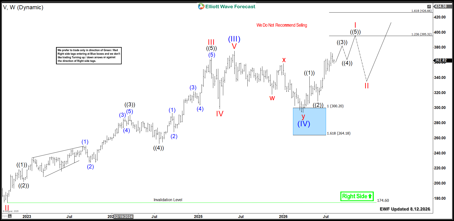
In our previous Visa article, we explained the corrective pullback in wave ((IV)). That decline found buyers at the Blue Box zone. We projected a base around $300 to establish the next rally in wave (V).

The current rally from the March low shows an initial impulsive three-wave advance. It still needs to break above the wave (III) peak. This will deny any potential double correction. Following that, Visa should extend the rally within wave I toward the target area at $395 - $426 . Then, a three-wave pullback in wave II will occur. This correction should remain supported above $300.

Consequently, the stock should continue its extension higher within the current bullish cycle. This move will continue until it completes the larger degree five-wave advance.

Visa V Weekly Chart 8.12.2026​

Visa V Weekly 8.12.2026

Conclusion​

Visa‘s larger-degree bullish cycle remains firmly intact. Therefore, investors should target buying opportunities within daily pullbacks.

Source: https://elliottwave-forecast.com/stock-market/visa-nyse-v-charges-toward-new-all-time-highs/