Elliottwave-Forecast

Master Trader
Feb 17, 2017
2,466
9
84
www.elliottwave-forecast.com
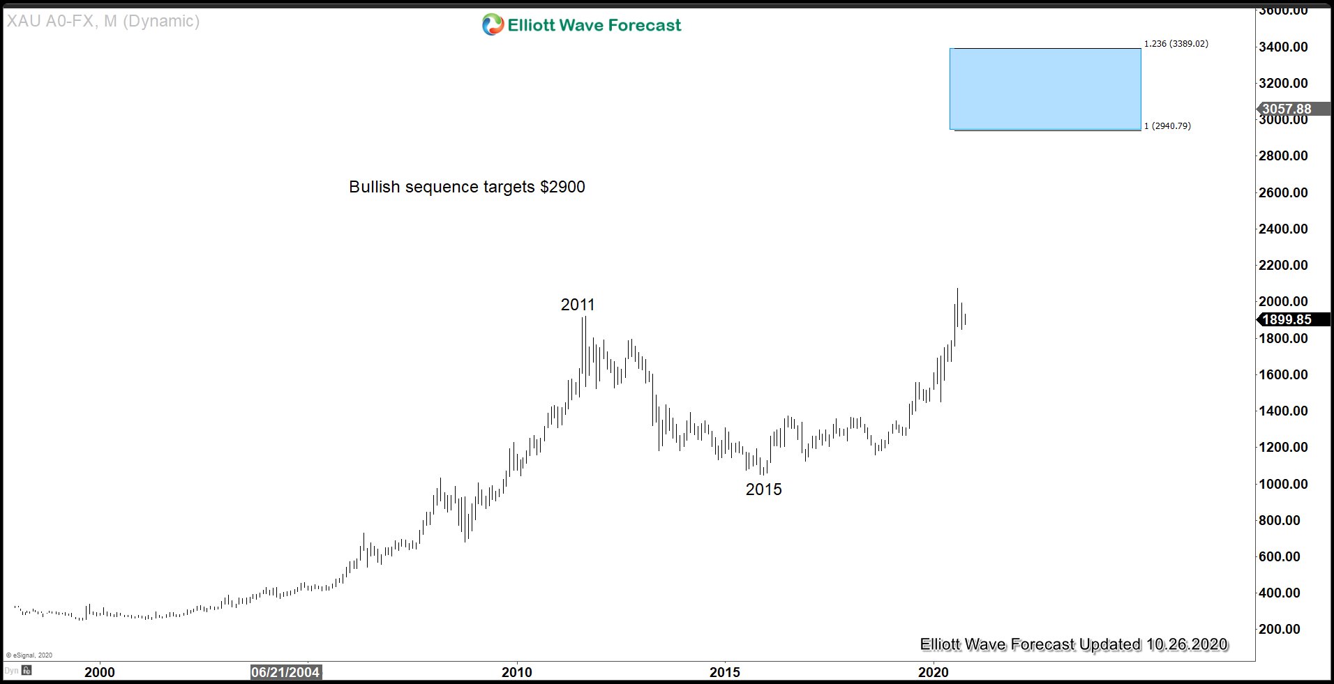
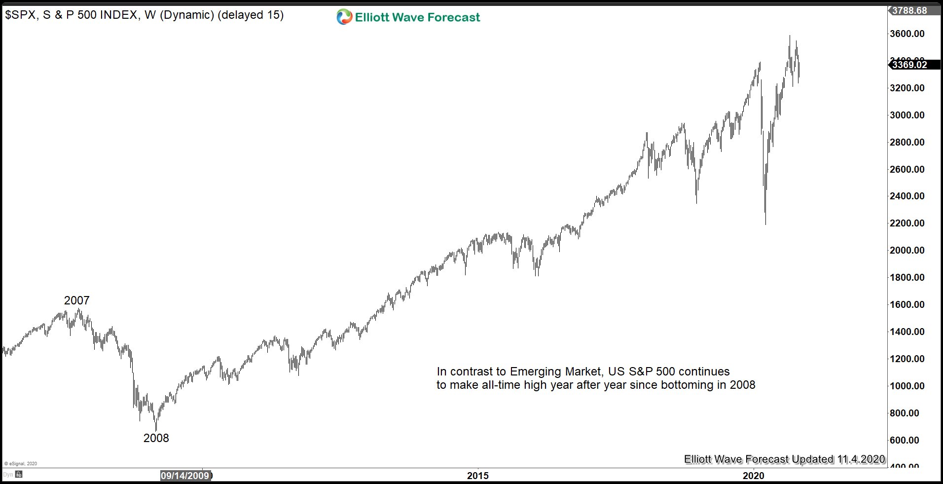
Government and corporations around the world continue to accumulate unsustainable debt. Since it's unthinkable for developed countries such as the United States to default on the obligation, the only way out of this situation is to continue to debase currencies. This environment is very supportive for Gold and Silver in coming years. Indeed, Gold has broken to new all-time high against all other world currencies including US Dollar. The chart below in Gold suggests a simple 100% extension from all-time low should see Gold reaching $2900 as a conservative target.


Furthermore, Gold-to-Silver ratio also confirms the direction of Gold and Silver remain bullish as the chart below suggests. Gold-to-Silver ratio is the ratio of gold price / silver price.

Gold-to-Silver Ratio Weekly Chart​

Gold-to-Silver Ratio weekly Chart

The chart above shows an overlay of Gold-to-Silver ratio chart (top chart) with Gold (middle) and Silver (bottom). We can observe an inverse correlation between the ratio and the price of the underlying metals. The dotted vertical line above shows important swing high and low in the instrument. In between the vertical lines, we can see when the ratio formed significant peak, the price of gold and silver formed significant low and vice versa.

We can also see the ratio has reached perfect 100% - 123.6 extension blue box from March 1980 in 3 swing. From the blue box, the ratio reversed down violently. The current decline has broken below 2011 rising trend line suggesting the uptrend has ended. Expect the ratio to continue lower in coming years with possible next target at around 40 which is the lower end of the multi decade channel. Due to the inverse correlation, we can expect the price of Gold and Silver to continue higher in coming years.

Gold-to-Silver Ratio 4 Hour Elliott Wave Chart​


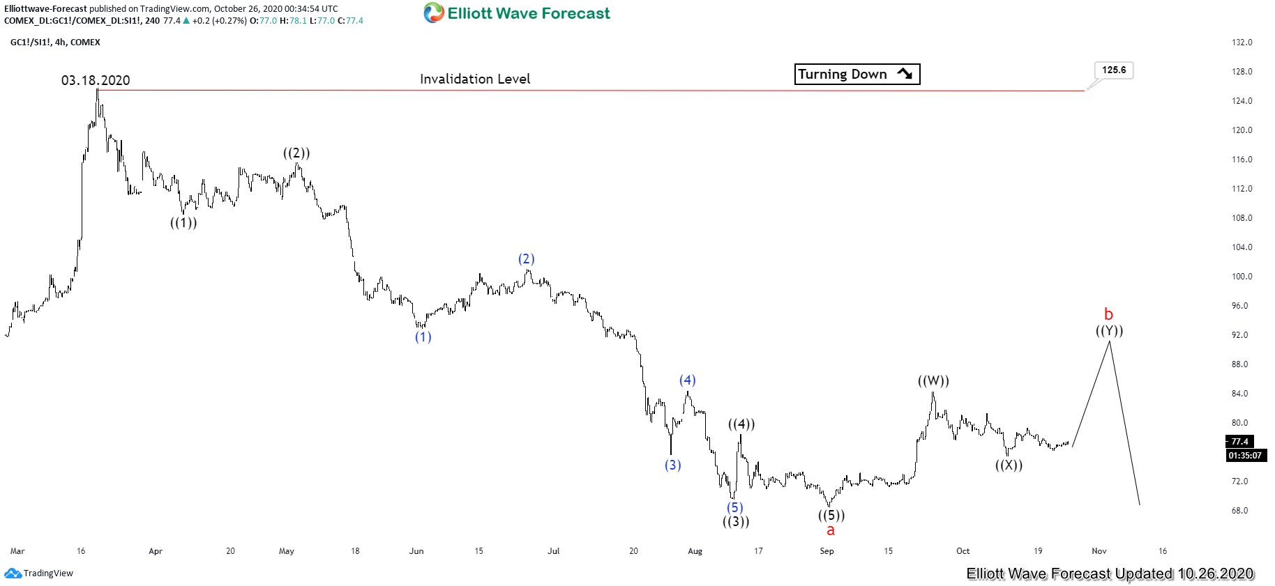
4 hour chart of Gold-to-Silver ratio above shows a 5 waves impulsive structure from March 18, 2020 high. Short term, another leg higher still can't be ruled out to end wave b before the ratio turns lower again. If the ratio is still doing another leg higher as expected, then we can't rule out further correction in Gold and Silver due to the inverse correlation. Afterwards, when the ratio starts turning lower again, the price of Gold and Silver can start to extend higher.
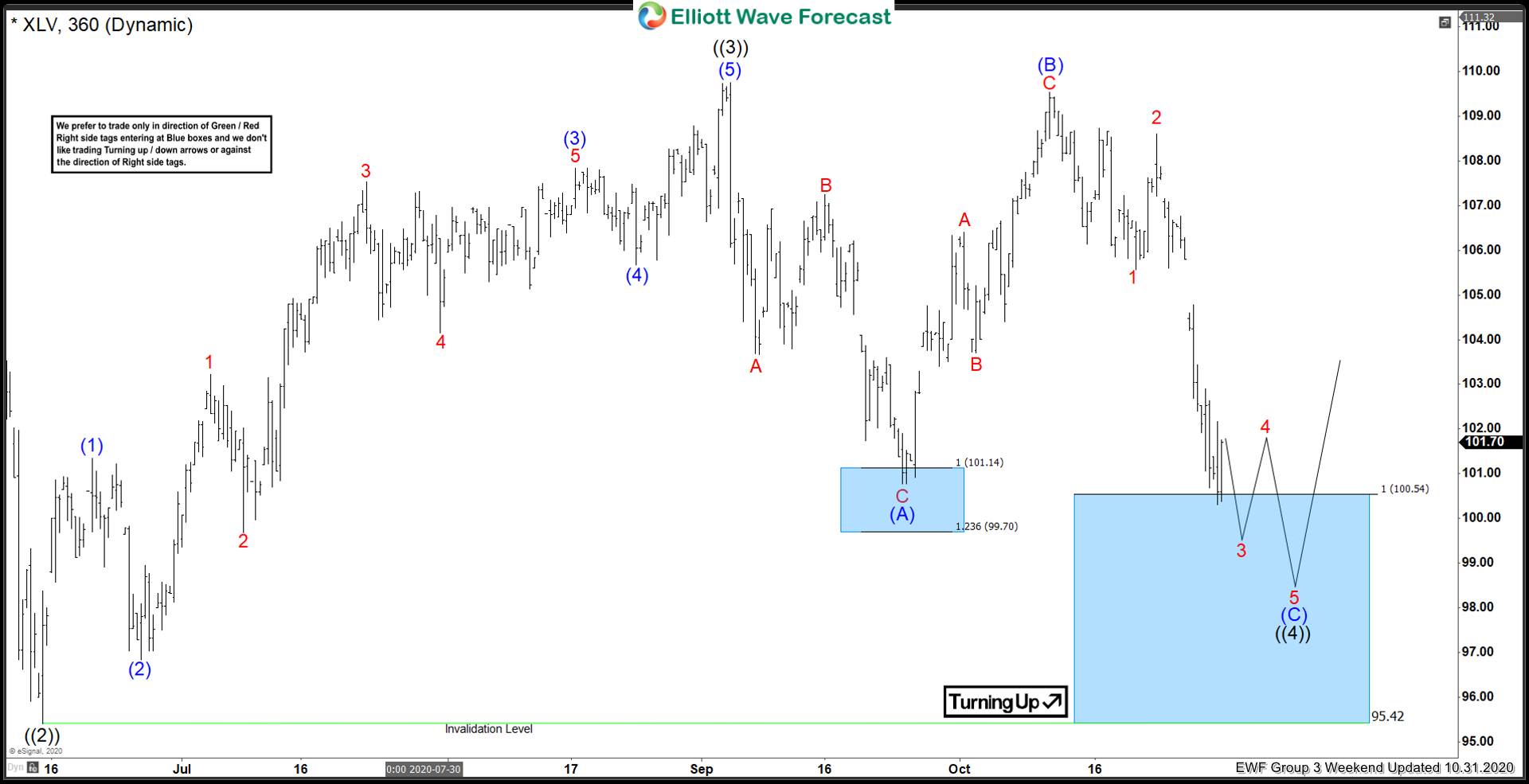
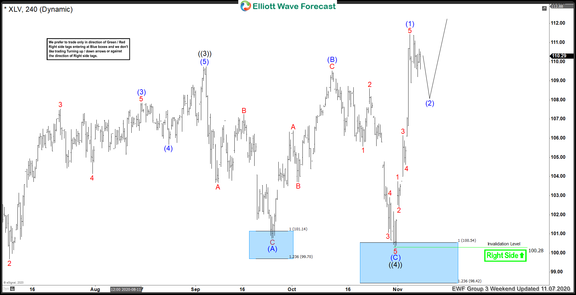
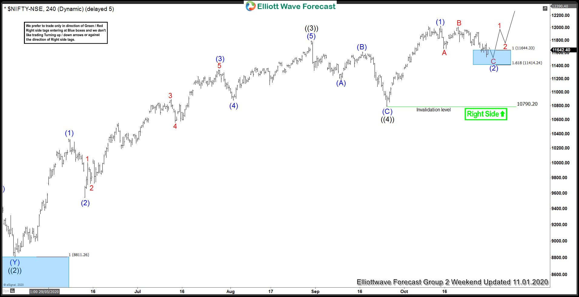
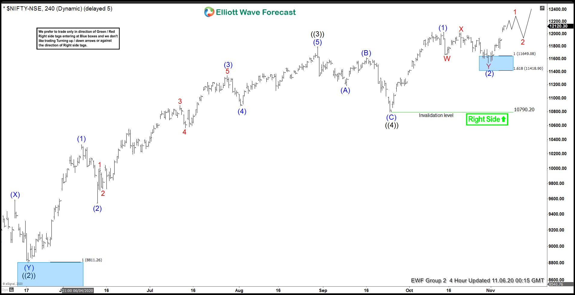
 

Elliottwave-Forecast

Master Trader
Feb 17, 2017
2,466
9
84
www.elliottwave-forecast.com
In this technical blog we’re going to take a quick look at the Elliott Wave charts of GOOGLE stock ( $GOOGL) published in members area of the Elliottwave-Forecast . As our members know, GOOGLE stock is trading higher in the cycle from the September 1394.15 low. Recently we got short term pull back that has unfolded as Elliott Wave Double Three pattern. In further text we’re going to explain the forecast and Elliott Wave Pattern.

Before we take a look at the real market example, let’s explain Elliott Wave Double Three pattern.

Elliott Wave Double Three Pattern​

Double three is the common pattern in the market these days, also known as 7 swing structure. It’s a reliable pattern which is giving us good trading entries with clearly defined invalidation levels and target areas.
The picture below presents what Elliott Wave Double Three pattern looks like. It has (W),(X),(Y) labeling and 3,3,3 inner structure, which means all of these 3 legs are corrective sequences. Each (W) and (Y) are made of 3 swings , they’re having A,B,C structure in lower degree, or alternatively they could have W,X,Y labeling.

Double Three

GOOGLE 1 Hour Elliott Wave Analysis 10.19.2020​

GOOGLE completed September cycle from the 1395.51 low as (1) blue and now correcting it. Wave (2) pull back looks incomplete. Current view suggests pull back is unfolding as Elliott Wave double three pattern with inner labeling: WXY red. W and X legs has corrective structure. We assume that Y red leg is still in progress, that can also be unfolding as corrective structure. The stock can see more downside toward equal legs from the peak that comes at 1528.37-1493.84 area . We expect stock the remain supported and resume rally toward new highs ideally. As the main trend is bullish buyers should appear at the blue box for a 3 waves bounce at least.

You can learn more about Elliott Wave Double Three Patterns at our Free Elliott Wave Educational Web Page.

Google

GOOGLE 1 Hour Elliott Wave Analysis 10.26.2020​

Eventually Google made another leg down and found buyers at 1528.37-1493.84 , the Blue Box area. Pull back (2) blue ended at 1516.2 as Double Three and we got nice rally toward new highs as expected. Short term cycle from the 1516.2 low ended as 5 waves rally when wave (v) was extended. As far as 1516.2 pivot holds we expect further rally once short term pull back completes.

Keep in mind that market is dynamic and presented view could have changed in the mean time. You can check most recent charts in the membership area of the site. Best instruments to trade are those having incomplete bullish or bearish swings sequences. We put them in Sequence Report and best among them are shown in the Live Trading Room.

Google

Elliott Wave Forecast
 

Elliottwave-Forecast

Master Trader
Feb 17, 2017
2,466
9
84
www.elliottwave-forecast.com
Short term Elliott Wave View in ASX 200 (XJO) suggests that cycle from September 22, 2020 low is in progress as a 5 waves impulse structure. In the 30 minutes chart below, Index ended wave ((2)) of this impulsive move from September 22 at 5779.6. Wave ((3)) higher ended at 6248.3 with internal subdivision as another impulse of lesser degree. Up from wave ((2)) low at 5779.6, wave (1) ended at 5957.1 and wave (2) pullback ended at 5912.7. Index then resumed higher in wave (3) towards 6232.8 and wave (4) dips ended at 6165. Final leg higher wave (5) ended at 6248.3. This completed wave ((3)) in the higher degree.

Wave ((4)) pullback is currently in progress to correct cycle from October 2 low as a zigzag. Down from wave ((3)) at 6248.3, wave (A) ended at 6100.6 and wave B bounce ended at 6206.5. Index then turned lower in wave (C) and it has reached the 100% extension area at 5969 - 6060. Buyers may appear from this area for more upside or a 3 waves bounce at least. As far as wave ((2)) pivot at 5779.6 low stays intact, expect the Index to turn higher from the blue box in 3 waves at least.

ASX 200 1 Hour Elliott Wave Chart​

ASX 200 Elliott Wave Chart
 

Elliottwave-Forecast

Master Trader
Feb 17, 2017
2,466
9
84
www.elliottwave-forecast.com
$FXY Longer Term Elliott Wave Cycles

Firstly the $FXY instrument inception date was 2/12/2007. The instrument tracks changes of the value of the Japanese Yen versus the US Dollar. There is plenty of data going back into the longer term 1970’s time frame available for the currency cross rate in the USDJPY. The foreign exchange pair shows a larger degree time frame low is in place in October 2011 at 75.57. Comparatively, the FXY instrument reflects a price high at 130.22 in October 2011.

The analysis continues below the FXY Monthly chart.


Secondly the FXY instrument mirrors USDJPY price highs and lows inversely as the initial above paragraph suggests. In the FXY instrument the decline from the October 2011 high into the June 2015 lows is an Elliott wave impulse. Internally there are a couple of degrees shown there in the red & blue colors that finished the black wave ((I)). From the June 2015 lows the bounce higher in both price and momentum indicators suggested the cycle lower had ended there.

In conclusion: As the FXY weekly chart suggests the instrument ended a larger degree cycle in an Elliott wave impulse of five waves lower in June 2015. The bounce from there is in five waves as well in the wave (a) in blue that ended August 2016. From there a double three wave (b) in blue ended in January 2017. From there a larger cycle in the red I ended in March 2020. The pullback in the red II was fast however did end March 2020 as well.

Currently & ideally while it is below the September 2020 highs it can see a pullback correct the cycle from the March 2020 lows before turning higher again in the blue (c) of ((II)). While this plays out with price remaining above the January 2017 lows the FXY can see a turn higher. This larger degree ((II)) is a ziz zag Elliott Wave structure. It can reach the 100.90 – 112.99 extension area before the larger degree time frame bearish cycle takes over again taking prices substantially lower.
 

Elliottwave-Forecast

Master Trader
Feb 17, 2017
2,466
9
84
www.elliottwave-forecast.com
Short term Elliott Wave View in Silver (XAGUSD) suggests that cycle from August 7 peak is unfolding as a triple three Elliott Wave structure. In the 60 minutes chart below, the metal ended wave ((X)) ((X)) at $25.57. Silver is proposed to have started wave ((Z)) lower with the internal of a zigzag (A)-(B)-(C).

The 5 waves move lower from wave ((X)) ((X)) below is then internal of wave (A) zigzag. Down from $25.57, wave ((i)) ended at $24.75 and bounce in wave ((ii)) ended at $25.25. The metal extended lower in wave ((iii)) towards $23.85, wave ((iv)) ended at $24.63, and wave ((v)) ended at $23.5. This 5 waves lower completed wave 1 of (A). Bounce in wave 2 ended at $25.28 as a double zigzag. Wave ((w)) ended at $24.97, wave ((x)) ended at $24.18, and wave ((y)) of 2 ended at $25.28. The metal has turned lower in wave 3 where wave ((i)) ended at $24.07 and wave ((ii)) bounce ended at $24.61. The metal has resumed lower in wave ((iii)) of 3 of (A). Near term, as far as pivot at $25.57 high stays intact, expect rally to fail in 3, 7, or 11 swing.

Silver (XAGUSD) 1 Hour Elliott Wave Chart​

Silver Elliott Wave
 

Elliottwave-Forecast

Master Trader
Feb 17, 2017
2,466
9
84
www.elliottwave-forecast.com
Another blog on a great looking Energy producer. Yes, this sector has been under a strong bearish trend. But, there are some names that have better structures than others. Penn Virginia Corp chart has a great technical chart. As with the MTDR Blog I did a few weeks back, I am going to compare PVAC to XLE to get an idea of when this stock can strike a low. Lets dig in.

Penn Virginia Elliott Wave View:​

Penn Virginia

This stock has just recently broke below the July low. This qualifies it as having the minimum number of swings needed to complete this correction. When comparing to the XLE chart below, we can see that XLE is very close to the equal leg extreme area (Blue box). This is an area that can provide a bounce in 3, 7 or 11 swing at least. Why does this matter? Because when XLE reaches that extreme area, it is highly probably that other energy producers are going to bounce along with it. This is why we want to find the strongest charts and trade those ones.

On the Penn Virginia Chart, from the March 2020 low at 0.99, there is a 5 waves advance into black ((1)) which peaked at 19.97 on June 8/2020. That is a staggering 2000% gain in the short span of a few months. From there, the swings are lining up well with the XLE Energy ETF shown below. Penn has an equal leg extreme blue box area of 2.68 to the invalidation level of 0.99. An area where buyers may show up for a bounce in 3 waves at least. But considering the relative strength of this name, it may strike a low when the XLE energy ETF hits its equal leg blue box. It may be the case that Penn strikes a low at the orange area instead, which is the 61.8 to 76.2 fib area extension. As mentioned above, this will depend on when the broad market, XLE, strikes a low. Lets look at the XLE chart.

XLE Energy Producers ETF Elliott wave View:

XLE ETF

When looking at XLE ETF. We can see that an equal leg extreme 25.46 to invalidation level 22.85 is much closer than the blue box for PVAC. An area to watch for a broad turn in the Energy Producer complex is that blue box extreme on the XLE ETF. If XLE manages to get there, and Penn is at the orange area, Penn may find a low there instead.

In Conclusion. Ideally, the PVAC price will get down to the blue box extreme the same time as the XLE hits the blue box. But considering how far down PVAC would need to travel, this looks unlikely. Watch for clues on how XLE reacts at that area, as for if Penn Virginia can find a low at the 0.618 area instead.
 

Elliottwave-Forecast

Master Trader
Feb 17, 2017
2,466
9
84
www.elliottwave-forecast.com
Every 4 years the elections arrive in the United States, the performance of the most important health indicator of the financial markets, such as SP500, is reviewed again. In recent years the SP500 has been well above other indices worldwide like the DAX or the FTSE. That leads us to think about the importance of the SP500, this index drags the world economy towards a better financial health because if it weren't for the economy of the United States, other countries would be well below their current levels. In addition, we will take a look at the behavior of the DXY after the elections, which is another important index as it affects international trade.

SP500 and its performance in election years​

In the following chart we can look at how the SP500 keeps, in general, a positive behavior since President Ronald Reagan, but that does not mean that the president in office does not matter for there to be a good performance in the SP500, since we can see under President G. W. Bush the performance was well below average and a president with bad policies can push the SP500 underwater. Politics Matters but can't change the underlying trend of the market!SP500 performance by President

In table 1 we have the percentage of profit of the SP500 in the election year and in the following election year. We can determinate that in the SP500 71% of the time its performance drops between the pre-election and the post-election. For example in the year of 1988, where the pre-election yield was 11% and the post-election return was only 1%. While we saw a rebound in a few year like 1960, 1992, 2004 and 2008. For example in 2008 emerging from a recession of -32%, post elections the yield was -10% improving the yield of the pre elections.

SP500 performance pre post election year

What about the DXY?​

In the following table we analyse that the DXY generally has a favorable performance in election years, except for two years since 1980. The inverse correlation with the EURUSD remains, but with the USDJPY it is different. In years like 1980, 1992, and 2008, the USDJPY performance is worse that the DXY, and this is most likely due to a poor performance of the stock markets that year. While in the year 2012 the USDJPY looks much better than the DXY sure for a rebound in the stock market worldwide.

USDX election year

Now what about the first 100 days after electing a President in the United States. The DXY has a totally favorable performance. Only in 2004 it registered a negative balance of -1.4% since 1980.

USDX 100 days after elections

Conclusion​

Therefore, we can conclude that economic policies influence the performance of the SP500 and in the year after the elections it is most likely that its performance will decline. The DXY reports a favorable performance in the first 100 days of government of a new election. Will that performance be repeated this end of year 2020 and in beginning of the 2021?
 

Elliottwave-Forecast

Master Trader
Feb 17, 2017
2,466
9
84
www.elliottwave-forecast.com
On October 27 2020 I posted on social media Stocktwits/Twitter @AidanFX "GBPCAD Watch for a move higher. Will be watching for possible buying opportunities." The chart below shows bullish market patterns were visible and were calling for a move higher. Bullish Pattern (purple) triggered BUYERS at the BC 0.50% Fib. retracement level where the point D of the pattern terminated. The purple bullish pattern also terminated at a key support/resistance zone (light blue) where price reacted with push higher. Price was also respecting and staying above the 200 moving average (dark blue) which was another signal the pair could push higher. Also a bullish ascending triangle breakout pattern (blue) was forming and a break above the triangle would send GBPCAD higher and hit targets above it. These visible bullish patterns and signals allowed me to call the move higher and advise traders to look for buying opportunities.

GBPCAD 1 Hour Chart October 28 2020

GBPCAD, forex, trading, elliottwave, market patterns, AidanFX, @AidanFX

GBPCAD broke above the blue triangle which caused more buyers to get in the market and pushed the pair higher eventually hitting the 1:2 RR BUY target at 1.7311 from my 1.7171 buy entry for +140 pips. A trader should always use multiple trading strategies to confirm the trade and never trade off one simple strategy. If you followed me on Twitter/Stocktwits @AidanFX you too could have caught the GBPCAD move higher.

GBPCAD, forex, trading, elliottwave, market patterns, AidanFX, @AidanFX

Of course, like any strategy/technique, there will be times when the strategy/technique fails so proper money/risk management should always be used on every trade. Hope you enjoyed this article and follow me on Twitter for updates and questions> @AidanFX
 

Elliottwave-Forecast

Master Trader
Feb 17, 2017
2,466
9
84
www.elliottwave-forecast.com
At EWF, we believe the market works as a whole. Every instrument, symbol, or ETF is therefore related. Many traders do not track as many markets as we do, but through analyzing hundreds of charts every day, we can see a clear relationship between these different instrument. This time, we will take a look at EME, which was created back in 1988. Constructed according to the MSCI Global Investable Market Indexes (GIMI) Methodology, the MSCI EM Index is designed to dynamically reflect the evolution of the emerging markets opportunity set and to help investors meet global and regional asset allocation needs.

The Index, just like every risk asset, formed a low back in 03.23.2020. Since then it has traded higher in an impulse sequence. The market always advances in either a sequence of 5-9-13-17-21-25 when the sequences is an impulse. Alternatively, it advances in 3-7-11-15-19-23-27 when the sequence is corrective. The chart below shows an an impulsive sequence, which is a clear definition of five waves. Each subdivision in this case comes in five waves.


This idea represents the basis of the Elliott Wave Theory. The key is understanding the sequence, the stage, and what to expect next. Every time we see a possible five waves advance with a momentum divergence, we can expect a three waves pullback. A momentum divergence in three degrees should happen. First is the divergence between wave ((iii)) of 3 and wave ((v)) of 3. Second is the divergence wave 3 of (5) and wave 5 of (5). Last is the divergence between wave (3) and (5). If these conditions are present, the pullback is imminent and traders need to be aware that chasing the advance is risky.

EME 720 Minutes Elliott Wave Chart​

EME (Emerging Market ETF) Elliott Wave Chart

The chart above shows the advance since the lows at 03.23.2020 for EME. There's a very clear subdivision of five waves since the lows. Although we believe a new high still can happen, we can already see a divergence, thus the cycle is mature. Chasing the move higher at this stage will need to be with a very well defined risk level. From the chart above, we believe that no matter what the result of the US General Election is, there won't be a big rally into a wave III yet.

Correlation Between EEM and SPY​


The chart above is an overlay chart of the EME and SPY, which shows an identical trade and also the relationship between the two markets. As we always say, It's useful to know where every market is. This time around the warning is there, so let's be careful.
 

Elliottwave-Forecast

Master Trader
Feb 17, 2017
2,466
9
84
www.elliottwave-forecast.com
IBM has been trading within a corrective sequence lower since the peak on 03.11.2013. The decline is a clear 3-7-11 sequence, which comes with a lot of overlapping and choppy price action. We do believe a double correction (WXY) is taking place. This is a combination of either two Zig Zags or two WXY which at the end reaches 100% between the first leg related to the second leg. The following chart illustrates this structure:


The same structure happens in IBM chart below.

IBM Weekly Elliott Wave Chart​


As we can see in the chart above, there is overlapping due to the fact that buyers understand the main trend in the higher degree cycles and enter the market. Sellers however see the multi-year decline and keep entering the short side. The WXY structure is very popular across the Market. When the structure is well defined, it becomes very easy to trade because the invalidations level is clear.

IBM chart above shows an overlapping decline from the peak at 03.11.2013. We did this article on IBM as long term investment opportunity \ back on 04.2020. At that time, we knew a bounce was coming. However, we also understand that the bounce will fail and sellers will have another chance to make the final push lower into the target. The idea is that every instrument is related. In the same way, IBM and World Indices also correlate even if they don't necessarily trade in the same degree. World Indices can trade in first and second-degree correlation with IBM, but world indices will not be able to start a huge wave III advance until this bearish cycle in IBM ends.

As we have been saying, we relate all instrument and we understand the sequence and invalidation levels.

IBM Daily Elliott Wave Chart​


The chart above represents the short term structure and the most bearish path. It also shows the path which will will be defined in the next few weeks of trading. Right now the key is to identify the latest push lower by the sellers and understand what that means. Relating the higher degree decline since the peak at 03.11.2013 with the peak at 06.08.2020, we can draw a conclusion that as far as the short term peak at 06.08.2020 remains intact, the last swing lower might have started. That means World Indices should be close to turning lower into the biggest decline since 03.23.2020 low. Alternatively, if IBM breaks above the peak at 06.08.2020, Indices can create another extension higher before another pullback. There will not be acceleration higher in World Indices until IBM ends the cycle since the peak on 03.11.2013.
 

Elliottwave-Forecast

Master Trader
Feb 17, 2017
2,466
9
84
www.elliottwave-forecast.com
SMI is a Swiss Market Index representing a capitalization-weighted measure of the 20 most significant stocks on the SIX Swiss Exchange in Zurich; the ticker is $SMI. The "COVID-19" drop in indices in February-March 2020 has marked most probably a significant low in world indices. It seems like $SMI has also found its bottom on march lows at 7648.5 and is now looking higher.

SMI Monthly Elliott Wave Analysis 11.02.2020​

The monthly chart below shows the SMI index $SMI listed at SIX Swiss. From the all-time lows, the index price has developed a cycle higher in wave (I) of a super cycle degree. It has ended by printing a high in July 1998 at 8491. From the highs, a correction lower in wave (II) has retraced during following 10 years a half of the of the motive cycle higher towards March 2009 lows at 4216. Technically speaking, the decline can be seen as an Elliott Wave running flat pattern.

From the lows at 4216, another cycle higher in wave (III) has been confirmed by breaking 8491 highs. Later on in February 2020, it has printed the all-time highs at 11272. From the highs, a sharp decline in wave (IV) has unfolded as a straight down correction. It has found its bottom in March 2020 at 7648.5. While above there, SMI might be now in the early stages of the wave (V). As a target, expect the price to extend towards 12619-14602 area and even higher.

SMI Elliott Wave Monthly

SMI Daily Elliott Wave Analysis 07.08.2020​

The daily chart below shows in more detail the advance higher in wave I of (V) and the first leg lower of the pullback in wave II. From the March lows, wave I demonstrates clearly the subdivisions of 5. In fact, this number of 5 is a characteristic feature of the motive waves. Within wave I, there are 5 black subwaves ((1))-((5)). These in turn subdivide similarly into 5 blue waves (1)-(5). Since the price has broken below the price trendline, the March cycle has ended in September 2020 at 10593 highs.

From the September highs, pullback in wave II has started and should find support in 3, 7, 11 swings above 7648.5 for an extension higher in wave III of (V). In shorter cycles, a first leg lower in wave ((A)) of II is currently in progress. Once finished, the bounce in wave ((B)) should fail below 10593 highs for another leg lower in wave ((C)). Later on, investors and traders can buy SMI against 7648.5 lows for an extension higher in waves III-V of (V) looking towards 12619-14602 area and even higher .

SMI Elliott Wave Daily
 

Elliottwave-Forecast

Master Trader
Feb 17, 2017
2,466
9
84
www.elliottwave-forecast.com
$FXF Elliott Wave and Longer Term Cycles

Firstly there is data back to when the ETF fund began in 2006 as low as 78.43. Data correlated in the USDCHF foreign exchange pair suggests the FXF high in August 2011 is also the lows of a cycle lower from the all time in the USDCHF. In this instrument there is data available back to 1971 when the exchange rate was 4.3180.

The FXF instrument reflects the price swings of the currency pretty well since inception and as previously mentioned the instrument made a high in August 2011. This where the analysis begins on the weekly chart shown below. The correction from those highs appears to be a an Elliott Wave double three structure. The analysis continues below the monthly chart.


Secondly, as earlier mentioned the decline from the August 2011 highs appears to be an Elliott Wave double three structure. In the second swing of a double three Elliott Wave structure, it generally will reach a price where it is equal to the first swing. When a cycle ends it will show in momentum indicators usually before price makes it obvious. These cycle highs and lows are in the blue color as shown on the chart above (w)-(x) & the proposed (y) that remains in progress after this current bounce in wave b (red) ends.

I will mention how this target area lower is obtained in conclusion. Take a Fibonacci extension tool on your chart platform. Beginning at the August 2011 highs as point 1, trace down to the January 2015 lows where the blue (w) is for point 2. Now trace back up to January 2015 blue wave (x) highs for point 3. This will give the equal legs area (not shown) at 70.95.
 

Elliottwave-Forecast

Master Trader
Feb 17, 2017
2,466
9
84
www.elliottwave-forecast.com
In this technical blog, we are going to take a look at the past performance of EURJPY, 4-Hour Elliott wave Charts that we presented to our members. But before looking into the Charts, we need to understand the market nature first. The market always fights between the two sides i.e Buying or Selling. We at Elliott Wave Forecast understand the Market Nature and always recommend trading the no-enemy areas. We called those no-enemy areas which are reflected as blue box areas on our Charts. They usually give us the reaction in favor of market direction in 3 swings at least. Now, let us take a quick look at the EURJPY Charts and structure below:

EURJPY 4 Hour Elliott Wave Chart​

EURJPY Forecasting The Decline From Blue Box Area

The decline from September 01, 2020 peak unfolded in 5 waves impulse structure thus suggested that it’s a continuation pattern. Therefore, wave ((b)) bounce was expected to fail in 3 or 7 swings for another 5 wave extension lower. Above is the 4 Hour Elliott wave Chart from the 10/12/2020 update. In which the decline to 122.34 low ended wave ((a)) as 5 waves impulse structure. Up from there, the bounce from the lows unfolded as a zigzag structure in a lesser degree cycle. When wave (a) ended at 124.50 high, wave (b) pullback ended at 122.99 low. Wave (c) was expected to reach the no enemy area at 124.91-126.10 100%-161.8%Fibonacci extension area of (a)-(b). From there, the pair was expected to resume the next extension lower or to do a 3 wave reaction lower at least.

EURJPY 4 Hour Elliott Wave Chart​

EURJPY Forecasting The Decline From Blue Box Area

Here’s 4 Hour Elliott Wave Chart from the 10/31/2020 Weekend update. In which the pair managed to reach the blue box area at 124.91-126.10 100%-161.8% and got rejected as expected. Allowed our members to create a risk-free position shortly after taking the short positions as per Elliott wave hedging.
 

Elliottwave-Forecast

Master Trader
Feb 17, 2017
2,466
9
84
www.elliottwave-forecast.com
Emerging Market has been lagging the US market in the past 10 years. One ETF which tracks the Emerging Market's performance is iShares MSCI Emerging Market (EEM). The ETF gives exposure to large and mid-sized companies in emerging markets. Currently, the largest three holdings in the ETF are all technology-based companies, including Alibaba, Tencent, and Taiwan Semiconductor Manufacturing. The ETF does contain a lot of exposure to the Chinese market.

A look at the chart of the EEM below suggests a range bound performance in the past 10+ years. Since the Index bottomed in 2008, it has never been able to make a new high, unlike the US Indices.

Emerging Market Index is Range Bound in the Past 10 Years​


In contract, the US Index S&P 500 has continued to rally and makes new high year after year since it bottomed in 2008 as the chart below shows.

S&P 500 (SPX) Continues to Make New High Year After Year​


When we look at the ratio chart below between EEM and SPX, the ratio continues to decline since 2010 as the performance between US and EEM decouples. US market continues to extend higher while EEM trade in a multi-year range.

EEM and SPX ratio

As we can see from the chart above, the ratio between EEM and SPX has gone back to the 2004 low. However, there's an indication that the ratio may have started to reverse higher. If this is really happening, then this suggests Emerging Market is going to outperform the US market.

EEM to SPX ratio can rise due to several combination of possibilities. We'll take a look at these three possibilities below:

  1. Both EEM and S&P 500 can rally, but EEM rallies more than the S&P 500. This is a possible scenario as Emerging Market generally has a higher beta than the US market, so when the ratio rallies, EEM can outperform in the rally. In this scenario, world indices in the US and outside the US continue to march higher.
  2. EEM rallies while S&P 500 trades in a big range. This is also a possibility. In this scenario, basically S&P 500 and Emerging Market switches role. If the period of 2010 - 2020 sees emerging market range trading and S&P 500 continues to rally, then when the ratio reverses higher, the opposite can happen. In this scenario, the baseline is there's no crash in the market. US market at worst case will be range trading
  3. Both EEM and S&P 500 decline. Since the ratio rises, then this suggests S&P 500 declines much more than the Emerging Market. Although this scenario is not totally impossible, but it's the least likely as true risk off scenario such as the 2007-2008 sees the ratio declines precipitously.
From here, we can make conclusion that if our assumption is correct that the ratio is about to reverse, it's unlikely to see a big crash in world indices anytime soon.
 

Elliottwave-Forecast

Master Trader
Feb 17, 2017
2,466
9
84
www.elliottwave-forecast.com
Hello fellow traders. In this technical blog we’re going to take a quick look at the Elliott Wave charts of $XLV published in members area of the website. We’ve been calling for further rally in $XLV within the cycle from the March 73.86 low. Recently we got 3 waves pull back in wave ((4)) that has ended perfectly at the Equal legs. In further text we’re going to explain Elliott Wave Forecast and price structure.

$XLV 4 Hour Elliott Wave Analysis 10.29.2020​

Current view suggests March cycle is still in progress as 5 waves structure. Short term cycle from the 95.42 low ended as 5 waves rally , labeled as ((3)) black on the charts. Currently we are getting wave ((4)) black pull back that is unfolding as Elliott Wave Flat Pattern. First leg (A) blue ended as clear 3 waves pattern ABC red. Then we got 3 waves up in (B) blue, that was very deep correction against the peak. Finally we are getting decline in wave (C) that is still unfolding as 5 waves structure. The price is now reaching equal legs area at 100.54-95.42 where buyers should ideally appear for further rally in wave ((5)) toward new highs.

You can learn more about Elliott Wave Flat Patterns at our Free Elliott Wave Educational Web Page.

$XLV

$XLV 4 Hour Elliott Wave Analysis 11.05.2020​

Eventually XLV made another short term low toward Blue Box ( buyers zone). Wave ((4)) pull back ended as Elliott Wave Flat Pattern. Buyers were strong enough to push the price higher and we got broke above September 2nd peak confirming next leg up is in progress. As our members know, Blue Boxes are no enemy areas , giving us 85% chance to get a bounce.

Keep in mind market is dynamic . You can check most recent charts in the membership area of the site. Best instruments to trade are those having incomplete bullish or bearish swings sequences.We put them in Sequence Report and best among them are shown in the Live Trading Room.

$XLV

Elliott Wave Forecast
 

Elliottwave-Forecast

Master Trader
Feb 17, 2017
2,466
9
84
www.elliottwave-forecast.com
Fiverr International is another online marketplace name that shows a promising future. When taking a look at the chart since the IPO in 2019, a strong bullish trend has emerged. In which, the price action is very constructive for the bulls. Before I get into the charts, lets take a look at what the company does:

"Fiverr was founded by Micha Kaufman and Shai Wininger, and was launched in February 2010. The founders came up with the concept of a marketplace that would provide a two sided platform for people to buy and sell a variety of digital services typically offered by freelance contractors. Services offered on the site include writing, translation, graphic design, video editing and programming. Fiverr's services start at US$5, and can go up to thousands of dollars with gig extras. Each service offered is called a "gig".

The website was launched in early 2010 and by 2012 was hosting over 1.3 million Gigs. The website transaction volume has grown 600% since 2011. Additionally, Fiverr.com has been ranked among the top 100 most popular sites in the United States and top 200 in the world since the beginning of 2013."


Lets take a look at the Fiverr Elliott wave count.

Fiverr Elliottwave View:

Fiverr


Medium term term view from 3/18/2020 lows of 20.42. It is currently factored that this stock is still within the March Cycle rally. This means that the cycle from that March low is still on going, further extension higher is expected. After the March 2020 cycle peaks, this stock is favoured to correct with the rest of the broad markets. This should provide an excellent buying opportunity on a 3, 7 or 11 swing pullback against the March low.

From the lows at 20.42 set in March 2020, Fiverr showcases clean swings. Black ((1)), ((2)), ((3)), and ((4)) are all favoured set with ((5)) in progress. There is a divergence in the daily timeframe on RSI, which tells us that a 5th wave is due. I do not like to short this stock, but prefer to look for an extreme area pullback in Red II, to an equal leg extreme where risk reward can clearly be defined. Further upside extension right now is favoured to take place, there is no specific area where Red I can peak. All this to say, is that it is favoured that ((5)) of Red I is in progress, so caution may be warranted heading into this final 5th wave.

In conclusion, the structure from the March low is bullish, there is no denying that. But the thing to take note in the present time is the risk to establishing new long positions. The trend is getting mature, and a correction against that March low is favoured to take place at some point in the coming months ahead.

Risk Management​

Using proper risk management is absolutely essential when trading or investing in a volatile stocks. Elliott Wave counts can evolve quickly, be sure to have your stops in and define your risk when trading.
 

Elliottwave-Forecast

Master Trader
Feb 17, 2017
2,466
9
84
www.elliottwave-forecast.com
Last week the movement of the stock market was overtaken by the elections in the United States and the narrow margin in votes that they had in some States. However, at www.elliottwave-forecast.com we ignore the noise and focus on our Elliott Wave trading system and technical analysis. What happened with the actions of Nike ($NKE) shares is a proof of that. Before the elections, the structure of Nike told us that we were going to have at least one bounce in 3, 7 or 11 swings, so we put the blue box in position knowing it would do its job in favor of the right side of the market.

Placing the Blue Box in the $NKE 4-hour chart present on Oct 29th, 2020

As we said the structure was clear. After completing the wave ((3)) in $NKE, we had two waves (A) and (B), where (B) got quite close to the start of wave (A) and continued the downward movement very strong. This indicated a high probability that the structure that was forming a flat correction. (For more details on what a flat correction in Elliott waves means, please visit this link: Flat Corrections). So taking lentghs of wave (A) and wave (B) we place the blue box, which is the area where we must see a counter reaction in at least 3 swings in a corrective way, and even better if the rebound was in the same direction of the right side of the market, mark that we can see it in green in the lower right part of the chart.

Nike $NKE reaching the blue box

$NKE 4-hour chart shown after the US Elections.

As we can see in the following chart, the $NKE reached the blue box and bounced, we placed the wave ((4)) analyzing the market as a whole and looking at the structures of instruments such as the $SPX and the $UKX-FTSE which showed that a bullish continuation was most likely and we looked to continue in the same direction with Nike. Currently, the instrument has already made 3 swings to the upside which was what at least we expected to happen and we will keep informed in our members area, if we will finally break the wave ((3)) or we will make a double correction as wave ((4)).

Nike $NKE bouncing from the blue box

In Elliottwave Forecast we update the one-hour charts 4 times a day and the 4-hour charts once a day for all our 78 instruments and also the blue boxes and rigth side mark. We do a daily live session where we guide our clients on the right side of the market. In addition, we have a chat room where our moderators will help you with any questions you have about what is happening in the market at the moment.
 

Elliottwave-Forecast

Master Trader
Feb 17, 2017
2,466
9
84
www.elliottwave-forecast.com
The Real estate market has always been related to the world indices. It provides an alternative investment to holding stocks. Many investors are nervous of the volatility in the stock market due to the constant exposure in media. The ease of owning/selling stocks as well as the lower capital requirement makes it a popular speculative investment vehicle. In contrast, housing market requires significantly larger amount of capital, and the news media does not report the up and down of the market in daily basis.

Similar to the stock market, real estate market also runs in cycles. It has a beginning, an end, and also a target. The key for every investor is to identify when to buy and when to sell. There are two types of real estate market, the buyers market and the sellers market. In a seller's market, it is easy to sell a property because there's a lot of buyers in the market place. On the other hand, in a buyer's market, it is hard to sell a property because there are many sellers and fewer buyers.

It is a very simple concept, but it's difficult to time the property market. Many buyers buy at the peaks and many investors end up holding the properties when the market switches. To understand the market, Elliott Wave Theory helps with the ideas of the cycles and the cycle degrees. A cycle by definition is s a series of events that happen repeatedly in the same order or similar forms. We get a cycle from Latin cyclus and Greek kuklos, both meaning "circle. The Theory provides different degrees of cycles, which we explain below.

Elliott Wave Labelling Cycles​

Grand Super Cycle : ((I)) (((II)) ((III))((IV))((V)) ((a)) ((b))((c)) ((w)) ((x)) ((y))

Super Cycle : (I) (II) (III) (IV) (V) (a) (b) (c) (w) (x) (y)

Cycle : I II III IV V a b c w x y

Primary : ((1)) ((2)) ((3)) ((4)) ((5)) ((A)) ((B)) ((C)) ((W)) ((X)) ((Y))

Intermediate : (1) (2) (3) (4) (5) (A) (B) (C) (W) (X) (Y)

Minor : 1 2 3 4 5 A B C W X Y

Minute : ((i)) ((ii)) (( iii)) ((iv)) (( v)) (( a)) ((b)) ((c)) ((w)) ((x)) ((y))

Minutte : (i) (ii) (iii)(iv)(v) (a) (b) (c) (w) (x) (y)

Subminutte : i ii iii iv v a b c w x y

The idea is that the higher degree the cycle is, the fewer the oscillations and the longer the periods. Stock Market traders most of the time are trading in shorter cycle below the Cycle degree. In real estate market, it's better to trade above the Cycle degree. This makes it easier to enter and exit the market due to a lesser number of oscillations.

Dow Jones US Real Estate Index (DJUSRE) Monthly Chart​

Dow Jones Real Estate Market (DJUSRE) Chart

As the chart above shows, the real estate market has taken the peak in 2007. As a result, it will continue to go higher to the target which is the 100% extension since the all-time lows within the Grand Super Cycle. We show this target with a blue box. The closer we get to the blue box area, the riskier the market will be. There's also an increasing likelihood that the market switches from a seller's market to a buyer's market.

The reasoning of the switch is simple. Smart investors understand when to buy or sell. Most property investors, like the stock market traders, also enter and exit the market. Everyone who bought the properties in the 2009 dip will be looking to sell them soon. The technical aspect for the switch is there and buyers should be aware that the market is in a mature stage. Although there could be a short-term joy ride, some pain in the housing market may happen in the near future.


Elliottwave-Forecast

Master Trader
Feb 17, 2017
2,466
9
84
www.elliottwave-forecast.com
Last week, the US general election took place. The whole world was in the edge about the results. Many headlines have happened since November 3rd. We have been waiting for four days until finding a result that the current president still does not accept. Traders have been at the edge and stay in front of computers and TV trying to trade the market and guess how the outcome will affect their positions.

We at EWF forecast 78 instruments in four different time frames and provide several updates per day. Are we also staying in front of the TV waiting for the headlines? Of course not. It is almost impossible to do that because of the amount of work that takes to complete a chart update. Our forecast uses a combination of Elliott Wave, cycles, distribution, and correlation, among other things.

However, one thing which is not part of our forecasting system is the fundamentals or news events. Going into the election time, we were expecting the Indices to reach buying areas. Some Indices reached the buying area last week, and we were expecting Indices to extend higher higher after the correction from September 2020 high ends. Our system's simple rule is to buy/sell the trend in three, seven, and eleven swing. We develop this 3, 7, 11 system, which is the nature of the corrective path. We do understand that we do not make the market. However, we also understand how it works and consequently, we trade with the market's nature.

Elliott Wave Zigzag Corrective Structure​


The graphic above is a representation of zigzag (ABC) structure. It is a corrective sequence of 5-3-5 and 85% of the time will end between 100% to 161.8% of the A leg related to the B. This is a simple corrective pattern. Buying and selling within the 100% -161.8% area of C=A is a high probability trade. At minimum this will result in a bounce in either a wave 4 or wave X which is all we need.

We trade at the no-enemy zone which by definition is an area where both buyers and sellers agree for a bounce. Remember, we do not control what the market will do, so we need to trade smart.

Double Three Elliott Wave Structure​


The graphic above is a representation of a WXY double three structure. This is a seven swing structure which happens to be a sequence of 5-3-5-3-5-3-5. The sequence in a simple way is a two set of of ABC (a double zigzag). Again, we like to buy/sell the 100%-1.618% of the (Y) related with (W) with the higher degree trend. As we buy/sell the area, we are expecting a bounce in 3 waves at least.

Going into the US General Election, our position across world indices were very clear. We like to buy the 100%-1.618% extension from the September 2020 peak. As we always say, there's no such thing as a perfect alignment in which each world index is able to reach the buying area at the same time.

Perfect alignment is almost impossible to achieve. We do not make the market, we are just traders looking for any world index that reaches the area. We then go long the market at the extreme 100% - 161.8% extension area waiting for a reaction. At EWF, we try to get in the market the smart way. We take what the market gives us. We avoid overtrading and adjust to the unexpected market moves as soon as we can. It will be unrealistic to think that every single chart will work or every target will be reached. That simply will not happen.

The idea of this article is to show a realistic way of trading and show how some world indices reached our entries and some did not. We want to make it clear that we are not perfect because nobody is, even the Market makers.

Dow Jones Futures (YM_F) 4 hour Elliott Wave Chart from 31 October​

Dow Jones Futures (YM_F_ before the US election

The chart above is the Dow Futures ($YM_F) chart presented to members during the weekend update before the US General Election. We were expecting the market to react from the blue box area in a minimum of three ways. We presented the Blue Box and the right side tag to the upside.

Dow Jones Futures (YM_F) 4 hour Elliott Wave Chart from 7 November​


The chart above is the latest 4 Hour chart of Dow Jones Futures (YM_F) for members. The market reached the blue box area and reacted higher. Our members were able to enter and now it is waiting for the Market to decide whether it makes a new high or it just bounces in three waves and turns lower again. Regardless, if buying at the blue box, position is now risk free (stop moved to entry level).

S&P 500 (SPX) 4 Hour Elliott Wave Chart from 22 October​


The chart above is the S&P 500 ($SPX) presented to members during the Weekend update before the US General Election. We were expecting the index to react from the blue box buying area. Unfortunately, the Index did not reach the blue box, and we were forced to adjust at the moment we know the move lower has been negated. But one thing is clear, we were never looking to sell despite the chart calling it lower to the blue box. We only looked to buy the dips.

S&P 500 (SPX) 4 Hour Elliott Wave Chart from 3 November​


The chart above is 4 hour chart of $SPX from 3 November to members. At that moment, we identify that the Index will not reach the blue box area, thus we adjusted. As we always said, we are a forecaster and not market makers, so we have to adjust.

XLV 4 Hour Elliott Wave Chart 31 October​


The chart above is the 4 Hour chart of $XLV presented to members during the Weekend update before the US General Election. It shows the Blue Box buying area and expected next move.

XLV 4 Hour Elliott Wave Chart 7 November​


The chart above is the latest $XLV 4 Hour chart presented to members. As we can see, the market reached the blue box and already makes new highs. As always, we trade as hunters looking for the opportunities to enter and waiting for the reaction without any control.

NIFTY 4 Hour Elliott Wave Chart from 1 November​


The chart above is the $Nifty 4 Hour chart to members before the US General Elections. We were buying the Blue Box and expecting new highs.

NIFTY 4 Hour Elliott Wave Chart from 6 November​


The chart above is the latest 4 Hour chart of $Nifty to members. As we were expecting, the Index reacted from the Blue Box and already trade into new highs. The new high also created a bullish sequence from the previous lows, favoring more upside.

As we have said above, we are not market makers and we do not control the market. However, we do have an understanding of the market and a forecasting system that we apply in our daily service operation. The market has performed nicely and as expected since the US General Election. We knew that the rally from the blue box can still fail and trade lower in a double zigzag. We never have control of the market, but we know where to enter the market. In the end, the market trades in technically, and the events do not matter.
 

Elliottwave-Forecast

Master Trader
Feb 17, 2017
2,466
9
84
www.elliottwave-forecast.com
Nifty ended an impulse advance from September 24 low to October 15 high and started pulling back. The pull back was corrective so we expected it to end the correction and resume the rally for a new high in wave ((5)) extension or produce a bounce in 3 waves at least. Let's look at the recent charts to see how it unfolded.

Nifty 4 Hour Elliott Wave Analysis 11.1.2020​

Chart below shows Impulse Elliott Wave Structure from March 2020 low is still in progress and within this impulse structure wave ((3)) completed at 11794.25 and wave ((4)) completed at 10790.20. This was followed by rally to a new high to 12025.45 which could have been all of wave ((5)) but based in market correlation, we anticipated an extended wave ((5)) and labelled the rally to 12025.45 as just wave (1) of ((5)). As per Elliott Wave Theory, after a complete 5 waves move, there should be a pull back in 3 waves at least. We can see that Index pulled back in 3 waves and already reached the blue box area which we highlighted as an area to complete wave (2) pull back and expected buyers to appear in the blue box and resume the rally in wave (3) of ((5)) or produce 3 waves bounce at least.

Nifty 4 Hour Elliott Wave Analysis 11.1.2020

Nifty 4 Hour Elliott Wave Analysis 11.9.2020​

Nifty completed the pull back in the blue box and buyers entered as expected. Index resumed the rally and has already made a new high above 12025.45 peak exposing 12766 - 13057 as the next target area. We could either be nesting or the mentioned area would complete wave (3) of ((5)). In either case, more upside should take place.

Nifty 4 Hour Elliott Wave Analysis 11.9.2020