




To get an idea of how the market is reacting to changes in volume, you can add the Market Facilitation Index indicator to your Forex charts. In this guide, we explain what the Market Facilitation Index indicator is, how it works, and how you can make use of it while you are trading.
What is the Market Facilitation Index indicator?
The Market Facilitation Index indicator was developed by Bill Williams, and is sometimes also called the BW MFI for short, or just MFI. But do not confuse it with the Money Flow Index, which is also sometimes called MFI.
Williams created the indicator as "a measure of the market's willingness to move the price".
The Market Facilitation Index doesn't just show you volume. What it does is show you how price has moved in relation to changes in volume.
How is the Market Facilitation Index indicator calculated?
Here is the formula that can be used to calculate the Market Facilitation Index:

In this formula, H is the high, L is the low, and V is the volume. All three are from the same period (whatever period you choose).
Although this formula is pretty simple, you do not have to calculate the values yourself. Your charting software will do it for you.
What kind of volume? Spot Forex is decentralized, so traders don't see true exchange-reported volume. Platforms therefore use tick volume, which is the count of price changes in a period, instead.
What does the Market Facilitation Index indicator show in the Forex market?
When you add the Market Facilitation Index to your charts, it will display as a series of vertical bars at the bottom of your chart of varying heights and colors.
The colors of the bars tell you what is happening both with volume and with the Market Facilitation Index itself. There are always four different colors (you can pick the specific hues you want to use). Here are the default settings in MT5. Note that when we discuss "up" or "down", the current MFI bar is compared to the previous MFI bar and the current volume bar is compared to the previous volume bar.
- Lime: MFI Up, Volume Up
- Saddle brown: MFI Down, Volume Down
- Blue: MFI Up, Volume Down
- Pink: MFI Down, Volume Up
What do each of these mean? Importantly, the BW MFI does not identify whether price is moving up or down. It provides context about the strength, participation, or a possible exhaustion of a move whose direction you identify using price action, trend analysis, or another indicator.
- Lime: MFI Up, Volume Up: A lime green bar indicates that, compared to the previous bar, volume and MFI have both increased. In the context of an established trend, it can suggest that the current move has increasing participation and may continue in that existing direction. Remember, you have to determine the direction through your analysis; the indicator does not give it to you. This caveat applies to the three types of bars below as well. Treat a Lime bar as a potential trend continuation pattern when it agrees with your existing trend analysis.
- Saddle brown: Market activity has decreased compared to the prior bar, and MFI has decreased as well. This type of bar is called a Fade. The trend you have identified may be losing momentum or participation, and a new move may be forthcoming.
- Blue: MFI Up, Volume Down: MFI has increased while volume has declined. Within an existing trend identified through other analysis, this can suggest lower participation or enthusiasm behind the current move. Williams referred to this as a Fake.
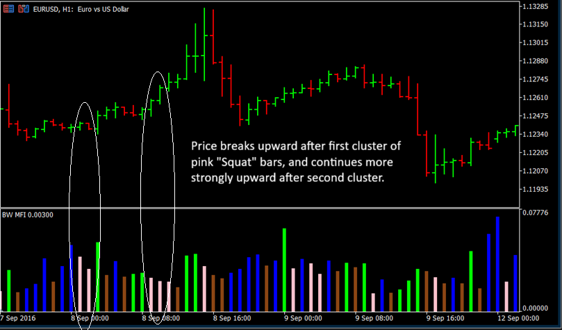
- Pink: MFI Down, Volume Up: Volume is increasing, but MFI is declining, meaning that price is producing less range relative to the increased volume. This is referred to as a Squat. It can signal a market struggle or possible exhaustion before a larger move; afterwards, price may break out in either direction, either continuing or reversing the established trend.
That explains the different colors you can see with the MFI Indicator. Here is what to know about the bar heights:
- Taller Bars: The price changed a lot with very little effort or volume, meaning the market is moving easily in that direction.
- Shorter Bars: The price moved very little even though there may have been a lot of trading volume, meaning the market is hitting resistance or stalling.
It may take some practice, but with time, you will learn to read this indicator with ease. Scrolling through your charts and noting the correlations between the indicator and what is going on with the price will help you become more MFI-literate.
How to plot the Market Facilitation Index indicator on your charts
It is easy to add the Market Facilitation Index indicator to your charts. Here is how the process works in MT5 (the process is the same in MT4):
- In the top menu, navigate to Insert, Indicators, and Bill Williams. From that menu, select Market Facilitation Index.
- A dialog box will open that lets you choose your options. You can pick whatever colors you want for the four different types of bars the indicator displays. You can choose how thick you want the bars to be, and you can pick either tick or real for Volumes (Forex symbols don't have real volume in MT5, but this option can be useful for exchange-traded symbols).
- Complete selecting your options, and click OK. The MFI will appear at the bottom of your chart.
It is recommended either sticking with the default colors or choosing colors that are intuitive to you. The more sense the colors make to you, the easier it will be for you to read and interpret the indicator.
How to use the Market Facilitation Index indicator while you trade
You can use the MFI indicator on any timeframe. You will need to pair it with a strategy, since it is not a system in and of itself. It is just a tool that provides you with some market context while you are trading.
Here is how you can interpret and use each type of bar:
- Lime: MFI Up, Volume Up: This is an opportunity to get in on a continuation of a trend. You could enter after a pullback and confirmation.
- Saddle brown: Both volume and MFI are declining, which can suggest that the existing move is losing participation or momentum. If you are in a position, you may want to make an exit. If you are not, you probably should wait to see what happens before you consider placing an entry.
- Blue: MFI Up, Volume Down: Waning enthusiasm means that the trend may not be as strong as it appears. Consider exiting your trade or reducing exposure if you are in one. If you are not, don't jump into a new trade right now.
- Pink: If this appears during a potential trade setup, it may be confirmation that there is about to be a breakout. Just keep in mind it may be continuation or reversal. If your strategy does not tell you which via other means, you could set up entries on either side so you are ready to catch a move either way.
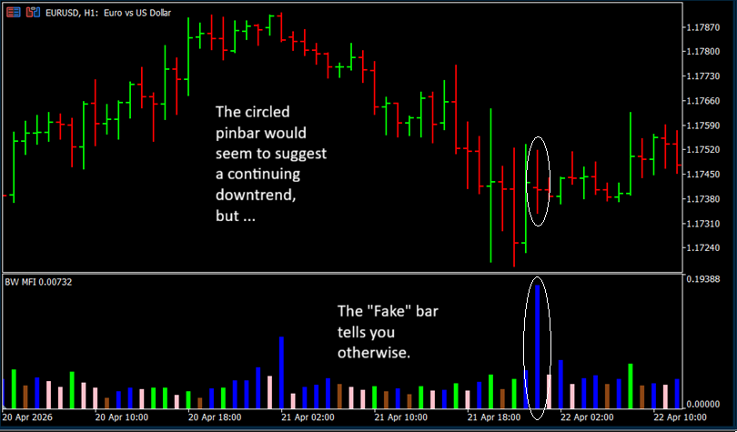
Here are a few examples. In the chart below, you can see a bearish pinbar. It's not perfectly formed, but it might look tempting. However, there is also a blue Fake bar in the BW MFI. Remember, such a bar can mean that enthusiasm is waning. This gives you reason to question whether the downtrend will really continue.
So, this might have been a good time to exit the trade. You can see that indeed price consolidates upward a bit at this point.
In this next chart, we have some pink Squat bars signaling a potential breakout. Price ends up moving upward, gradually at first, then more rapidly as another set of pink bars forms.
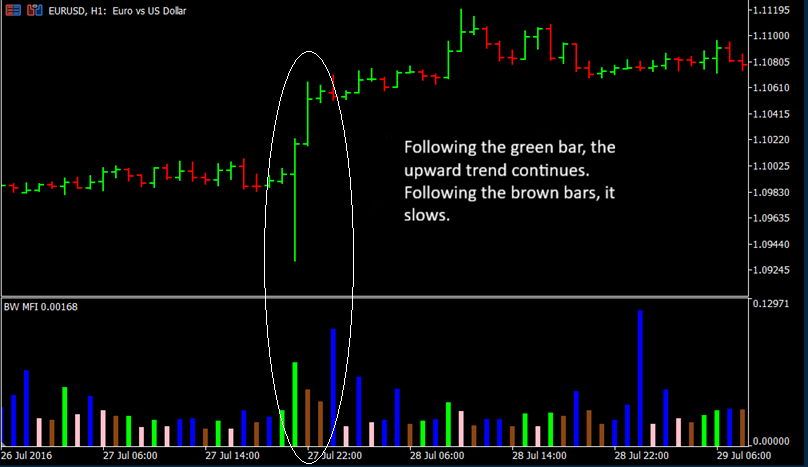
In this chart, a green bar forms in the BW MFI at the same time as a bullish pinbar. Green suggests a continuation. The next price bar continues a strong move upward.
You'll notice two brown bars in the indicator at this time, however, which suggests volume and trend are stalling. The upward movement continues, but sluggishly, consolidating along the way.
General tips for using the Market Facilitation Index indicator
- If you are a strong visual thinker and tend to find it easy to view and sort categories in your mind by color, the BW MFI may be an excellent addition to your chart. You might find it easier to see at a glance what is going on than you would with nothing but the red and green price bars.
- The MFI helps you interpret context, but not on its own. You will need to place it within a broader understanding of what is going on in order to make good trading decisions with it.
- To help you establish that context, you will need to use this indicator in combination with other indicators and price analysis.
- Some of the other Bill Williams' indicators can pair well with the BW MFI. For example, you can confirm momentum with the Awesome Oscillator, and tell whether momentum is accelerating or decelerating with the Accelerator Oscillator. The Alligator indicator can act as a trend regime and directional filter. Layer on the Gator Oscillator to check if the Alligator is waking, feeding or sleeping. Fractals can help you identify entry points for breakouts.
- In some scenarios, you are looking for confluence between the BW MFI and the other indicators or price patterns. For example, if the MFI has a pink bar, and you are seeing a breakout signal like a moving average crossover, that is a sign you have found a good setup.
- In other scenarios, you should note disagreement. The screenshot you can find above with a pinbar and a blue bar is a good example. The MFI could be telling you to exercise caution instead of jumping into a trade.
- Thoroughly test any strategy you are thinking of using before you take it live with real money. Backtest, then demo test. With a system that utilizes the Market Facilitation Index, it is wise to do extra testing, because how accurate the MFI is, and what it is telling you, can vary quite a bit depending on market conditions. You need to see how it performs in a broad range of contexts.
Conclusion: The BW MFI helps you see context
On its own, the Bill Williams' Market Facilitation Index indicator can leave some gaps in your vision of the current market conditions. But used in combination with a sound trading method, it can help shed some light on the context. Consider using it as one tool in your trading toolbox.


