
The present study provides an updated review of the most trending currency pairs in 2026. Additionally, it provides a script that you can use to calculate trend statistics for any set of trading instruments and timeframes.
Measuring the trendedness of a currency pair (or any other trading instrument) is always a challenge. It is accentuated by the problem of this trendedness changing over time. A currency pair might be trending strongly one year and be completely trendless the next year. Still, it is possible (and important if you trade the trend) to compare the trendedness of currency pairs based on a set of metrics to get a better understanding of which currency pairs trend the most and also how exactly they trend.
The study below analyzes 10 currency pairs based on six metrics. It explains how these metrics work and why they can serve as a rough proxy of a pair's trendedness.
Currency pairs
For the analysis, we chose 10 currency pairs that meet three conditions: they are very liquid (according to the 2025 Triennial Central Bank Survey), they have low spreads, and they are readily available at retail Forex brokers. For example, the rather liquid USD/CNY currency pair (which is the third most liquid in the world) is omitted because it is available only at a few brokers, its spreads are high, and trading is severely restricted by the People's Bank of China. Instead, we will look at the following currency pairs for this study (presented in alphabetical order):
- AUD/USD
- EUR/GBP
- EUR/JPY
- EUR/USD
- GBP/JPY
- GBP/USD
- NZD/USD
- USD/CAD
- USD/CHF
- USD/JPY
Methodology
We use the following methods to assess the trendedness of the currency pairs:
- Mean and median rate of change.
- Mean and median volatility.
- Mean and median number of consecutive closes above/below 50-period simple and exponential moving averages.
- Mean number of consecutive Higher High + Higher Low or Lower Low + Lower High occurrences.
- Mean number of consecutive bullish or consecutive bearish candles.
- Mean and median spikiness
Rate of change is calculated as the absolute difference between previous Close and the current Close, divided by the previous Close to get the percentage value. Obviously, this is a crude method of analysis. However, it can give us some hints on the pairs that trend often.
A currency pair’s volatility is calculated as a candle's High minus Low divided by its Open. It is calculated in percentage points too.
The above calculation are only a starting point. To identify the best of the trending currency pairs, we need to calculate precisely the number of periods a pair has been in a trend during some span of time. We need a dependable indicator to identify trends in three different timeframes. We use the moving average for that purpose. We calculate the mean and median number of consecutive closes above/below the moving average. By ranking the average of the number of closes above/below a moving average, we can get additional insights regarding how trending the pairs are. Beginners are often advised to use an exponential moving average instead of a simple one, as the former lags less (i.e., it follows a trend more quickly). We verify that as well by applying the calculations to both simple and exponential 50-period moving averages.
Consecutive Higher High + Higher Low or Lower Low + Lower High show exactly that — the streaks of bars that are formed according to one of the most popular definitions of trend.
Consecutive bullish and bearish candles show how likely a bearish candle is to be followed by other bearish candles, and the same goes for bullish ones.
Spikiness shows how often currency pairs were experiencing spikes — the situation where the body of the candle is much smaller than its wicks. A candle with a large body and almost no wicks will show a low level of spikiness, whereas a candle with the open and close at almost the same level and a large wick (or both wicks) will show a high level of spikiness.
All calculations are repeated on three timeframes: daily, weekly, and monthly. All currency pairs are analyzed using the data from 5 years back, from August 20, 2026. The data is derived from the MetaTrader 5 platform with a server in the GMT+2 time zone, which means that the weekly session goes from Monday 00:00 to Friday 23:59.
Calculations
Rate of change
We can calculate the absolute change in the exchange rate of a currency pair in a given period (day, week, month) using the following formula:


where N is the total number of periods.
The median rate of change is calculated by sorting the individual rates of change (Tn) and either picking the middle one (for an odd number) or calculating the mean of the two middle-most rates of change.
We have to use the percentage values because the direct (pips) rate of change would differ significantly among currency pairs as their exchange rates are not comparable.
The table provides the 5-year mean and median percentage (%) rate of change values for the studied currency pairs for three timeframes from August 21, 2021, until August 20, 2026.
| Currency pair | Daily | Weekly | Monthly | |||
| Mean | Median | Mean | Median | Mean | Median | |
| AUD/USD | 0.48 | 0.37 | 1.08 | 0.92 | 2.35 | 2.19 |
| EUR/GBP | 0.24 | 0.18 | 0.53 | 0.40 | 0.88 | 0.69 |
| EUR/JPY | 0.42 | 0.31 | 0.94 | 0.70 | 1.89 | 1.62 |
| EUR/USD | 0.35 | 0.27 | 0.73 | 0.54 | 1.73 | 1.64 |
| GBP/JPY | 0.44 | 0.33 | 0.96 | 0.64 | 1.89 | 1.57 |
| GBP/USD | 0.38 | 0.30 | 0.82 | 0.64 | 1.86 | 1.70 |
| NZD/USD | 0.49 | 0.39 | 1.14 | 1.00 | 2.71 | 2.35 |
| USD/CAD | 0.29 | 0.22 | 0.64 | 0.52 | 1.50 | 1.33 |
| USD/CHF | 0.38 | 0.30 | 0.83 | 0.65 | 1.95 | 1.82 |
| USD/JPY | 0.45 | 0.33 | 1.00 | 0.68 | 2.65 | 2.27 |
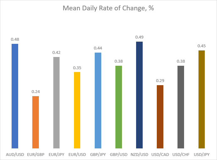
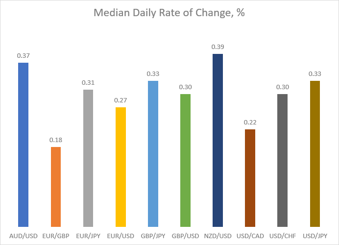
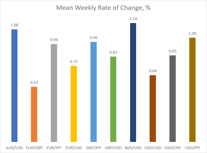
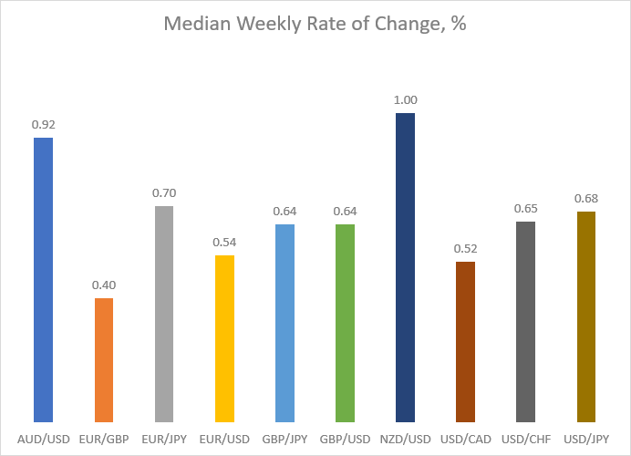
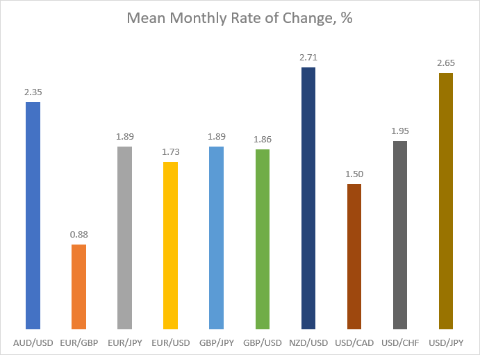
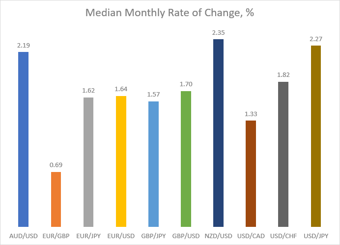
The table above shows how the mean and median changes (per day, per week, and per month) differ between currency pairs. The first noticeable thing is that they don't vary by a lot, at least on the daily and weekly timeframes. The situation is different in the monthly timeframe, particularly if we look at the median values. The rate of change of the most active currency pairs (AUD/USD and NZD/USD) is about three times bigger than that of the slowest currency pair (EUR/GBP). Let's look at the charts below to better analyze the differences between the currency pairs' average change for the period.
This year, there was a clear winner across all timeframes — NZD/USD. And just like the prior year, AUD/USD was close behind, showing the same or almost the same results on all timeframes except for monthly. USD/JPY was the third on the daily and weekly timeframes, except for the median measure on the weekly timeframe, where it lost third palce to EUR/JPY, while on the monthly timeframe it managed to seize second place. The rest of the pairs fell behind. And like last year, EUR/GBP showed the lowest rate of change, both mean and median, on all timeframes.
Volatility
The volatility of a currency pair can be calculated using the formula:


where N is the total number of periods.
The median volatility is calculated by sorting the individual volatility values (Vn) and either picking the middle one (for odd N) or calculating the mean of the two middle-most values (for even N).
The table summarizes the mean and median percentage (%) volatility values of the studied currency pairs for daily, weekly, and monthly timeframes from August 21, 2021, to August 20, 2026.
| Currency pair | Daily | Weekly | Monthly | |||
| Mean | Median | Mean | Median | Mean | Median | |
| AUD/USD | 0.99 | 0.89 | 2.17 | 2.01 | 4.62 | 4.57 |
| EUR/GBP | 0.52 | 0.46 | 1.14 | 0.99 | 2.26 | 2.03 |
| EUR/JPY | 0.85 | 0.74 | 1.93 | 1.68 | 4.05 | 4.01 |
| EUR/USD | 0.71 | 0.63 | 1.57 | 1.40 | 3.45 | 3.29 |
| GBP/JPY | 0.91 | 0.78 | 2.07 | 1.84 | 4.46 | 4.07 |
| GBP/USD | 0.78 | 0.67 | 1.73 | 1.56 | 3.74 | 3.34 |
| NZD/USD | 1.02 | 0.92 | 2.22 | 2.07 | 4.87 | 4.44 |
| USD/CAD | 0.59 | 0.52 | 1.30 | 1.20 | 2.80 | 2.66 |
| USD/CHF | 0.77 | 0.70 | 1.72 | 1.54 | 3.71 | 3.52 |
| USD/JPY | 0.88 | 0.76 | 2.06 | 1.88 | 4.69 | 4.63 |
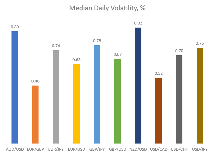
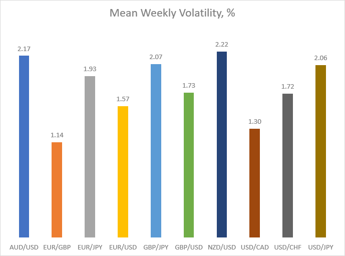
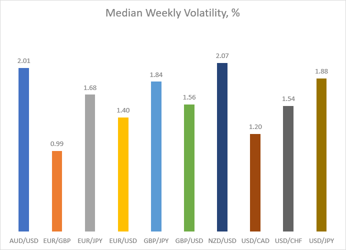
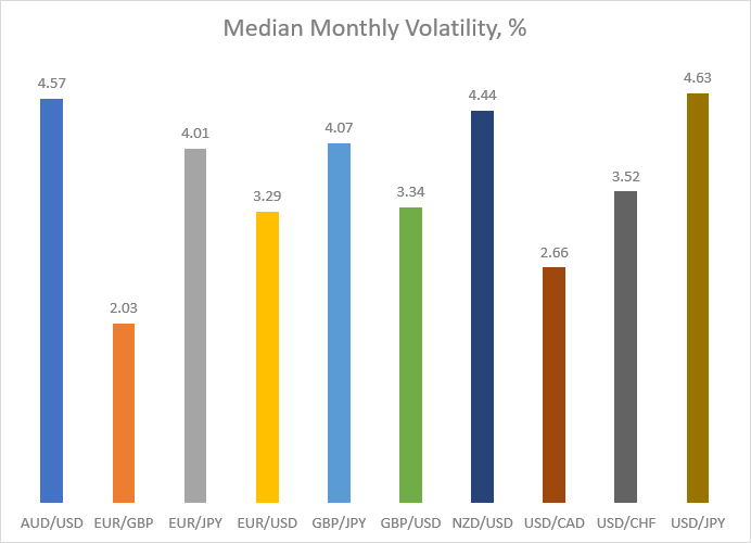
As you can see, the mean and median volatility of the studied currency pairs varies less than the rate of change. Unsurprisingly, the most volatile currency pairs were the same as the most trending pairs, as measured above using the mean rate of change. Below, you can find six charts that illustrate and help to compare the differences in volatility for the studied currency pairs.
AUD/USD and NZD/USD were fighting for first place among the most volatile currency pairs. NZD/USD was the most volatile on almost all timeframes, except for the monthly chart of median volatility, where USD/JPY came first. GBP/JPY was the third on the daily timeframe and in the mean measure of the weekly timeframe, while USD/JPY was the third in the median estimate of the weekly timeframe and on the monthly timeframe. EUR/GBP demonstrated the lowest volatility on all timeframes.


Consecutive closing above/below moving average
One of the most intuitive methods to detect Forex trends is to use a moving average. We calculate the mean and median number of consecutive closes above and below a 50-period (daily, weekly, and monthly) moving average (both simple and exponential).
| Daily | ||||
| Currency pair | SMA | EMA | ||
| Mean | Median | Mean | Median | |
| AUD/USD | 11.4 | 3.0 | 10.5 | 4.0 |
| EUR/GBP | 10.1 | 5.0 | 10.2 | 5.0 |
| EUR/JPY | 11.7 | 4.0 | 10.0 | 3.0 |
| EUR/USD | 15.1 | 4.0 | 13.8 | 4.0 |
| GBP/JPY | 11.1 | 4.0 | 9.6 | 3.0 |
| GBP/USD | 14.1 | 4.0 | 12.5 | 5.0 |
| NZD/USD | 11.2 | 3.0 | 9.5 | 3.0 |
| USD/CAD | 10.8 | 3.0 | 9.4 | 3.0 |
| USD/CHF | 10.7 | 3.0 | 9.8 | 2.0 |
| USD/JPY | 16.0 | 4.0 | 14.6 | 3.0 |
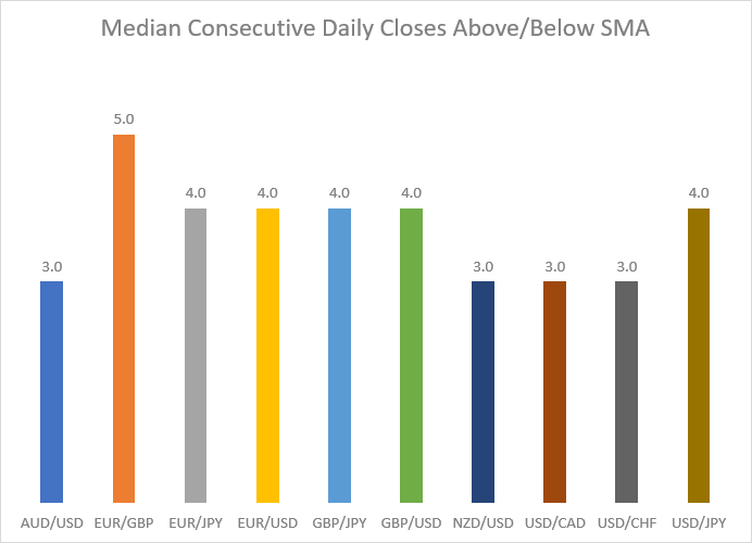
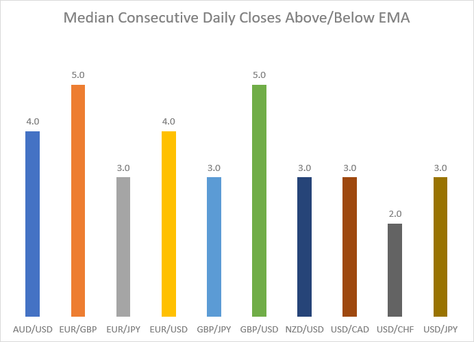
Just like last year, the analysis made in 2026 showed that all measurements were rather close to each other. The comparison of the pairs is illustrated well in the charts below.
Unlike in the previous measures, there were no clear winners. According to the mean estimate, USD/JPY demonstrated the biggest number of consecutive days above/below SMA and EMA. EUR/USD was following in second place, and GBP/USD took third place. If we turn to median measures, EUR/GBP showed the highest result when looking at SMA. But if we look at the median EMA measure, EUR/GBP and GBP/USD showed the same value of 5.0, while most other currency pairs were lagging behind at the same level of 3.0, except for AUD/USD and EUR/USD, which demonstrated a value of 4.0, as well as USD/CHF, which resided at 2.0.


The table for the consecutive weeks above and below the moving averages is presented below.
| Weekly | ||||
| Currency pair | SMA | EMA | ||
| Mean | Median | Mean | Median | |
| AUD/USD | 10.0 | 3.0 | 7.4 | 3.0 |
| EUR/GBP | 10.4 | 2.0 | 7.4 | 2.0 |
| EUR/JPY | 11.3 | 3.0 | 12.3/td> | 4.0 |
| EUR/USD | 13.6 | 5.0 | 9.6 | 3.0 |
| GBP/JPY | 11.3 | 3.0 | 11.3 | 3.0 |
| GBP/USD | 12.3 | 5.0 | 7.4 | 3.0 |
| NZD/USD | 6.0 | 3.0 | 6.0 | 3.0 |
| USD/CAD | 9.3 | 5.0 | 8.9 | 6.0 |
| USD/CHF | 12.3 | 5.0 | 10.8 | 4.0 |
| USD/JPY | 15.2 | 8.0 | 11.3 | 2.0 |
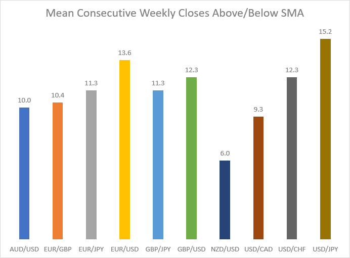
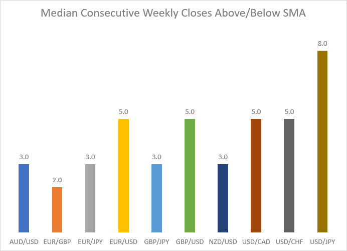
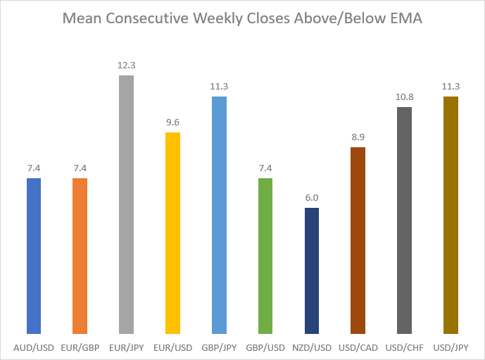
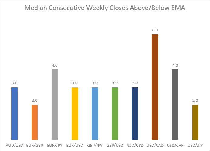
USD/JPY demonstrated the highest number of consecutive weeks above/below SMA on both the mean and the median measures but surprisingly showed the lowest number of consecutive weeks above/below EMA on the median measure. On the mean measure, EUR/JPY showed the highest number of consecutive weeks above/below EMA, while USD/CAD was in the first place on the median measure. The results for other currency pairs varied widely on different charts. EUR/USD was in second place, and both GBP/USD and USD/CHF were in third place if we look at the mean measure of weeks above/below SMA. Looking at the mean measure of consecutive weekly closes above/below EMA, though, we can see that GBP/JPY and USD/JPY shared second place, and USD/CHF was third. Turning to the median measure, we can see that currency pairs were rather close to each other. EUR/USD, GBP/USD, USD/CAD, and USD/CHF shared second place when counting the number of consecutive weeks above/below SMA, whereas the rest of the currencies were lagging behind, with EUR/GBP showing the lowest number of consecutive weeks above/below SMA. But if we look at the median measure of weeks above/below EMA, EUR/JPY and USD/CHF shared second place, and all other currency pairs were very close to each other. Again, EUR/GBP, together with USD/JPY, showed the lowest number of consecutive weeks above/below EMA.
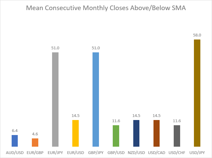
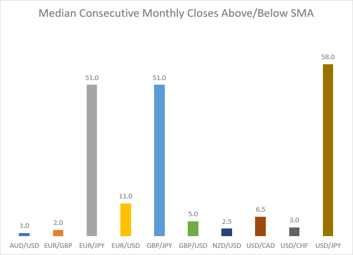
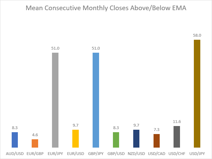
The table for the monthly data is presented below. Unfortunately, it doesn't offer reliable information because 5 years contain just 60 monthly candles to work with.
| Monthly | ||||
| Currency pair | SMA | EMA | ||
| Mean | Median | Mean | Median | |
| AUD/USD | 6.4 | 1.0 | 8.3 | 4.0 |
| EUR/GBP | 4.6 | 2.0 | 4.6 | 2.0 |
| EUR/JPY | 51.0 | 51.0 | 51.0 | 51.0 |
| EUR/USD | 14.5 | 11.0 | 9.7 | 6.5 |
| GBP/JPY | 51.0 | 51.0 | 51.0 | 51.0 |
| GBP/USD | 11.6 | 5.0 | 8.3 | 4.0 |
| NZD/USD | 14.5 | 2.5 | 9.7 | 2.5 |
| USD/CAD | 14.5 | 6.5 | 7.3 | 1.0 |
| USD/CHF | 11.6 | 3.0 | 11.6 | 7.0 |
| USD/JPY | 58.0 | 58.0 | 58.0 | 58.0 |
USD/JPY demonstrated the highest number of consecutive monthly closes in all instances, while EUR/JPY and GBP/JPY shared the second highest number of consecutive closes. Again, only 60 candles were used for the calculation. This means prices did not have many opportunities to move from above the moving average to below or vice versa, making the average number of months above/below MA unreliable.

Higher High + Higher Low and Lower Low + Lower High
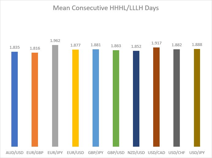
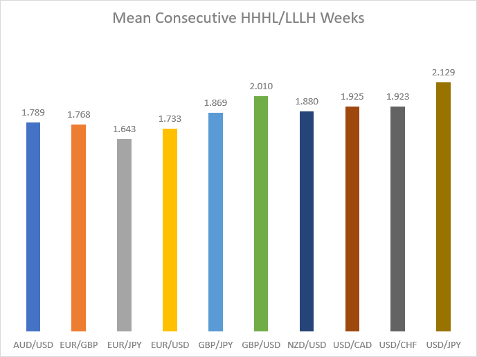
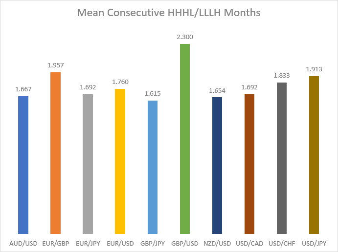
A currency pair is generally believed to be trending if it forms consecutive Higher Highs with Higher Lows (HHHL) in an uptrend or Lower Lows with Lower Highs (LLLH) in a downtrend. We calculate the mean number of HHHL and LLLH patterns for each currency pair on the daily, weekly, and monthly timeframes.
| Currency pair | Mean length of HHHL or LLLH streak | ||
| Daily | Weekly | Monthly | |
| AUD/USD | 1.835 | 1.789 | 1.667 |
| EUR/GBP | 1.816 | 1.768 | 1.957 |
| EUR/JPY | 1.962 | 1.643 | 1.692 |
| EUR/USD | 1.877 | 1.733 | 1.760 |
| GBP/JPY | 1.881 | 1.869 | 1.615 |
| GBP/USD | 1.863 | 2.010 | 2.300 |
| NZD/USD | 1.852 | 1.880 | 1.654 |
| USD/CAD | 1.917 | 1.925 | 1.692 |
| USD/CHF | 1.882 | 1.923 | 1.833 |
| USD/JPY | 1.888 | 2.129 | 1.913 |
In the charts below, you can see the illustration of the data presented in the table above. The results were all over the place in this measurement. EUR/JPY demonstrated the biggest number of consecutive HHHL/LLLH days, with USD/CAD taking second place and USD/JPY following in third. EUR/GBP, meanwhile, was the least trending pair in this measurement. But things change dramatically if we look at the weekly timeframe. In this timeframe, USD/JPY demonstrated the largest number of consecutive HHHL/LLLH weeks, with GBP/USD taking second place and USD/CAD coming third. And on the monthly timeframe, GBP/USD went ahead of the rest, while EUR/GBP took second place and USD/JPY third.
Consecutive bullish/bearish candles
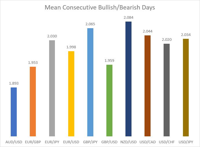
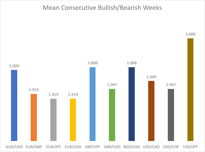
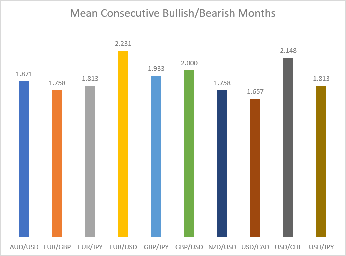
A blunter way to measure trends is to record the average number of consecutive bullish or bearish candles. It ignores the Higher High + Higher Low and Lower Low + Lower High condition outlined in the previous analysis but still captures useful information about the currency pair's trendedness. The following table contains the mean values of consecutive bullish/bearish candles for each currency pair on the daily, weekly, and monthly timeframes.
| Currency pair | Mean consecutive bullish/bearish candles | ||
| Daily | Weekly | Monthly | |
| AUD/USD | 1.893 | 2.000 | 1.871 |
| EUR/GBP | 1.953 | 1.933 | 1.758 |
| EUR/JPY | 2.030 | 1.919 | 1.813 |
| EUR/USD | 1.998 | 1.919 | 2.231 |
| GBP/JPY | 2.065 | 2.008 | 1.933 |
| GBP/USD | 1.959 | 1.947 | 2.000 |
| NZD/USD | 2.084 | 2.008 | 1.758 |
| USD/CAD | 2.044 | 1.969 | 1.657 |
| USD/CHF | 2.020 | 1.947 | 2.148 |
| USD/JPY | 2.034 | 2.089 | 1.813 |
On the daily timeframe, NZD/USD showed the highest number of consecutive bullish/bearish days, though GBP/JPY and USD/CAD were just a little behind it. On the weekly timeframe, USD/JPY demonstrated the biggest number of consecutive bullish or bearish weeks. Other currency pairs lagged behind, with GBP/JPY and NZD/USD sharing the second and AUD/USD taking the third highest number of consecutive bullish/bearish weeks, respectively. Most currency pairs were very close in the number of consecutive bullish/bearish months. However, there were outliers, like EUR/USD, which showed a noticeably higher number of consecutive bullish/bearish months than the rest of the pairs, as well as USD/CHF and GBP/USD, which had the second and the third highest number of consecutive bullish/bearish months, respectively.
Spikiness
Spikiness is a measure that shows how likely a currency pair is to create a spike — a wick (or wicks) that is much bigger than the body of the candle. Spikiness is calculated by dividing High - Low (the whole range of the move) by Open - Close (the length of the candle's body). The minimal figure is 1, and there is no specific upper limit to the spikiness value. Spikiness is a very useful measure for determining the trendedness of currency pairs. Low spikiness means that, usually, the currency pair has candles with large bodies and small wicks, and that is a sign of a strong market sentiment, which means the pair tends to move in a particular direction. On the opposite side, high spikiness shows a tendency for a currency pair to have candles with short bodies and long wicks, and that is a sign of market uncertainty, which usually leaves the pair trading without a strong trend.
The spikiness of the specific candle i is determined using this formula:
If Openi - Closei = 0, the symbol's price point is used as a divisor:
| Currency pair | Daily | Weekly | Monthly | |||
| Mean | Median | Mean | Median | Mean | Median | |
| AUD/USD | 7.68 | 2.14 | 9.05 | 2.19 | 5.96 | 2.07 |
| EUR/GBP | 7.48 | 2.41 | 12.02 | 2.35 | 12.46 | 2.83 |
| EUR/JPY | 6.92 | 2.10 | 16.16 | 2.14 | 13.85 | 2.32 |
| EUR/USD | 7.23 | 2.17 | 7.67 | 2.48 | 4.50 | 1.94 |
| GBP/JPY | 6.57 | 2.24 | 32.85 | 2.50 | 135.16 | 2.47 |
| GBP/USD | 7.89 | 2.14 | 17.82 | 2.36 | 4.72 | 1.82 |
| NZD/USD | 6.50 | 2.24 | 6.08 | 2.02 | 3.63 | 2.16 |
| USD/CAD | 7.86 | 2.25 | 12.54 | 2.12 | 2.85 | 1.79 |
| USD/CHF | 7.80 | 2.13 | 5.25 | 2.41 | 5.61 | 1.59 |
| USD/JPY | 8.36 | 2.11 | 5.61 | 2.39 | 4.03 | 1.78 |
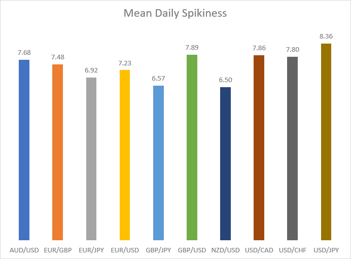
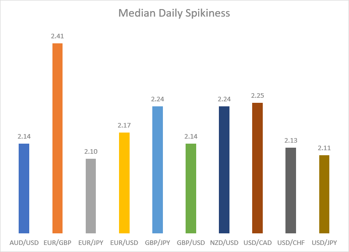
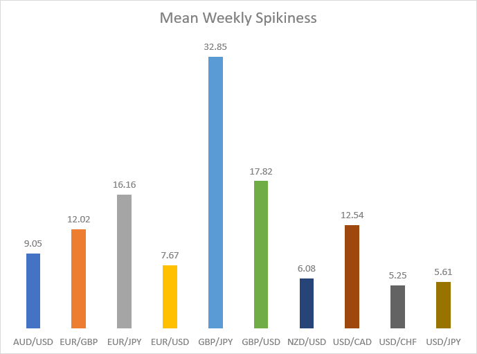
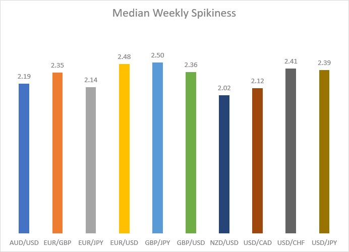
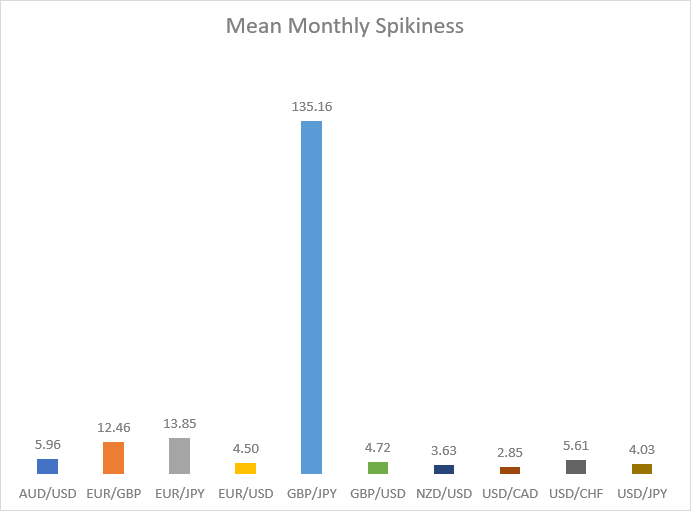
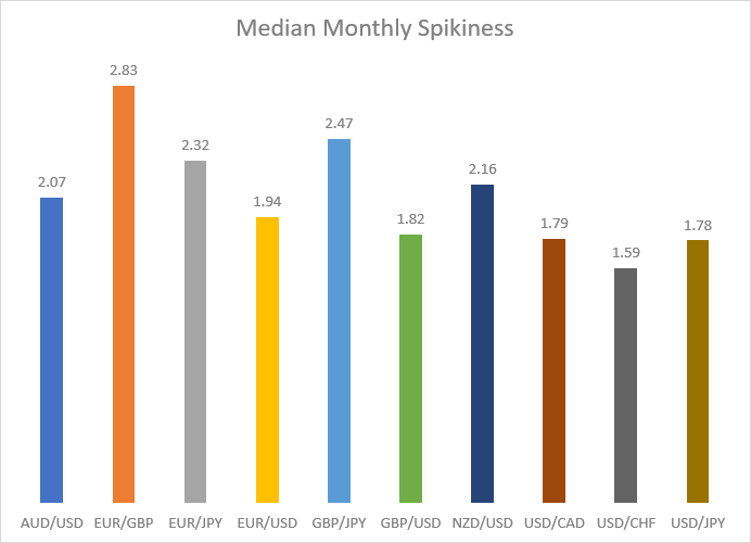
The table above shows the spikiness values, while the graphs below show their visual representation with bars. The mean measure on the daily timeframe shows that USD/JPY has the highest level of spikiness of all the currency pairs examined, though AUD/USD, GBP/USD, USD/CAD, and USD/CHF were not that far behind. NZD/USD demonstrated the lowest level of spikiness. On the median measure, the situation was rather different, with EUR/GBP taking the lead, while EUR/JPY demonstrated the lowest amount of spikiness. Things become weird when we turn to the mean measure in longer timeframes. GBP/JPY shoots to the upside in the weekly timeframe, and in the monthly timeframe, it shows an insane value that is 10 times higher than any other currency pair. This phenomenon can be explained by the way the value is calculated. Even one candle with an almost non-existent body (which happens when the close is the same or very near to the open) and a big wick can significantly skew the average figure, and the GBP/JPY currency pair had several such candles over the 60 months included in the calculation. That means the mean number is highly unreliable, and we should pay more attention to the median figures as such extremes are smoothed in their calculation. In the weekly timeframe, GBP/JPY takes the lead, while EUR/USD follows close behind, becoming the pair with the second-highest spikiness. NZD/USD was the pair with the lowest weekly spikiness. Turning to the monthly timeframe, we can see that EUR/GBP turned out to be the pair with the highest spikiness, while USD/CHF was the pair with the lowest level of spikiness over the months.
Conclusions
Our research has revealed the following facts based on the studied period of 5 years:
- NZD/USD, USD/JPY, and AUD/USD have the largest expected rate of change for any of the studied periods — day, week, and month. These should be your currency pairs of choice if your trading strategy involves opening a trade and holding it for some fixed period of time.
- NZD/USD, GBP/JPY, USD/JPY, and AUD/USD are also the most volatile pairs. This means that the average candle on these pairs' charts is likely to be longer than that of other currency pairs. This can be used to capture large short-term movements with well-placed take-profit orders. This conclusion (along with the one above) also seems to be very reliable as the currency pairs lead not only by mean but also by median values.
- EUR/USD, GBP/USD, EUR/GBP, and USD/JPY are the best-trending pairs when measuring trends with a moving average on a daily timeframe.
- USD/JPY, USD/CAD, USD/CHF and EUR/JPY enter longer trends on average on a weekly timeframe.
- Monthly timeframe comparison to moving averages is highly unreliable, so there is little point in trying to get any insights from GBP/JPY, EUR/JPY, and USD/JPY dominance there.
- There isn't much difference between simple and exponential moving averages when measuring trends.
- The data on consecutive Higher High + Higher Low or Lower Low + Lower High is very mixed with no clear leaders.
- Consecutive bullish/bearish candles data is also very mixed but suggests that trading in NZD/USD, GBP/JPY, and USD/CAD on a daily timeframe can be more lucrative if your strategy relies on candles repeating their color.
- EUR/GBP and GBP/JPY demonstrated the highest level of spikiness, making them preferable for traders who like to trade rapid short-lived swings, like day traders. For those who prefer a more stable and predictable currency pair, NZD/USD seems to be the best choice.
Additionally:
- The higher volatility on GBP/JPY, NZD/USD, USD/JPY, and AUD/USD also warrants a wider stop-loss for your trades.
- The low median number of days above/below a moving average for most currency pairs (just 3 or 4 days, with only EUR/GBP, as well as GBP/USD on the median measure of days above/below EMA, reaching 5) suggests that the basic moving average crossover strategy is ineffective with most trading instruments. Whether expecting the high median values to hold for pairs that had them high during the previous 5 years is a good idea is another (unanswered) question.
- If you were to answer the question of what the most trending currency pair is based on all the data in this study, it would make sense to say that it is either AUD/USD or NZD/USD. However, it should be noted that the latter usually involves lower spreads. Also, this year, GBP/JPY demonstrated a tendecy for trending in a significant number of measured results
Important note: Past performance is not an indication of future performance. This means that it might be impractical to base actual trading on expectations that the trending behavior will remain the same as it was during the studied period.
Script
And now, to the most important stuff — a MetaTrader script that can be used to get the same data that is presented in this study and even more. TrendStats script consists of two files that should be unarchived into the same subfolder inside your \MQL4\Scripts\ folder (\MQL5\Scripts\ for MetaTrader 5). You need to compile TrendStats.mq4 (for MetaTrader 4) or TrendStats.mq5 (for MetaTrader 5); TrendStats.mqh is an included file used by TrendStats.mq4 and TrendStats.mq5.
The script, when run on any chart, will analyze a list of currency pairs (given via input parameters) on a range of timeframes (also given via input parameters) and on a given time period (also changeable via input parameters). It will produce .csv files with output results and will also print the results in the Experts tab of the terminal. Here is the list of input parameters for the script:
- Symbols — a list of currency pairs and other trading instruments you want to analyze. Enter them as they are listed in your Market Watch window. You can use space, comma, or semicolon to separate them.
- Timeframes — a list of timeframes to process. Enter them as
M1,H4, orPERIOD_M1,PERIOD_H4, and so on. Same as with Symbols, recognized separators are space, comma, and semicolon. - PeriodToProcess — a period to process by the script. It is a choice of one of the following options:
Last_5_Years: the same as was used in this study.Time_Period: you set the exact start and finish dates via StartDate and FinishDate inputs.Last_N_Candles: you set the exact number of candles to process via the N input parameter.
- StartDate — ignored unless
Time_Periodis selected in PeriodToProcess. - FinishDate — ignored unless
Time_Periodis selected in PeriodToProcess. - N — ignored unless
Last_N_Candlesis selected in PeriodToProcess. - Time_Shift — you can set the time shift in hours to move the start of the day. This is useful if your broker has an unconventional time zone. For example, if your server is UTC-7 and you want the day to start exactly at 00:00 UTC, you set this parameter to 7. Please note that setting a non-zero Time_Shift will make the script calculate everything using H1 data only — it will be converted to other timeframes you request via the Timeframes parameter, but there might not be enough H1 candles to generate enough high-timeframe data. The script won't calculate moving average statistics if this parameter is set to a non-zero value.
- MA_Period — a moving average period for moving average comparison stats.
- FileNamePrefix — a prefix for the generated .csv file names.
- SilentMode — if true, the silent mode will prevent the script from outputting any calculation data into the Experts tab of the terminal. Service and error messages will still be printed.
Downloads (ver. 1.01, 2024-05-21):
The resulting .csv files are generated in the \MQL4\Files\ folder (or \MQL5\Files\ for MT5).
If you have some questions about this study of the major currency pairs' trendedness, if you want to suggest some other measures of trendedness to analyze, or if you find some bugs in the TrendStats script, please proceed to our Forex forum.


