Volume Spread Analysis
Contents
- The origin of Volume Spread Analysis
- Why is volume so important?
- What candles can tell you in Volume Spread Analysis
- Basic rules of Volume Spread Analysis
- Examples of validation and anomaly
- Three steps to analyze candlestick charts in Volume Spread Analysis
- Trend analysis and cycles in VSA
- Candle patterns
- Support and resistance
- Dynamic trendlines with isolated pivot points
- Conclusion
While analyzing the Forex market, most traders focus on prices and their moves. That makes sense. After all, buying low and selling high is the basis of trading. But the price is not the only metric by which you can judge the market. Volume can also be a factor to use in your analysis. If, for example, a few traders decide to sell a currency, it does not mean much. But if thousands of traders decide to do the same, it probably warrants attention.
But volume itself also cannot tell much. Just knowing how many participants are involved in the market is of little use without knowing what they are doing. That is why combining the study of both price moves and the accompanying volume can seem like a good idea. Such a type of analysis can potentially be a tool to help you understand what is going on with the market and where it can be heading next.
The form of analysis that studies both price action and volume is called Volume Price Analysis or Volume Spread Analysis. The ‘spread’ part in the latter name refers to the spread between the opening and the closing price. This article will use the term ‘Volume Spread Analysis’ (or VSA for short).
The VSA is typically performed on candlestick charts. Other types of charts, such as bar, line, or Kagi charts, are ill-suited for it.
The present article explains the basics of the Volume Spread Analysis as well as more in-depth concepts, such as the study of candlestick charts, trends, supply and resistance within the VSA paradigm.
The origin of Volume Spread Analysis
The name Richard Wyckoff is usually brought up when talking about the origin of the VSA. He was an American stock investor as well as a founder and an editor of the Magazine of Wall Street. After founding a success in financial markets, he decided to become an educator and teach other investors and traders so they could follow in his footsteps.
One of his contributions to the theory of trading was three basic laws:
- The Law of Supply and Demand. It is the simplest of the three laws to understand and, probably, the most well-known. It postulates that supply and demand balance out each other eventually. If demand is high and supply is low, then prices will rise until demand falls to the level where supply will be able to satisfy it. If demand is low and supply is high, then prices will fall until demand rises enough to absorb the excessive supply.
- The Law of Cause and Effect. It postulates that the ’cause’ will be followed by an ‘effect’ that will be proportional to the ’cause’. If the ’cause’ is strong, then the resulting ‘effect’ (trend) will also be strong. The weak ’cause’ will lead to a weak trend.
- The Law of Effort vs. Result. It states that the result should reflect the amount of effort spent to get it. In other words, the large amount of volume should result in a significant price move (spread). If the spread is small, this should mean that volume was also small. Any deviation from this rule should be considered an anomaly.
Why is volume so important?
But should not the price alone be enough for analysis? After all, it is what ultimately drives the decisions traders make. So, why care about how big or small the volume is? Should it not be reflected in the price moves anyway, as postulated in Wyckoff’s third law?
Well, let us return to the previous comparison of one trader versus a thousand. It stated that one trader is not important while a thousand is. That is not necessarily always correct. And that is because the statement does not take into account what type of traders we are speaking about. If that one trader is a big bank, and the thousand traders are just regular retail traders, it is likely that they have no chances to contend with the bank. Many market experts often say that retail traders almost always lose in the end.
And that is why proponents of the Volume Spread Analysis think that the VSA is so important: they believe that markets are manipulated. Banks, various funds, and other big financial institutions are the ones who are driving markets, not the average Joe who tried to dabble in trading. They have means to affect markets in the ways retail traders are simply incapable of. And that does not include just their big capital but also their intimate knowledge of the current supply-demand balance, not available to regular traders, and their ability to influence news outlets to drive the market sentiment in the ways those insiders need. While insider trading is considered a crime when a regular person is involved, big institutions are not only allowed but even licensed to do that. Some think that it proves that markets are inherently unfair. Others argue that those institutions perform an essential job as market makers, providing liquidity to the markets. Whatever the case, fans of the VSA argue that for successful trading, it is imperative to understand what market makers are currently doing. If you have traded for some time, you have probably heard the adage “follow the smart money”. Well, those insiders are supposed to be smart money. But how to know that? They are not going to tell you that, and they are not overt in their actions.
Here is where volume comes into play. According to the Volume Spread Analysis, it is hard to hide the volume. Yes, the advocates of the VSA think that insiders learned to conceal their actions by spreading buying and selling over a period of time, so their influence over the markets was not apparent. Still, fans of the VSA believe that a keen-eyed observer should be able to notice changes in volume that signal strong market activity. As stated by Wyckoff’s third law, the result should be proportional to the effort. Therefore, if a significant move of prices up or down is accompanied by a rise in volume, then this move is valid and not an anomaly. In other words, volume validates price moves.
Volume Spread Analysis is also supposed to help you understand when a cycle or trend starts and at what point the prices currently are precisely in the cycle/trend. What is interesting, the common wisdom is to buy when the prices are rising and to sell when they start to fall. But supporters of the VSA argue otherwise. To understand their viewpoint, imagine a wholesaler. When their inventories are low after they have sold out their goods and drew prices lower, they start buying goods at low prices. When inventories are full and prices have risen due to scarcity of the goods (either real or manufactured by news outlets), the wholesaler starts to sell goods until inventories are empty and prices are low again. Then the cycle continues. And that is how market makers, supposedly, work. When prices show a sharp drop accompanied by big volume, that signals panic selling by retail traders, whereas smart money is buying. A sharp increase in prices which is validated by volume, suggests that smart money is selling while regular traders are buying due to fear of missing out (FOMO).
The Forex market is a special case in the VSA. The problem is that Forex does not report the actual volume. Instead, it is replaced with a tick volume. It is not an ideal tool. Different brokers can report different tick volumes for the same currency pair at the same period. Data accuracy depends on whether the broker is subscribed to the expensive services of one of the wholesale data providers. But studies say that tick volume shows about 90% accuracy in representing true market activity. And as volume is directly correlated to market activity, tick volume can be considered a valid substitute for real volume.
To sum up the importance of volume. It validates price moves. It reveals manipulations in manipulated markets. And it shows the real market sentiment in pure markets.
What candles can tell you in Volume Spread Analysis
As was said in the introduction, the Volume Spread Analysis is performed on candlestick charts as it is ill-suited for other types of charts. Fortunately, it should not be a problem for most traders as candlestick charts are arguably the most popular chart type among Forex traders.
While you are probably familiar with the basic concept of a candle on a candlestick chart, it will be helpful to refresh your memory. Depending on the chosen time frame, each candle can represent a minute, five minutes, fifteen minutes, half an hour, an hour, four hours, a day (a full trading session), a week, or a month. Here is how candles look and what their basic parts are:
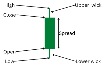
The candle’s body shows the spread between the opening and closing prices. Depending on the color of the candle or its body, it can be either bullish or bearish. In our example, a bullish candle is indicated by green color and bearish by red color. In the default MetaTrader color scheme, a bullish candle has an empty (black) body, while a bearish candle has a filled (white) body. In a bullish candle, the bottom of the body shows an opening price, and the top shows a closing price. In a bearish candle, the reverse is true — the top of the body shows an opening price, and the bottom shows a closing price. Wicks show the high and the low of the chosen time period. For the sake of simplicity, the rest of the article will use a daily time frame for discussion of candles and price moves. Therefore, each candle represents a trading session. In this case, wicks show the session’s high and the low.
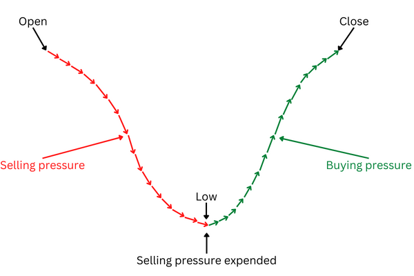
To understand how price moves during a session can form a candle and its parts, look at the following visual representation of price moves during a session:
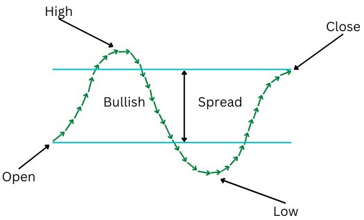
In this example, prices moved higher after the session opened, but the sellers took control and moved prices below the opening level, only for the buyers to wrestle the control back and push prices higher to close above the opening level. This would create a bullish candle, with wicks showing the high and the low of the session and the body of the candle showing the spread between the open and the close.
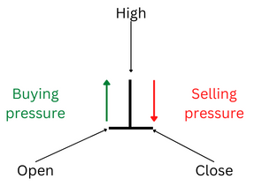
In the Volume Spread Analysis, the most important parts of the candle are the spread and the wicks. That is because the VSA considers candles to be a representation of not just price moves but also of market sentiment. According to this interpretation, the spread shows the strength of the sentiment. A wide spread indicates a strong sentiment. A narrow spread suggests that the sentiment is weak. Wicks show changes in sentiment during the session. After all, if the sentiment were consistent during the session, there would be no wicks. For example, if the sentiment were consistently bullish, the price would be steadily rising from the open to the close without going below the open or above the close, therefore creating no highs and lows during the session (or, technically, the high would be the same as the closing price, and the low would be the same as the opening price) and no wicks on the candle.
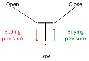
Let us look closer at how wicks are formed and what they reveal about changes in sentiment. To make the examples clearer, we assume that the price ended the session at the same level as it started. In other words, the spread is zero.
Here is an example of how an upper wick will form in such a situation:
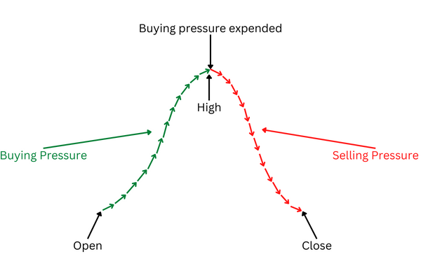
In this example, the price started the session moving higher. But as the price has been rising, the sellers started to come to the market. After a while, they overpowered the buyers as the price became too high, and the price returned back to where it had started.
But what do those price moves tell us about the sentiment? First, they show that the sentiment completely reversed during the session. Second, the sentiment was bearish at the end of the session. Does this mean a change in a trend? Not necessarily. To make such a call, you need to look at the broader picture as well as to combine both price and volume in your analysis. And this was just a simple theoretical example of how an upper wick can be created.
How will this price move look on a chart? Let us look at the upper wick created by it:
The following example shows how a lower wick is created:
In this example, the price started the session with a move down. But as it was falling, the price started to become more and more attractive for buyers. As a result, buyers began to come to the market in increasing numbers, eventually overpowering sellers and pushing the price back up. In this instance, the market sentiment also completely reversed during the trading session. But unlike the previous example, the market closed with a bullish sentiment as the price was moving higher before the close.
And here is the resulting lower wick, created by the price move:
Basic rules of Volume Spread Analysis
People who use the Volume Spread Analysis state that there are six basic rules that any trader, who wants to employ the VSA, should remember.
- Volume Price Analysis is art, not science. While data used in technical analysis may be precise, the interpretations of the data can vary from trader to trader. That is why the VSA can be somewhat subjective and sometimes depend more on intuition than hard data. Another result of this rule is the fact that the VSA poorly lends itself to automation. While you can try to create an algorithm using the VSA, ultimately, the Volume Spread Analysis works better when a living human makes decisions, not a robot.
- VSA requires patience. Any trader who uses the Volume Spread Analysis should learn to be patient (though patience is a good feature for trading in general). Just because you registered a trading signal does not mean you should enter the market. Markets usually have strong inertia, and it takes time for them to reverse momentum. After all, when buyers start to overwhelm sellers (or vice versa), the latter typically do not surrender immediately and try to hold their ground for a while. That is why, when you get a trading signal, do not act immediately but be ready for the coming change.
- You want consistency from your data, not precision. If you compare candles from different brokers and trading platforms, even candles representing the same trading session can vary slightly (and sometimes significantly). That is because different brokers can use different data feeds. Furthermore, the computing power of your PC, the speed of your internet, and other similar things can affect the data that your trading platform shows to you. And volume is also relative. But the consistency of the data is more important than its precision. If the data shows that volume is significantly higher or lower than average, so long as this is correct, it does not matter precisely what the current volume and the average are. That is why, as long as you use the same data feed, you can rely on the Volume Price Analysis with relative certainty.
- VSA requires practice. This one is simple. It takes time and effort to master the VSA and learn how to adjust it to your trading style. Just be patient and learn from your mistakes, and you will be rewarded in the end.
- Combine the VSA with regular technical analysis. While the Volume Spread Analysis is a powerful tool, it should be supplemented with other types of technical analysis. In particular, trends, as well as support and resistance, are particularly important for the successful usage of the VSA.
- Look for validation or anomaly. This is probably the most important rule. In essence, you are doing only one thing when using the VSA: looking for either validation or anomaly. If volume validates the price, the price will likely continue to behave the same way as before. Anomaly (disparity between volume and price behavior) signals about a potential change or reversal of the trend. The next chapter will discuss validation and anomalies in more detail.
Examples of validation and anomaly
To help you understand what price moves the Volume Spread Analysis considers to be validation and what it considers to be an anomaly, this chapter will provide examples of validations and anomalies on candlestick charts.
Single-candle examples
Let us start with something easy. To do this, we will look at how validation or an anomaly can look on a single candle.
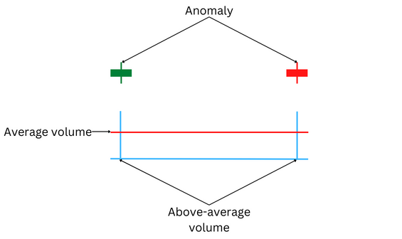
Validation
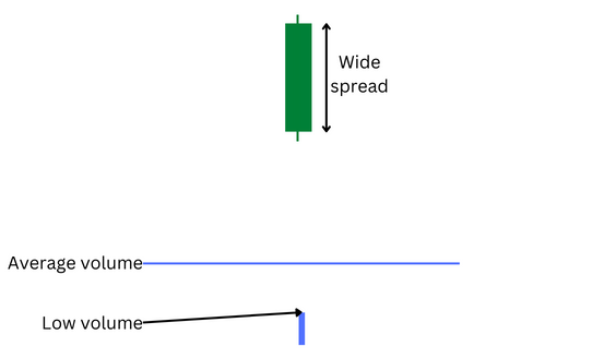
The first example shows a candle with a wide spread and small wicks:
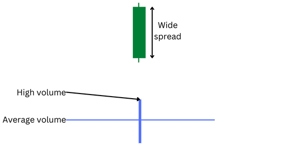
Here, we can see a significant price move. According to Wyckoff’s third law, a great effort should be responsible for this result. And indeed, volume confirms this, being high. According to the VSA, this means that volume validates the price.
But what can this example tell us about the market? According to the VSA, two things:
- The price move was legitimate, and insiders were not manipulating the market.
- The market sentiment is bullish (and strong, considering that the wicks are small), and if you have long positions, you should hold them.
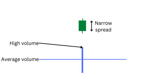
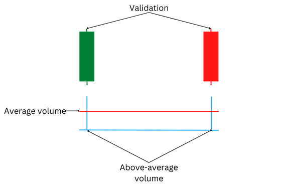
Let us look at another example. This time, the spread is narrow, and the wicks are small:
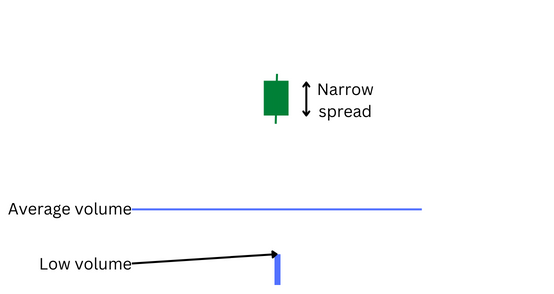
In this example, the price move is small. Again, the result should follow the effort. Did this happen in this case? Indeed, it did, as the volume was below average.
Anomaly
Now, let us look at arguably, more exciting examples — anomalies. The Volume Spread analysis considers an anomaly to be a situation when price and volume contradict each other.
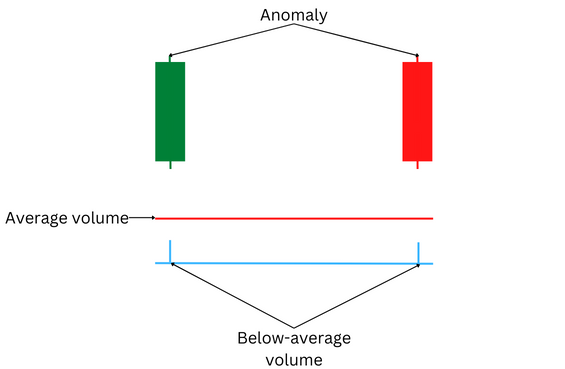
Look at this example:
Here, the price move is significant. According to Wyckoff’s third law, it should be a result of a great effort. Yet, it was not the case, as volume was below average. What could this mean?
Adherents of the VSA postulate that such an anomaly can mean one of a couple of things:
- It can be a sign that insiders are probing the market. They set the price higher but not committing themselves to the move, waiting to see if the market responds. And the low volume suggests that the market is unresponsive as buyers consider the price to be too high.
- Another possibility is that insiders are trying to wipe out stop-losses of retail traders, making them close their short positions.
Whatever the case, the VSA suggests that such a move higher is a trap and does not suggest that the market is really bullish.
Now, let us look at an opposite example:
As you can see here, the price move is small. And Wyckoff’s third law suggests that the effort should also be low to cause such a small result. But as the chart shows, the volume is relatively high. What does this mean? It means that buyers and sellers are clashing in a battle. Specialists are taking a profit, selling their assets at a high price. But buyers are coming in to buy those assets, preventing the price from moving much lower. At the same time, the market is no longer bullish enough to allow the price to move higher either. According to the VSA, this often happens at the height of a bullish move and suggests that the market is running out of bullish momentum. Usually, it is a sign of weakness and indicates that a reversal of the trend may happen soon.
Multi-candle examples
The basic idea behind analyzing several candles on a chart is the same as when you analyze a single candle — volume should validate the price. But in the case of multiple candles, it should validate not just every candle itself but also the overall trend. After all, the Effort vs. Result rule applies to trends the same way as it does to a single candle — the stronger the trend bigger the volume that should create it.
Validation
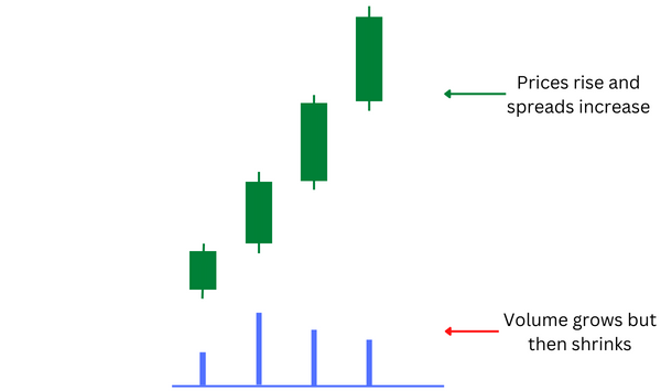
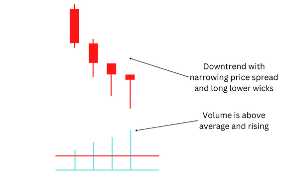
Let us start by looking at an example of a bullish trend:
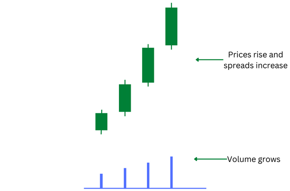
What can the Volume Spread Analysis tell us about this chart? For starters, each candle gets validation from volume — small candles correspond with low trading volume, while large candles show high volume. But what about the change in prices that created the bullish trend? Does it move in sync with the volume or opposite to it? Well, as you can see, each subsequent increase in spread correlates with an increase in volume. Therefore, it can be considered a validation as a result (growing strength of the trend) coincides with the effort (increasing volume).
But what does it tell us from the VSA point of view? According to the theory of the VSA, several things. Firstly, fans of the VSA would consider such a move to be a valid move, insisting that the high volume indicates that market makers have joined in pushing the market higher. Next, a trend can be considered firmly established after three candles got validated (in this example, all four candles got validation). Additionally, the bullish trend is strong as the wicks on the candles are small. And ultimately, it can be relatively safe to jump in together with other bulls, opening long positions.
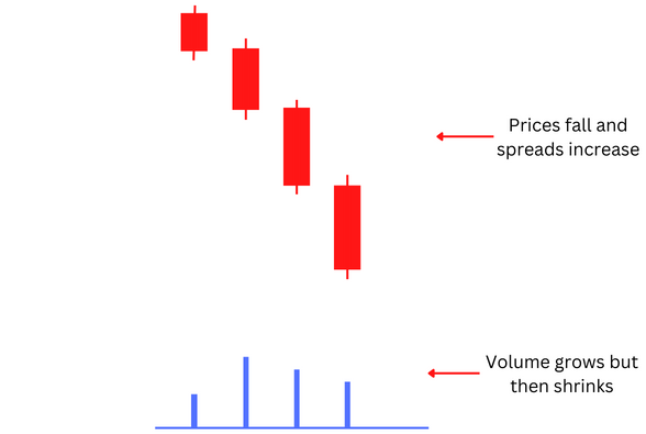
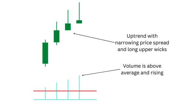
Here is another example:
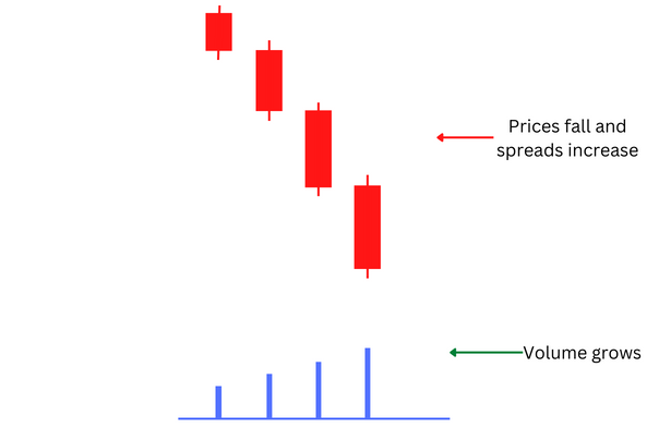
This time, it is a bearish trend. But did it get validation from volume? For some, it may look at first glance like it did not. After all, the price was moving down while the volume was moving higher. That means that the price move and volume opposed each other, right?
And that is why the term Volume Spread Analysis is probably better than Volume Price Analysis. That is because, ultimately, the price itself is not nearly as important as the spread. And it is irrelevant whether the candle or the trend is bullish or bearish. Remember, prices do not move by themselves, they need an effort to be moved, and it does not matter whether they go up or down. To push the price by a certain amount to the downside, you will need the same effort as to push it by a similar amount to the upside.
So, let us return to the example. The fact that the price was falling is unimportant. The important part is that the spread was increasing. And that coincided with the rising volume. Therefore, this example also shows validation, as the result was similar to the effort. Furthermore, the small wicks indicate that bears were the ones who created the majority of the volume.
Anomaly
Now, after seeing how validation looks on multiple candles, it is time to see how anomalies can look on a multi-candle chart. Remember that examples provided here do not cover all the possible ways anomalies (or validation, for that matter) can look on an actual chart. Live charts can be very complex, and the present examples are simplified to show the basics.
Let us start by looking at an anomaly on a bullish trend:
The price move is similar to the price move shown in the validation example. Prices are moving higher with an increasing spread. But what about volume? Does it increase in tandem with the prices? Initially, it looks like the volume validates the price — the spread is small, and the volume is appropriately low. But the second candle starts to show an anomaly. While both the volume and the spread increased, the volume jumped sharply while the spread demonstrated just a modest increase. That contradicts Wyckoff’s third law. But what happens next? The price continued to rise, with the spread widening at each consecutive candle. But the volume was not supporting the price move, moving in the opposite direction — falling.
How can the Volume Spread Analysis explain this anomaly? According to the VSA, the market is overbought. Market makers are trying to push prices higher, but sellers are jumping in to profit from high prices. That explains the sharp increase in volume with just a moderate price increase. While many traders were present in the market, a significant portion of them were sellers who prevented prices from increasing. But what about the subsequent price move higher that was accompanied by a falling volume? Adherents of the VSA speculate that it was an attempt by insiders to lure in bulls, giving the impression that the market is bullish while preparing themselves for the market to go lower. Whether this is true or not, the anomaly supposedly shows a sign that the market is weak, as traders are not interested in buying at the current price level. This does not guarantee that a reversal will follow, however. The weakness may be short-lived, resulting in just a small pullback. But it will be a good idea to watch the market and see if there is a good opportunity to short it.
Now, let us look at an anomaly on a bearish chart:
The situation is similar to that on the bullish chart. The spread and the volume start in sync with each other. But the second candle shows an anomaly as the high volume resulted in just a moderate increase in the spread. And while the prices continued to collapse with an ever-increasing spread, the volume started to decrease. The result seems not to be supported by the effort.
The Volume Spread Analysis says this is a sign of an oversold market. Sellers were trying to push the market lower, but buyers came in, attracted by the low price, preventing the price from going much lower. That explains why the high volume did not result in a sufficiently wide spread. And while specialists were setting the price lower (at least fans of the VSA think so), most traders were no longer interested in selling at such a low price. This anomaly supposedly signals that either a bullish correction or a trend reversal is in order. It can provide a good opportunity to open long positions while the price is low. But analysts using the VSA advise waiting for the validation of a bullish move before doing so.
Three steps to analyze candlestick charts in Volume Spread Analysis
The Volume Spread Analysis suggests that you should start looking at the small details and then move to the big picture when analyzing charts. This is done in three simple steps:
- Start looking for a validation or an anomaly on a single candle.
- Next, look at several previous candles and see if they create a clear picture of a multi-candle validation or anomaly.
- And then look at a longer-term timeframe. This will help you understand where the validation or anomaly is happening in the trend. Remember that markets have inertia. And just because the market shows weakness on a short-term timeframe does not necessarily mean that a strong trend on a long-term timeframe is going to end. On the other hand, when the trend reversal starts, it will first appear on a smaller timeframe and only then will slowly proceed to become evident on longer timeframes. Therefore, it often makes sense to start analyzing smaller timeframes and then go step-by-step to large-scale timeframes. For example, you can start looking at a five-minute timeframe, then go to a one-hour timeframe, then to a daily timeframe, and then to a weekly or even monthly timeframe.
Of course, it can be hard to see trends on different timeframes and catch a reversal just by looking at price and volume. To complement the VSA, you will have to use technical indicators, such as trendlines, support and resistance lines, and candlestick patterns. The following chapters of this article will explain how to use these tools in conjunction with the VSA.
Trend analysis and cycles in VSA
Adherents of the Volume Spread Analysis have an interesting view on why trends and price cycles exist. They believe that it is because insiders manipulate markets. Not necessarily prices themselves but rather the market sentiment. According to the VSA proponents, insiders use media and other tools to create a sentiment among traders, either bullish or bearish, depending on what the manipulators need. News pieces affecting the sentiment can include companies’ financial reports, macroeconomic data, geopolitical news, etc.
Such an idea may be hard to believe and suspiciously similar to a conspiracy theory. A less extreme view would be that market makers have better access to a wide range of data, allowing them to more efficiently assess when and where they should enter and exit markets. It is not that the majority of VSA followers believe that the manipulation is a concentrated effort on the part of insiders anyway. Rather, they think that insiders see the same data and use the same trading strategy, helping them to combine efforts in manipulating markets without a conscious agreement between them.
Before discussing trends in the VSA in more detail, though, you may want to know which timeframes you should use for analyzing trends.
Timeframes
As previously said, the Volume Spread Analysis can be used on any timeframe. Similarly, cycles discussed in this chapter can appear on any timeframe, be it a 1-minute timeframe or a monthly timeframe. What timeframe you should use depends primarily on two factors:
- The market you are trading. Different markets favor different timeframes. For example, stocks are usually bought for a longer term. Therefore, it can take days, weeks, or even months for a cycle to complete. In faster-moving markets, such as Forex, a cycle can be completed within hours, if not minutes.
- The trading style you are using.
Different trading styles require different timeframes. Scalpers usually use 1-minute, 5-minute, and 15-minute charts. Swing traders typically use 1-hour or 4-hour charts. Daily and longer term charts are more suitable for long-term investors.
You should also remember that trends start forming at shorter timeframes and then trickle up to longer timeframes. Thus, it makes sense to take a closer look at charts before considering a broader picture.
Main concepts
The Volume Spread Analysis uses the following concepts in relation to trends:
- Accumulation
- Distribution
- Testing
- Buying climax
- Selling climax
To better understand how cycles discussed in this chapter work, you can think about how wholesalers operate. They buy goods at a wholesale price to sell them at a retail price to get money to buy more goods at a wholesale price. Market makers behave in a similar manner. According to the fans of the VSA, they drive prices down, buy assets at a low price, then drive prices up, and then sell the accumulated assets at a high price.
Let us look at those concepts in more detail.
Accumulation and Distribution
According to the Volume Spread Analysis, markets shift between periods when specialists are buying (accumulating) at a low price and selling (distributing) at a high price. Those periods are called Accumulation and Distribution phases, respectively.
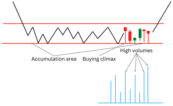
Accumulation
As any reasonable trader, market makers want to buy when prices are low. Traders following the Volume Spread Analysis believe that to achieve this, insiders use media to scare markets and make retail traders sell their assets, driving prices down. Of course, insiders should take care not to scare markets too much, otherwise nobody would buy the assets they have accumulated during the accumulation phase.
The accumulation phase can go on for a while before market makers decide to push the price higher. This means that prices will go up and down in a range during the accumulation phase.
There are several reasons why insiders do not buy everything they can in one fell swoop. For starters, insiders want to convince the bulls who hold onto their assets that their cause is lost. They also want to make sure that are no more sellers who will prevent the market makers from driving prices higher after the accumulation phase has finished. That is why specialists allow prices to rise a little bit during the accumulation phase, as they expect those small upswings to convince bears to sell their assets. And finally, specialists do not want to buy too much too fast as that would drive prices higher before the accumulation phase finishes.
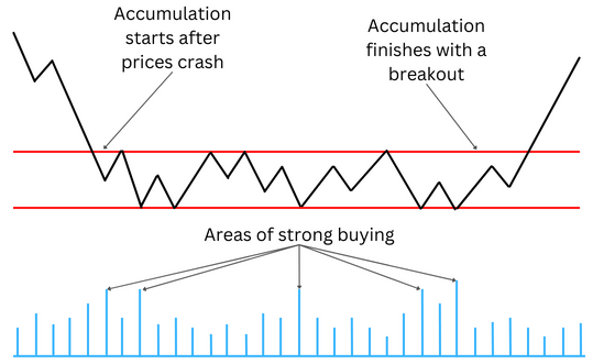
That is how the accumulation phase may look on a chart:
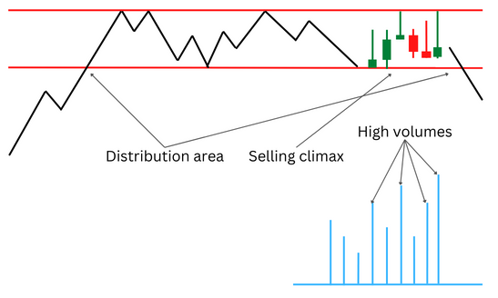
Distribution
Once insiders accumulate enough assets, they start pushing prices higher with positive news (or at least followers of the Volume Spread Analysis believe so). They prefer to do this slowly and steadily, feeling safe knowing they have enough assets to sell when the time comes. VSA fans speculate that insiders also use fear in this case, but the fear of missing out instead of the fear of loss.
Once prices reach the target level and retail traders are convinced that the market is bullish, specialists start to sell their stock. They do this slowly and steadily, the same as buying during the accumulation phase, to avoid crashing prices too soon. That is why prices usually move in a narrow range during this phase, also similar to the accumulation phase. Once market makers empty their inventories, they are ready to allow prices to crash so they can buy cheap. And the cycle repeats once again, ad infinitum.
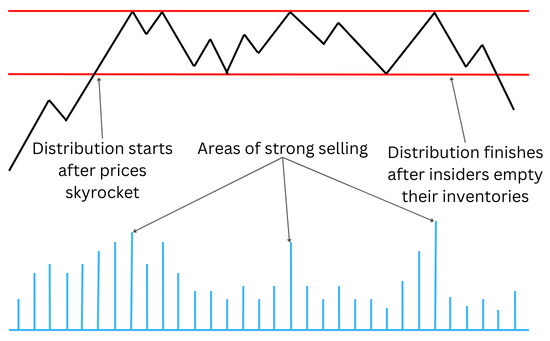
Here is how the distribution phase may look on a chart:
Testing
You may have a question: how do insiders know when to end accumulation and distribution? How can they be sure that there will not be enough traders to drive the market in the direction opposite to the insiders’ wishes? That is where the concept of testing comes into play. According to the Volume Spread Analysis, there are two types of testing: the testing of supply after the accumulation phase comes close to a finish and the testing of demand as the distribution phase nears its end.
Supply testing
When the accumulation phase finishes, insiders need to be sure that there are no sellers left (or, at the very least, their number is completely insignificant) to drive prices back down after insiders start their efforts to drive prices up. To do so, as the VSA fans believe, they drive prices higher to the levels where the recent heavy selling was happening and then try to push them back down to see if sellers will join.
That is how a successful test looks:
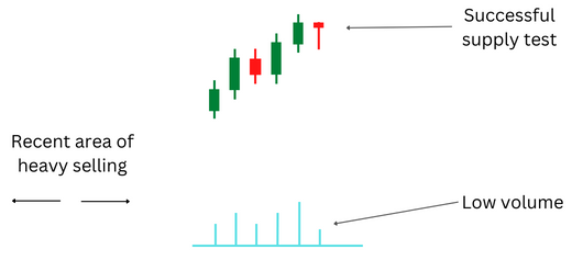
For starters, pay attention to how the last candle looks. In a successful test, it can be either bullish or bearish. It does not matter. What really matters is that its spread is narrow and its lower wick is big. It means that the market did not accept the lower price. Additionally, look at the volume. It is low, meaning that other traders did not join in the move lower.
And here is how an unsuccessful test looks:
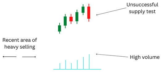
In this case, the candle’s body is wide, meaning that the market accepted the lower price. And the volume is high, suggesting that sellers joined in the move lower. According to the believers in the VSA, this is a problem for insiders as there are still sellers in the market who can stop the move higher planned by market makers. This means that insiders will renew their efforts to convince sellers to get rid of their assets, so the subsequent attempts to drive prices higher will go unhindered.
Proponents of the VSA believe that, regardless of whether the test was successful or not, it provides crucial information for traders. Namely, that market makers are ready to drive the market higher. If the test is successful, the move higher will likely happen very soon. If it is unsuccessful, it will happen eventually, but probably a bit later, when no sellers remain in the market.
Demand testing
Demand testing is basically a mirror opposite of supply testing. People believing in the VSA think insiders want to ensure that no buyers remain in the market after the distribution phase has been completed. To test this, they set prices lower, at the level where there was heavy buying recently, then push prices a bit higher and see if someone takes the bait, starting to buy.
This is how a successful test looks like:
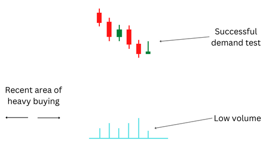
In this case, the market rejected the move higher, suggesting that no buyers remained in any significant number and prices could be driven lower. The candle, which shows where the test has occurred, has a narrow body, the same as in the supply test. The difference is that the upper wick should be big, while the lower wick should be nearly absent. The low volume also suggests that the move higher was not genuine.
And here is an example of an unsuccessful test:
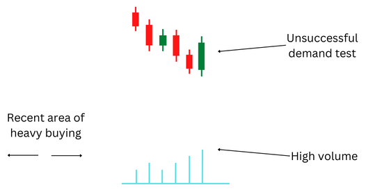
The market accepted the move higher, ending the session with a close that was noticeably above the opening. This is shown by the wide body of a bullish candle. Furthermore, the high volume indicates that traders joined in the move higher, meaning that the market is not yet ready for lower prices.
The same as in the case of a supply test, a demand test suggests that market makers are ready for a significant move, this time the move down. Whether the test is successful or not suggests whether the move will happen soon or will be delayed a bit.
Buying climax and selling climax
We have discussed the accumulation and distribution phases as well as how market makers test when the market is ready to finish those phases. But to successfully prepare for an end of a phase, you need to know the signs that the phase is nearing completion. The Volume Spread analysis provides signs of a buying climax and a selling climax that can help you when an end to a phase is approaching.
Before explaining the concept of buying and selling climax, it is important to note that “buying” and “selling” in the name of the concept reflect the viewpoint of specialists, not retail traders. That means the buying climax occurs at the end of the accumulation phase when retail traders are selling, but specialists are buying from them. And the selling climax happens at the end of the distribution phase when retail traders are buying and specialists are selling to them.
Here is an example of how a buying climax can look on a chart:
As you can see, the buying climax is represented by a sequence of candles with a narrow body and a prominent lower wick. What does that mean? Analysts adhering to the VSA believe that means retail traders are selling their stock, but specialists are happy to buy from them. That is why the lower wicks are created — the selling by retail traders drives prices lower, but market makers do not allow them to fall too much, buying whatever they can at the low price and thus pushing prices back up. The high volume on relevant candles confirms that big financial institutions are involved in the market activity. The VSA advises that if you see signs of a buying climax, to be ready for a sharp move higher.
And here is how a selling climax can look on a chart:
It is, essentially, a mirror opposite of a buying climax. The candles representing it also have narrow bodies, but the upper wicks are big instead of the lower wicks. For those who believe in the VSA, the logic is simple: prices try to rise as bullish retail traders jump in on the fear of missing out, but specialists prevent the prices from rising too high by selling their inventories to regular traders. High volume is required to confirm a selling climax, the same as in the case of a buying climax. According to the VSA, a selling climax is a sign that the market will experience a sharp price drop soon.
Example of a complete cycle
To conclude the discussion of cycles in the Volume Spread Analysis, let us look at an example of a complete cycle:
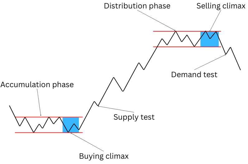
The cycle starts with accumulation as market makers, with the help of price fluctuations, are trying to convince retail traders to sell their assets at a low price. After insiders stocked their inventories and the accumulation phase came to an end with a buying climax, specialists test supply to make sure that there are no sellers left in the market. The accumulation phase is followed by a price rally to the upside, where market makers start distribution. They sell their assets at a high price as retail traders are convinced that the trend is bullish. After insiders empty their inventories, the distribution phase is concluded with a selling climax. Specialists then test demand, ensuring that no buyers remain in the market, and then drive the prices down. After the prices reach sufficiently low levels, market makers start replenishing their inventories in the accumulation phase, and the cycle begins anew.
Remember, the cycles similar to the one shown here occur on any timeframes, from a 1-minute to a monthly timeframe.
Candle patterns
This chapter explains candle patterns from the Volume Spread Analysis point of view. It talks about the most important patterns, the significance of their placement in the trend, and their relations to volume.
But before moving to specific candle patterns, you need to know the main principles of candle pattern analysis in the VSA.
Main principles
While some of the principles were mentioned before, it will be helpful to repeat them so you will remember to use them when analyzing candles and candle patterns:
- Wicks reveal the strength of the market sentiment. Long wicks on either side of the candle indicate indecision and uncertainty among traders. Very short or absent wicks mean a strong sentiment in the direction of the closing price.
- The spread (the length of the candle’s body) also indicates the market sentiment. If the spread is narrow, then there is no strong sentiment among traders. A wide spread suggests that the sentiment is strong in the direction of the close.
- Analyze the candle in relation to its placement in the wider trend. Just because you see a familiar pattern on a candle does not mean that you automatically know what it means. You need to consider the nearby candles and the pattern’s placement in the trend to understand what it says about the price.
- Remember to look at the volume. Volume validates the price. Therefore, remember to look for validation or an anomaly when analyzing candle patterns.
Steps in candle pattern analysis
Here is the list of steps an average VSA specialist does when analyzing candlestick patterns:
- Identify a pattern on a candle. Remember that one candle does not tell much. Just because you have found a pattern on one candle does not mean you should immediately open a position. Perform other steps of the analysis. Wait if you need to confirm that the story the pattern tells is true.
- Look at the nearby candles for a similar pattern. If the pattern indeed tells a story about the market and is not just a fluke, it is likely to occur on more than one candle. After all, if the market conditions that led to the creation of the pattern on a candle remain the same, then they should lead to the appearance of the same pattern on other candles.
- Look at the volume. Remember that volume validates the price. Consider whether the volume on the candle with the pattern was high or low. Look at the other candles with a similar pattern. If the volume is rising on each of the subsequent candles, then it is a strong signal that the pattern is valid.
- Look how prices behaved in this price area before. If, for example, prices were showing weakness at the current price range before, and the pattern also suggests weakness, then it is likely that a move down is coming.
- Look where at the broader trend the pattern has occurred. Remember that the same pattern can tell a very different story in different parts of a trend. There is a big difference between a pattern that appeared, for example, at the end of the accumulation phase and the same pattern that formed at the end of the distribution phase. Often, you will need to wait for the trend to progress before you are able to tell where in the trend the pattern has formed.
- Look at different timeframes. Remember that trends start forming on shorter timeframes and trickle up to longer ones. If you think that a trend is beginning to form on an hourly chart, look at the 15-minute chart. If you are correct, similar trends should have already formed on the shorter timeframe. If, for example, you think that a reversal has started on the hourly chart, it should be already apparent on the 15-minute chart. Afterward, wait for the same trend to appear on a 4-hour or even a daily chart to confirm that it is indeed happening. If the trend does not appear on a longer-term chart, that does not necessarily mean that it has not formed on a shorter-term chart. But what it does mean is that the trend will likely not last for long, and if you want to open a position, you should hold it only for a short time.
- Open a position only if all the steps result in confirmation of the pattern. In general, VSA specialists advise you to make a move only when you identify several candles with similar patterns, they show high or rising volume, the placement of the pattern in the trend is conducive to your plans, and the trend appears on several different timeframes.
Patterns
Shooting star
The pattern indicates weakness.
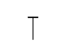
The shooting star pattern forms when a candle with a very narrow body and an almost or entirely absent lower wick has a very big upper wick. Here is how it looks:
You can see that it looks very similar to our example of an upper wick from the chapter explaining the basic parts of a candle. And that example also explains how such a pattern can be formed. Just to remind you: it happens when buyers try to push prices up during the session (or whatever timeframe you have chosen for your chart), but sellers overtake the market and bring prices back down. And that is why the pattern indicates weakness in the market — it shows that bears overpowered bulls.
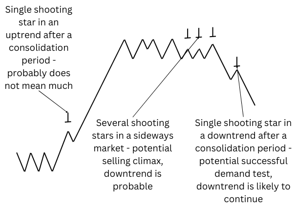
A very important thing to remember about this chart pattern: it does not automatically mean that prices will enter a downtrend. It only shows a weakness in the market. To understand how significant the weakness is and where prices may go next, you need to perform the steps listed above. In particular, you should see if there are other shooting star candles nearby on the chart, where in the trend they are, and what volume levels correspond to the candles.
If a single shooting star with a low volume occurs in the uptrend, you can expect a minor pullback at most. Every subsequent shooting star shows increasing weakness in the market. If they are accompanied by a rising volume, then a much stronger correction or even a reversal is likely. If several shooting stars with a high volume appear on a sideways chart, you can expect a downside breakout. The longer prices were moving sideways, the stronger the eventual downtrend should be.
Important note: a shooting star pattern cannot result in an anomaly. It shows that the market is weak, and that does not depend on the volume. The volume only reveals how significant the weakness is.
You also need to consider where in the cycle the pattern has been formed. If it appears in an uptrend soon after the accumulation phase, no reversal or even a strong pullback is likely. If several shooting stars occurred in the distribution phase, then you probably see a selling climax and should be ready for a downtrend to begin soon. And if a shooting star candle forms soon after the distribution phase’s completion, then it is likely that you are witnessing a successful demand test.
To make it easier for you to understand how this works, here is a chart with some of the possible variations of a shooting star pattern that can occur within a trend:
Hammer
The pattern indicates strength.
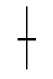
In essence, the hammer candlestick pattern is a mirror opposite of the shooting star pattern. It forms when a candle has a very narrow body with a very long lower wick and an extremely short or entirely absent upper wick. Here is how it looks:
Again, it reminds us of the picture from the chapter about candle parts, specifically about the lower wick. And the mechanism for the hammer pattern creation is similar to that of lower wick creation — sellers try to push prices down, but buyers come to take control of the market and make prices rebound. While in the case of a lower wick on a regular candle, prices can move up and down after the creation of the wick, a candle with the hammer pattern shows that bulls retained control by the end of the session. This means that the sentiment is bullish and the market is strong.
And again, remember about the main steps listed earlier if you want to analyze the chart using the Volume Spread Analysis: look for other similar patterns on the nearby candles, look at the volume, and look at the placement of the pattern in the trend.
By itself, the pattern suggests strength but does not tell how significant it is and how long it can last. A single hammer candle with a low volume in a strong downtrend hints at just a small short-term bounce before prices resume their move to the downside. If it happened shortly after the accumulation phase, it is probably a successful supply test. A hammer with an average volume suggests a more substantial upward correction. And a hammer with a high volume indicates a potential significant pause or even an end to the downtrend.
Important note: a hammer pattern cannot result in an anomaly. It shows that the market is strong, and that does not depend on the volume. The volume only reveals how significant the strength is.
Several nearby candles with hammer patterns increase the significance of the signal, especially if they are accompanied by increasing volume. If it happens after a period of sideways movement, an upside breakout is likely. According to VSA theorists, it is a sign that specialists are acquiring assets from retail traders, and it possibly means that the accumulation stage has reached the buying climax.
Here is a picture that shows some of the possible cases of the hammer pattern appearing on a chart:

Long-Legged Doji
The pattern indicates uncertainty.
A long-legged doji pattern looks sort of like a combination of the shooting star and hammer candles. A long-legged doji candle has a very narrow body while its wicks (both upper and lower) are very long (thus the name “long-legged”). Here is an example of how it can look:
The pattern signals that the market sentiment is neither bullish nor bearish. The long-legged doji indicates that the market is volatile as buyers and sellers struggle to get a hold of the market. They push the price back and forth, but neither can get a firm grip on the market in the end. This pattern usually results in an end to the trend or even a reversal. At least if it is validated.
And that is important to realize: according to the Volume Spread Analysis, the long-legged doji pattern can experience anomalies. In normal circumstances, volatility in the market means a high level of activity and, therefore, high or, at the very least, above-average volume. If that is the case, the long-legged doji pattern can be considered validated. But if the pattern that suggests volatility in the market is present, yet the volume is low, then it means an anomaly.
Fans of the VSA provide the following reasoning for why such anomalies occur: insiders are trying to trigger stop orders placed by retail traders. To this, market makers push prices back and forth, usually with the help of news, to create big swings. This way, insiders can get rid of unwanted influence from retail traders and take control of the market for themselves.
The VSA experts state that you should avoid the market if you see a long-legged doji candle with low volume. And if the candle is accompanied by high volume, which suggests market makers are actively participating in the market, you should be ready to identify the trend that will eventually develop and follow it. The logic behind such advice is that the participation of insiders means the trend is likely genuine and not a trap.
Narrow-spread candles
The pattern indicates a weak market sentiment.
While it is usually not listed among candlestick patterns, the Volume Spread Analysis has a special view on candles with a narrow spread and short wicks. In general, such candles occur when traders do not feel strongly about the market one way or the other and wait for news or data to push the market in a specific direction. Usually, such candles are not particularly interesting for traders. But the VSA users are particularly interested in such candles, looking for anomalies in volume.
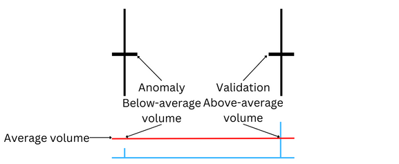
What constitutes an anomaly on a narrow-spread candle? For starters, let us think about what validation should be like for such candles. Narrow-spread candles usually signal about a calm market and a low level of activity. Therefore, the volume on such candles should also be low. That is why narrow-spread candles with low volume can be considered validated. Consequently, narrow-spread candles with above-average volume can be regarded as an anomaly.

But what such an anomaly can mean? Believers in the VSA think that it means insiders are losing control over the market. They are participating in the market in earnest, trying to push it in the direction they want. But the rest of the traders keep that from happening, pushing it in the opposite direction.
But what does that tell us about where the market is going to go? According to the VSA, that is a signal about the upcoming reversal. If the narrow-spread candle was bullish, the anomaly means that the market rejected a higher price and will probably go down. Conversely, if the candle was bearish, the anomaly suggests that the market does not wish for prices to fall and will likely rally in the near future.
However, experts in the VSA do not recommend acting immediately after you have spotted a narrow-spread candle. They advise waiting for other signs of reversals, including such patterns as a shooting star, a hammer, or a long-legged doji.
Wide-spread candles
The pattern indicated a strong market sentiment.
This pattern is simple: the candle’s body has a wide spread while the wicks are very short or absent. It shows that the market did not experience strong fluctuations during the session, moving primarily in one direction. Such behavior signals about a strong sentiment in the direction of the close — bullish if prices closed above the opening level, bearish if they closed below.
The VSA specialists insist that you should look at the volume before entering the market. If the volume is above average, then insiders supposedly participate in the market, and you can open a position in accordance with the market sentiment relatively safely. But if the volume is low, the VSA followers insist that it means the move is not genuine and you should stay away from the market.
Hanging man
The pattern indicates potential weakness in an uptrend.
The hanging man pattern looks precisely like the hammer pattern — a candle with a narrow body, a very small or nonexistent upper wick, and a very long lower wick. The difference between the two patterns is in their placement in a trend. While a hammer pattern can appear anywhere in the trend, the hanging man pattern can occur only at the top of an uptrend. That makes it somewhat difficult to spot a hanging man as it can be easily confused with a hammer despite those two patterns having polar opposite implications about the trend. It is also important for the volume to be above average.
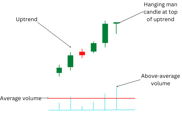
But why does the hanging man pattern tell a very different story compared to the one told by the hammer pattern? Why does it promise weakness even though the bulls control the market by the end of the session? The Volume Spread Analysis provides the following explanation: insiders test the water before starting a distribution phase. According to the theory of the VSA, the hanging man pattern suggests that market makers are checking whether the market can absorb their selling. The above-average volume confirms that marker makers are indeed actively participating in the market. The fact that prices bounced after insiders have driven them down shows that there are certainly enough buyers who want to buy assets that specialists are selling. And that suggests to insiders that it is an excellent time to start selling.
VSA experts advise waiting for confirmation of the weakness after spotting a hanging man candle. Ideally, the hanging man candle should be immediately followed by a shooting star candle. It is a strong validation signal and a sign that a reversal is likely to happen very soon. But even if a shooting star appears somewhat later, it is still a validation sign. In any case, validation is possible only if the hanging man candle is accompanied by above-average volume.
Stopping volume
The pattern indicates strength.
This pattern occurs when a downtrend starts to run out of momentum and the bulls begin to wrestle control over the market from the bears. But as markets tend to have strong inertia, a downtrend usually has to slow down gradually before an uptrend can develop. Experts often compare this to a large ship that needs to stop slowly before being able to reverse its movement.
The pattern looks like a sequence of candles with long lower wicks and ever-narrowing bodies. The Volume Spread Analysis also states that the volume should be above average and increasing to validate the pattern. The bullish signal is especially powerful if prices close in the upper half of the open-close range.
The VSA specialists explain this behavior by insiders buying from retail traders. But being unable to absorb selling in a single session, market makers return to the market the next day, and the next, and so forth, until no more sellers are left. While initially, sellers are able to continue pushing prices lower, their number dwindles with each subsequent day, weakening the downward momentum. That explains the continuously narrowing spread, which signals about the weakening bearish force.
The stopping volume pattern suggests that the market will probably reverse soon, starting to move to the upside. The pattern often begins to develop before the start of buying climax.
Topping-out volume
The pattern indicates weakness.
The topping-out volume is the polar opposite of the stopping volume pattern. It consists of a sequence of candles with ever-narrowing bodies and long upper wicks. Ideally, the sequence ends with a shooting star candle. As with the stopping volume, the decrease in the spread should be followed by an increasing above-average volume. The signal is especially strong when the upper wicks close in the lower half of the candle.
The VSA proponents explain the pattern by insiders selling the assets they have acquired previously to the market. They do not sell everything at once to avoid crashing the market but increase the amount they sell gradually, thus increasing volume. It becomes harder and harder for prices to rise as the amount of selling from market makers increases. That is why the spread decreases and prices struggle to stay close to the sessions’ highs, resulting in long upper wicks.
According to the Volume Spread Analysis, this pattern often precedes a distribution phase. If it happens when the distribution phase is already underway, the pattern signals that the selling climax is going to start soon. The VSA experts advise traders to get ready for a reversal.
Support and resistance
Up to this point, we were discussing either a single candle or a small group of candles. And while the information provided by candles and candlestick patterns certainly can be beneficial, it is usually of limited use without understanding where in the trend you currently are. Of course, it is easy to tell where in the trend you were at any given moment in hindsight. But understanding where in the trend you currently are at this exact moment, without the benefit of hindsight, can be extremely difficult. Various tools exist to help you with this issue. And the concept of support and resistance is one of such tools.
Note: support and resistance levels are also sometimes called price floor and price ceiling, respectively.
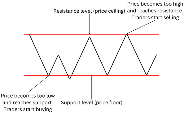
Broadly speaking, support and resistance levels are areas of the chart where prices tend to reverse their movement. If an uptrend reaches a resistance level, you can expect prices to fall back. If a downtrend reaches a support level, you can expect prices to bounce. In essence, support and resistance levels create a horizontal channel in which prices move sideways, jumping back and forth between the floor and the ceiling. But a market cannot move sideways forever, and the prices will ultimately break either to the upside or downside when the market forces are strong enough and the market sentiment overwhelmingly supports a move in a specific direction.
You can also think about the support level as a level at which the majority of traders start to believe that the price is too low, encouraging market participants to buy. And the resistance level is a level at which the majority of traders begin to think that the price is too high, prompting them to start selling.
Yet another way to think about support and resistance is that the market becomes overbought at the resistance level and oversold at the support level.
In a way, the concept of support and resistance can be considered a self-fulfilling prophecy. As most traders watch the support and resistance levels, they have similar expectations of a price reversal at certain levels. This prompts them to position themselves in the market based on the assumption that prices will start moving in the opposite direction once they reach a floor or a ceiling, and this leads to prices actually behaving that way.
Unlike the methods to analyze charts and price behavior we have discussed previously, support and resistance is a backward-looking (lagging) indicator and not a forward-looking (leading) one. It does not try to look into the future but instead tells you what happened in the past. But the widespread appeal of the indicator and the self-fulfilling nature of the outlook it creates still make the support and resistance technical indicator a handy tool for predicting the behavior of the market.
Support and resistance is a very popular concept, and you can read many different articles explaining how it works (like this one). But the Volume Spread Analysis has its own spin on this concept. But before discussing it in detail, you need to learn three main principles of using support and resistance in your analysis.
Main principles
- Support and resistance levels are not solid walls. While support and resistance levels are quoted as specific price points, in reality, prices almost never stop at precisely those points. As shown in the image above, the price can reverse its movement near a support or resistance without directly touching it. Or the price may go past a support or resistance level only to reverse afterward. In practice, support and resistance should be considered areas around the specified price levels, not solid barriers at those exact price points. This, of course, adds subjectivity to the analysis. And this makes it rather hard to predict the specific point at which the price will reverse or distinguish a genuine breakout from a bull/bear trap.
- The longer prices move sideways within the bounds of support and resistance, the stronger the resulting trend will be. As Wyckoff’s second law postulates, the effect should be proportional to the cause. You can think about it as the market gathering strength while moving sideways. And the longer it moves sideways, the more strength it gains. And consequently, the more strength it has gained, the more powerful the move will be after the market ultimately bursts out of the confines defined by the support and resistance levels. How far the market will go and how long the resulting trend will last depends on the chart’s timeframe. On a 15-minute chart, the move may last for a few hours. On a daily chart, the trend may exist for several weeks.
- Use isolated pivots to identify the support and resistance levels. As it was said previously, support and resistance are easy to spot when looking at past price moves. But it can be tough to do for the present moment. To resolve this problem, the Volume Spread Analysis recommends using pivot points — specifically, an isolated pivot high and an isolated pivot low.
Breakout analysis
Isolated pivot points
Isolated pivot points or isolated pivots is a chart pattern that consists of three candles.
An isolated pivot high has the middle candle with a high that is higher than the highs of the candles on either side of the middle candle and a low that is also higher than the lows of the neighboring candles.
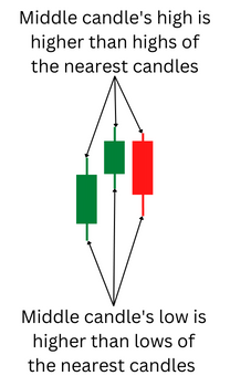
An isolated pivot low has a middle candle with a high that is lower than the highs of the neighboring candles and a low that is also lower than the lows of the candles on the other side of the middle candle.
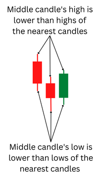
Isolated pivots show points at which prices are likely to reverse their movement. An isolated pivot high suggests that an upward movement will likely turn into a downside movement. An isolated pivot low indicates that a down move will probably be followed by an up move.
Identifying support and resistance using isolated pivot points
But how can you use isolated pivot points for identifying support and resistance areas? For example, an isolated pivot high forms after an upward movement. This means that a move down is likely to follow. If that is indeed the case, the pivot high marks the resistance level. After prices move down for some time, start looking for an isolated pivot low. If prices reverse the movement and begin to go up afterward, you have found the support level. Then, you can expect prices to move sideways, bouncing between the support and resistance levels.
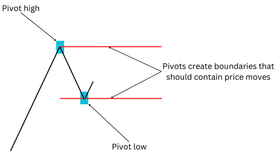
A similar situation happens when prices move downwards. In this case, an isolated pivot low points at a support level. If prices rebound, start looking for an isolated pivot high. It should show the resistance level. Those levels create a channel where prices will be contained, moving sideways until a breakout.
Breakouts
Prices may go sideways for a while, but they cannot do so indefinitely. Sooner or later, they are going to break either to the upside or to the downside. The longer the sideways move is, the stronger the eventual breakout will be. Breakouts are especially strong at the end of a distribution or an accumulation phase.
But as it was said earlier, the support and resistance levels are not solid barriers, and prices can go past them for a short term just to return back into the channel. So how can you distinguish a genuine breakout from a trap? The Volume Spread Analysis provides its usual answer: look at the volume. As it takes significant force to break from the confines of the sideways channel, an actual breakout should be accompanied by high volume. And any pullbacks toward the previous trading levels should have low volume.
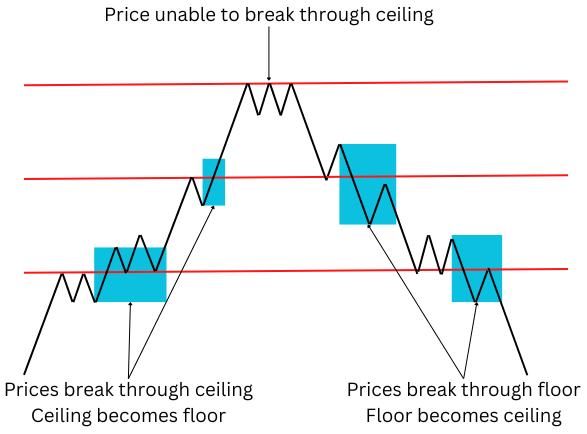
An important thing to remember: if prices break through support, it becomes resistance; if prices break through resistance, it becomes support. If prices pull back after an upward breakout, they should find support at the level that was previously resistance. If that happens, the breakout is likely genuine. The same goes for a downside breakout — any attempts to rebound should meet resistance at the previous support level.
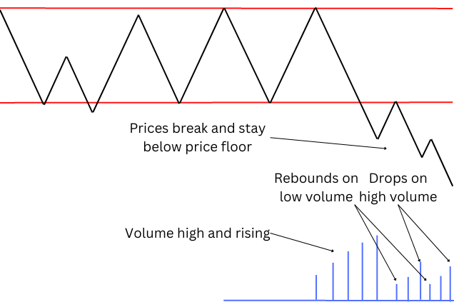
Here is how an upside breakout may look:
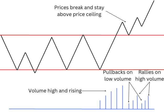
As you can see in the image, the volume starts to rise as prices get ready for a breakout, and the breakout happens when the volume reaches its peak. The first pullback occurs at low volume and is unable to go past the previous resistance level, which is now a support level. Any subsequent pullbacks also happen at low volume while the upside moves see rising volume.
And here is an example of a downside breakout:
The image looks similar but mirrored. Prices break through support while volume is rising. The follow-up rebound is unable to breach the resistance level that was previously a support level. Afterward, downside moves are followed by increasing volume, while any attempts at rebound have very low volume.
Trading breakouts
The Volume Spread Analysis offers three simple rules for trading breakouts:
- If you have an open position in the direction of the breakout, you should hold it.
- If you have an open position in the direction opposite to the breakout, you should exit it.
- If you do not have an open position, you should open it in the direction of the breakout.
Breaking through several support and resistance levels
We have discussed, so far, a breakthrough out of a single channel. But real charts have, of course, multiple levels of support and resistance. And real price moves constantly create new channels as prices move sideways in a range, break out of the range, establishing a trend, only to start moving sideways again, creating a new channel, after the trend runs its course.
This is an important detail to consider if you remember that support becomes resistance once it is broken, and similarly, resistance turns into support after prices break through it. To help you better understand how this concept works and how it can help you in predicting price moves, it is better to use the terms price floor and price ceiling. That way, you can think about levels of support and resistance as a house with several stories. And in this comparison, a ceiling of one story is a floor of the one above it. And when prices go up and pass a ceiling, the ceiling becomes a floor, and the next important level becomes a ceiling. And the process continues as long as each subsequent breakthrough is a continuation of the previous trend. And when prices reverse their trend, the opposite begins to happen — prices fall below a floor, and it becomes a ceiling. The next important level below becomes the next floor until prices fall below it, and then it becomes the next ceiling. And so forth. Here is an image for you to better understand how this process can happen:
But why do markets work this way and pay so much attention to those sometimes seemingly arbitrary levels? There are several possible explanations. As was said before, many popular technical indicators, including support and resistance, can work as a self-fulfilling prophecy. This means that if enough traders think that prices will struggle to move further at certain levels, this will indeed happen. Another explanation is that breaking away from a price range means that the market considers that price range to be inadequate — either too high or too low. Therefore, the market will be reluctant to return to that range, preventing prices from reaching it again, at least until the market sentiment changes and the trend reverse.
And how can this knowledge help you as a trader? For starters, you can use the strategy for trading breakout described in the previous section. Knowing where prices will likely stall can also help you set your profit objective. Traders often set their profit target at a major level of support or resistance. And, of course, it can also help you to set a stop-loss after a breakthrough. In case of an upside breakout, you can put your stop-loss at or slightly below the former resistance level that now has become a support level, as in case of a genuine breakout, prices are unlikely to fall back below it anytime soon. A similar strategy can be employed in case of a downside breakout — put a stop-loss at or slightly above the former support level that is now a resistance level, as prices will likely continue to move down for some time, at least if the breakout was validated. Even if you were wrong and prices pulled back to the previous trading range, a properly set stop-loss will limit your losses or even prevent them completely.
And, of course, the Volume Spread Analysis adds its own twist on top of that, throwing volume into the mix. If you want to use the VSA, always watch the volume. As the VSA postulates, you can consider a breakout to be valid only if it happened when the volume was high and rising before the breakout happened. If prices break through support or resistance when the volume is low, it is probably a trap.
Dynamic trendlines with isolated pivot points
Trends are exceptionally important for traders, making tools for spotting them very popular among traders. One of the simplest and most widely used tools for finding trends is trendlines. The easiest and most common way of defining a trend is to see whether prices create higher highs and higher lows (for an uptrend) or lower highs and lower lows (for a downtrend). Once this is done, you can draw a line through highs and another through lows. Those lines should be parallel to each other. This way, they create a channel (upward in the case of an uptrend and downward in the case of a downtrend) in which prices are supposed to bounce from one line to the other. Once prices break through the channel, you need to draw new lines to see the new trend. The idea behind the trendlines is that they should help you to see the trend, predict price movements within the trend (as prices are expected to bounce from the trend borders), and know when the trend pauses or reverses.
Usually, you need a minimum of three highs and three lows to draw trendlines. While it is possible to draw trendlines through just two highs and two lows, those trendlines would be unreliable. There are just too many possibilities for drawing a line through just two points on any given chart, meaning that any chart would have a score of such trendlines, making it hard to choose which one to use and making them useless for predicting price moves. There are significantly fewer lines that can be drawn through three points on a chart, making such trendlines much less frequent and more reliable. Here is an example of conventional trendlines:
Fans of the Volume Spread Analysis criticize the conventional creation and usage of trendlines, claiming that it is often simply too late to enter the market by the time you can draw them. You need at least three pairs of highs and lows to draw a channel, and by the time the third pair appears, the trend will be long underway and maybe losing momentum or even coming to an end. According to the critics of the regular trendlines, the problem is that this tool looks at the past. And that means trendlines cannot help you to enter the trend when it has just started, only when it is firmly established. And by that point, it can be already too late to join it.
Despite the criticism of trendlines, VSA users still find it helpful to employ trendlines. But they have their own spin on the usage of this tool.
For starters, those who believe in the Volume Spread Analysis always watch the volume. During the consolidation phase, they want the volume to tell them whether it is a small pause in a trend or a reversal. They think small volume during the sideways movement usually signals that the market just took a short breather before resuming the previous trend. And high volume suggests that the market is probably readying itself for a reversal. And, of course, the VSA traders use the volume to validate the eventual breakout, as was outlined in the previous chapter. They also consider the length of the consolidation phase as, usually, the longer the sideways movement was, the longer and more powerful the follow-up trend is going to be.
But the most crucial difference between the traditional method of creating trendlines and the method used in the VSA is that trendlines are created as the trend develops, not after it has been established. And to do that, the VSA experts use isolated pivot points.
Dynamic trendlines
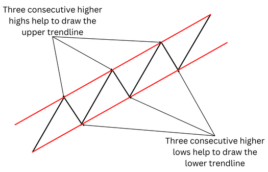
The Volume Spread Analysis suggests that you can use isolated pivots not just for creating horizontal channels, which indicate the phase of price consolidation, but also for making upward and downward channels, which show you the trend.
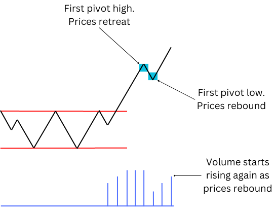
For starters, you need to wait for a breakout from the consolidation zone. As usual, the duration of the consolidations gives a hint as to how powerful the eventual trend is likely to be. Next, you need to validate the breakout with the volume, as was described in the earlier chapter. Afterward, the VSA suggests waiting for an isolated pivot point. Refer to the previous chapter if you need a refresher as to how isolated pivot points look. Let us look at an uptrend as an example. The prices break through the resistance level. This should be accompanied by above-average and, preferably, rising volume. After the prices rise for some time, a pivot high appears on the chart, and the prices retreat:
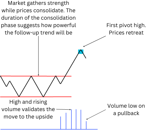
At the current moment, it is hard to tell for sure if the retreat is a reversal or just a minor pullback before a rebound. But the low volume, shown in the image, suggests that the bearish forces are weak. And this means that the retreat is a short pause before the prices continue to go higher.
Indeed, a pivot low appears on the chart, and the prices try to rise again:
By itself, the rise does not mean much as the prices may yet reverse again. But if the prices rise above the pivot high, the chances are good that the uptrend was established. Furthermore, as we are discussing the Volume Spread Analysis, you should always watch the volume. In the image above, the volume starts to rise together with the prices. This suggests that the bullish forces are in control and the market favors the upside movement.
In an actively traded market, isolated pivots appear constantly. So, let us skip a bit further and look at the chart with several pivot highs and pivot lows:
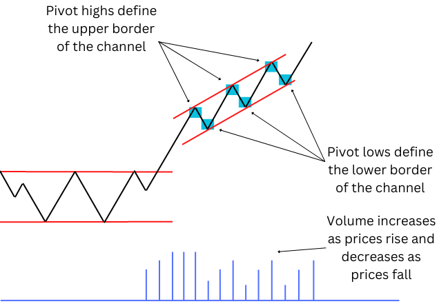
As you can see, the chart now has three pivot highs and three pivot lows. Notice that each pivot high is higher than the previous high, and each pivot low is also higher than the previous low. Now, you can draw trendlines, the same as you could have done with three pairs of highs and lows.
But what is the difference between this method and the regular trendlines? The VSA fans insist that the benefit of using isolated pivots is that this method allows you to enter the market at any point, not only after the trend has been present for a while. They believe that their method will enable them to see how the trend develops dynamically. Thus they call the method dynamic trendlines.
Of course, as always, the volume is extremely important. Look at the image above. As you can see, every move higher was followed by a rising volume. Meanwhile, all pullbacks happened when the volume was low. This is the foundation of the Volume Spread Analysis — always check whether the volume validates price movement.
To reinforce this lesson, let us look at a downtrend now:
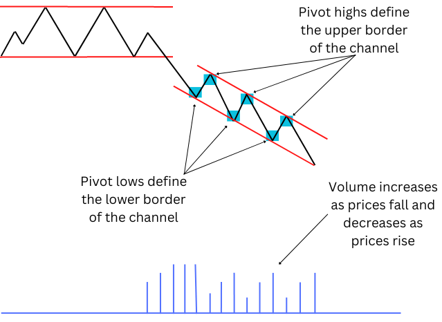
This chart looks similar to the previous one, just with prices moving in the opposite direction. But the logic of the dynamic trendlines remains the same — use isolated pivots (three pairs in this case as well) to draw trendlines that contain price moves and show you the trend. Yet look at the volume. In an uptrend, you can expect the volume to rise as the prices rise. So it is an understandable mistake to think that in a downtrend the volume should also move “in the same direction” as prices. In other words, the volume should decrease as prices fall. But that is not the case. Remember: the volume shows the strength of the move regardless of the direction of the move. High volume validates the movement, no matter whether it is to the upside or the downside. And this means that in a downtrend, the volume should increase when the prices fall, not decrease. And this is what you can see in the image: the volume rises when the prices drop, validating the downtrend, while any rebound happens on a low volume, meaning that bulls have no power in the market.
Returning to the example of an uptrend, sooner or later, the new pivot high will appear at the same level as the previous high or maybe even lower. It suggests that the uptrend has probably run out of steam. The uptrend may just pause for some time, or it may come to an end. The next pivot low can give you a hint of which one of those two options is more likely. If the new low is at the same level as the previous low or above, then the uptrend is likely just gathering strength before resuming sometime in the future. But if the new pivot low appears below the previous low, the chances are that the trend started a reversal and has probably turned into a downtrend.
Of course, real charts are not so simple and clear-cut. Sometimes, isolated pivots can be simply absent in a trend. The VSA analysts state that if this happens when the volume is average or below-average, this is a sign that the trend is weak, and you should probably stay out of the market.
Conclusion
The ideas of the Volume Spread Analysis may not appeal to every trader. In particular, the theory about markets being manipulated by insiders may sound suspiciously like a conspiracy theory. But you do not need to believe it to find the VSA, or at least some of its parts, useful. After all, the basic idea of watching the market activity and basing your trading decisions on how strong or weak it is sounds rather reasonable.
The advantage of the VSA is that, by combining price analysis with volume analysis, it can potentially help you better see and predict the strength of a trend, supply and demand imbalances, support and resistance levels, areas of accumulation and distribution, and potential reversal points. Another advantage of the method is that it can be used on any type of market, be it stocks, Forex, or commodities.
The main disadvantage of the Volume Spread Analysis is that it can be used only on candlestick charts. That is not a big disadvantage, though, as it is one of the most popular types of charts. The VSA might also not be suitable for every trader and every trading strategy. But it can be hard to tell immediately whether the VSA will be useful in your specific case. And that can be considered another disadvantage — it will take some time before you can learn whether this method is suitable for you. And even you will like the VSA, it will take time and experience to start using this analysis method properly.
If you want to get news of the most recent updates to our guides or anything else related to Forex trading, you can subscribe to our monthly newsletter.