Types of Charts in Forex: Line, Bar, and Japanese Candlestick Charts
In Forex, like in many other areas of the investing world, there are mainly three ways of indicating market movements and prices: line, bar, and candlestick graphs are the tools that make it easy for you to understand the behavior of any given pair during a certain timeframe.
Line Charts: The Simplest Chart of All
Line charts are very easy to look at and to understand, but they do not necessarily offer you as much information as the other two, as they are plotted by simply drawing a segment from one closing price to the next during a certain timeframe.
For instance, suppose you are trading EUR/USD on the H1 (one hour) chart, and that during that hour, the price goes from 1.1500 to 1.1530, then down to 1.1480, then a little up to 1.1503. The market has been extremely volatile in this hour, but you will only see a 3 pip change on the chart (from 1.1500 to 1.1503).
The chances of something like that happening are quite low, but nonetheless the line charts are in disuse these days because we have much better alternatives — bar and candlestick graphs. For this reason, line charts are only used in "tick charts," which detail the price changes one pip at a time and second-by-second but are not available on all trading platforms.
Bar Graphs: Getting All the Info You Could Possibly Want
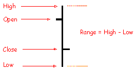
Bar graphs, although slightly more difficult to interpret, offer you more information on the trend of a currency pair during any given timeframe, as you can see in the picture below:

On the left, the horizontal hyphen indicates the Open price, while the right hyphen indicates the Close price; the vertical extension of the bar also instantly tells you what the High and Low during that timeframe was. For maximum clarity in a bar chart, the bar to the immediate left of the one in the picture will have a Close price at the same level of the Open price of the current bar, and the one to the immediate right will have the same Open price as the Close price of the current one. This is not always the case however — price gaps can occur even in Forex.
Candlestick Graphs: The Same Info, in a Cooler Way
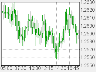
Japanese candlestick graphs present you exactly the same information as bar graphs but in a fashion that is easier on the eyes and to interpret. See the picture below:

As you can see, the candlestick chart is simply a bar chart, only with addition of color. A narrow rectangle is in fact drawn from the opening to the closing price, and colored accordingly — here, green stands for bearish market and white stands for bullish.
Most traders these days prefer candlesticks because such chart can really tell you with a glimpse of an eye how the market has been performing in the last hours or days. However, there is no reason why you should not use bar charts instead if you feel more comfortable with them.
If you want to get news of the most recent updates to our guides or anything else related to Forex trading, you can subscribe to our monthly newsletter.